Lino Printing Experiments
I’ve ben planning this idea mentally for some time. As a child I have a lovely book of Joan Aitken stories illustrated by Jan Pieńkowski in his absolutely amazing silhouette style. I’ve always loved that style and as a child attempted to replicate it many times – all sadly now misplaced, but the idea has been brewing to play about with this using lino prints, with ink and watercolour.
After discovering the Brusho recently (and buying an a4 Soft Cut sheet at the same time) this took off in my head.
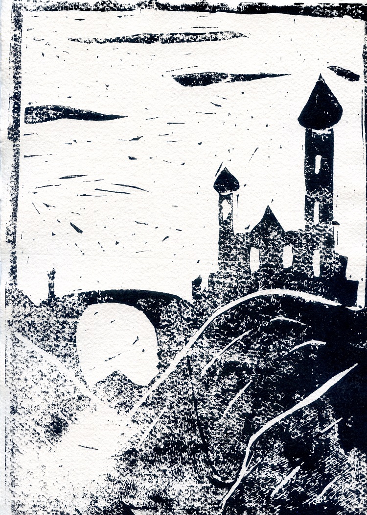
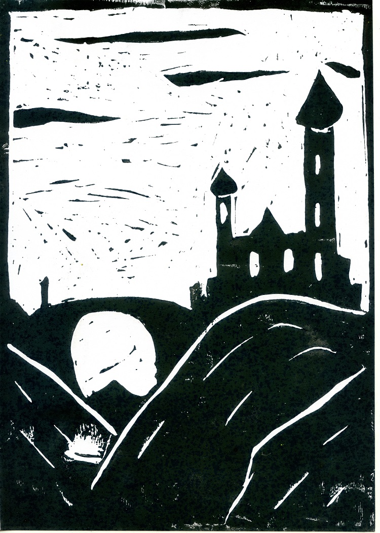
These are the base prints. I tried 3 different papers – Cartridge Paper (Daler-Rowney, I think, which I often use for Lino), some Mixed Media paper from The Works – this is 300gsm bright white with a slightly shiney finish) and Khadi Cotton Rag, which I adore, and found worked very nicely with the Brusho.
I printed three of each. These two are (left) the Khadi and (right) Cartridge paper. As you see, getting a clean print on the cotton rag was hard, due to the texture, though (as you’ll see) later attempts worked a bit better with a bit more ink and a bit more pressure with the baren. The Cartridge paper worked well.
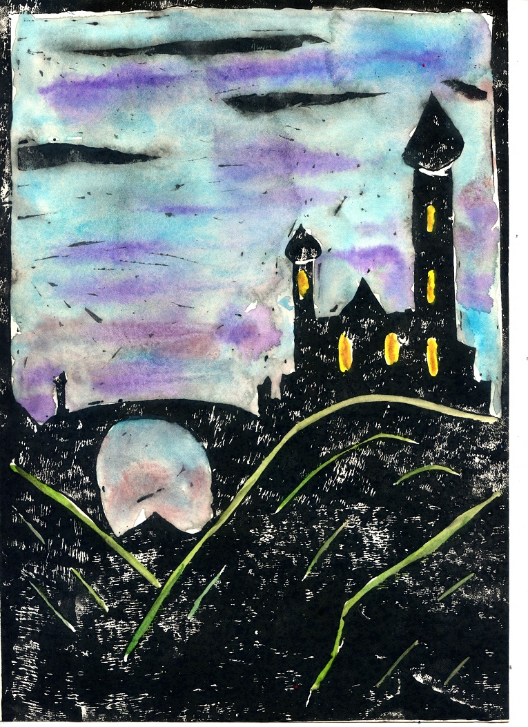
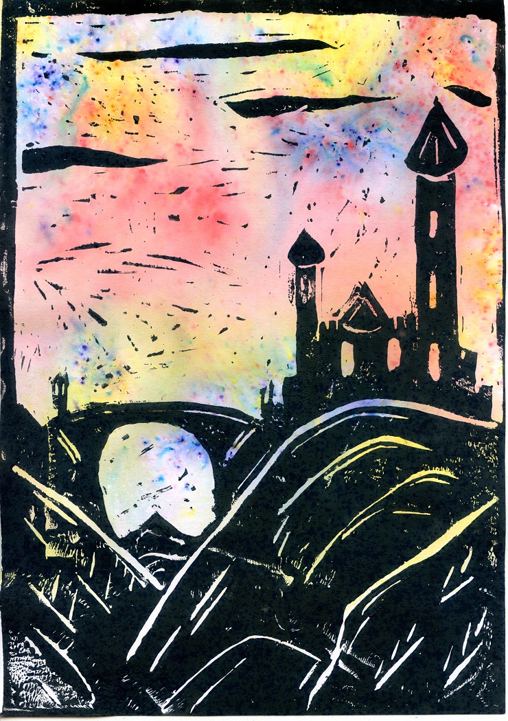
I have used some of the prints to experiemnt with colour, though what I hadn’t really thought of was how water soluable the lino ink remained. The first if these three images was using watercolour (on the cartridge paper print) – a technique I’ve used many times washing over Indian ink – but as I could not really wash without lifting the lino ink this contrained me somewhat.
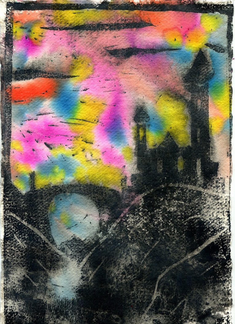
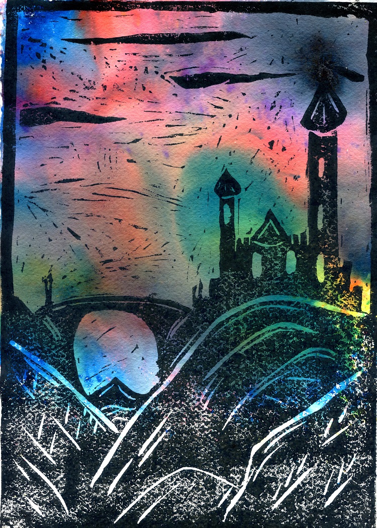
The second I sprayed the whole image with water and dropped on Pebeo Colorex ink – this was on the Cotton Rag. I actually quite like this one, as the spray has gently softened the silhouette without too much smearing.
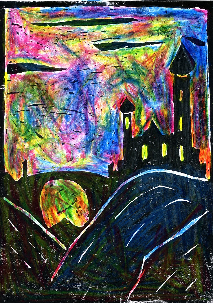
The Third, on the Mixed Media paper I decided to have a play with some marbled wax crayons – these are huge chunky things with different colours in the stick.
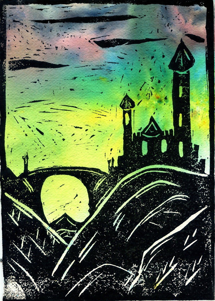
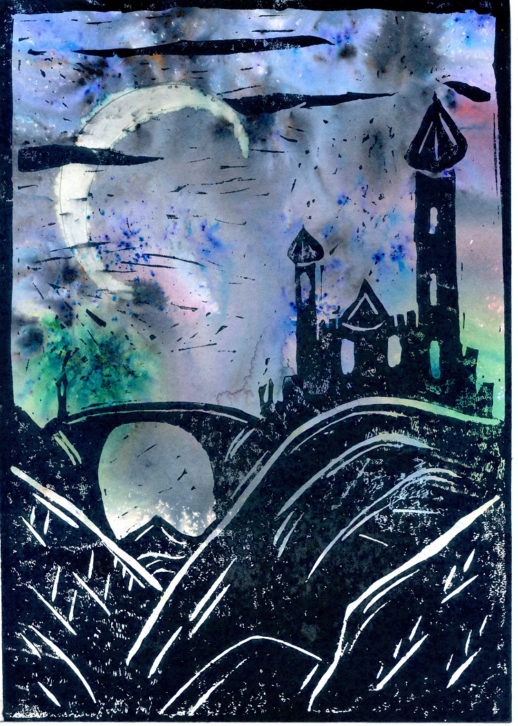
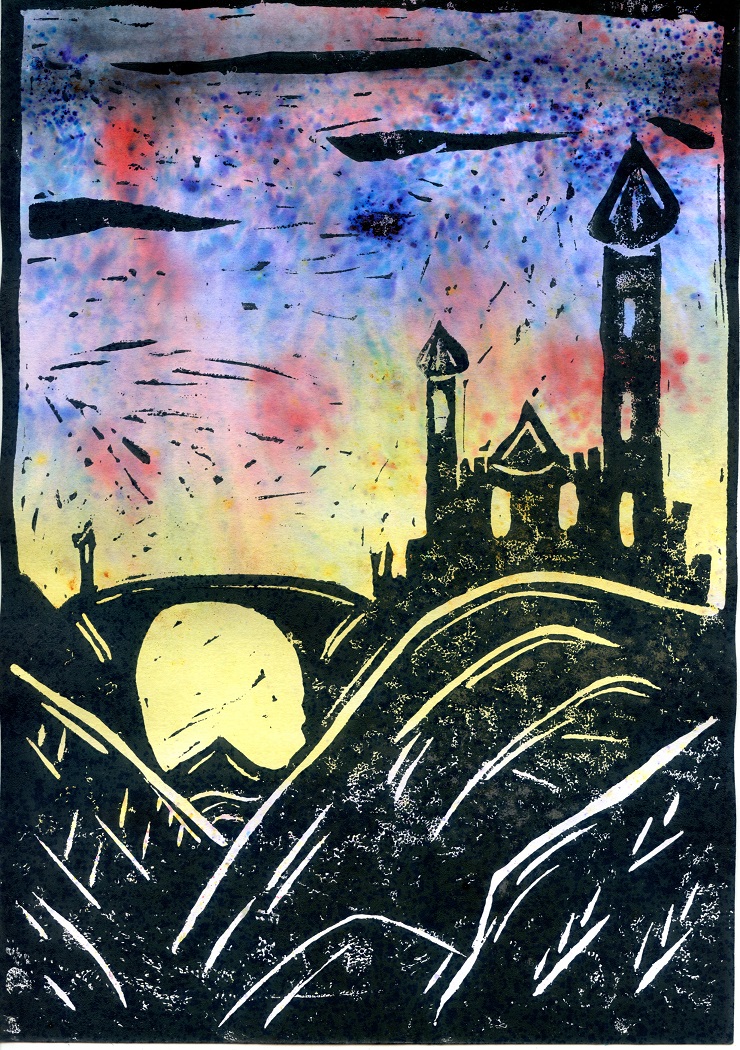
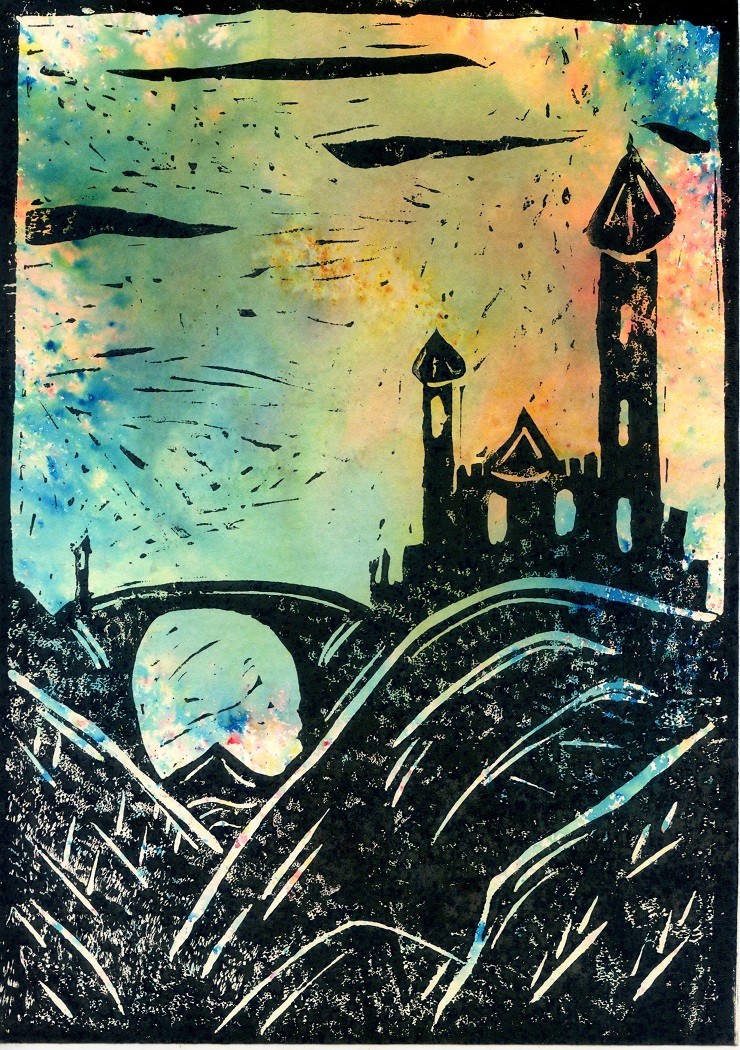
For the seciond round, firstly I decided to add a bit more detail into the image, making a few more lines in the hills and the rooftops of the towers. I then preprepared paper with the sprinkle and spray method for Brusho Crystal Colour. These have worked nicely and are getting towards what I aimed for. In one I bleached out to make a moon, but this didn’t really have the crisp edges I was after.
All in all this first play with this idea has been reall productive. I think I could perhaps have spent a little more time on the lino cut, as I was over excited about testing the idea and perhaps could have developed more detail into this. I’d also like to think about the composition of the brusho colours behind the print, perhaos to represent treees, or villages.
I’ll definitely play with this some more.