Rosa Watercolours
I have been meaning to try out Rosa Watercolours for a while, in my general quest/obsession to try every colour or preparation on the planet.
Rosa are a Ukranian brand, with a good reputation. They are also very inexpensive, and lets face it buying Ukranian products is probably a good thing to be doing right now.
They have a good single pigment range and also have some interesting mixed colours, and use some less common pigments. So I decided to test the water and try a few.
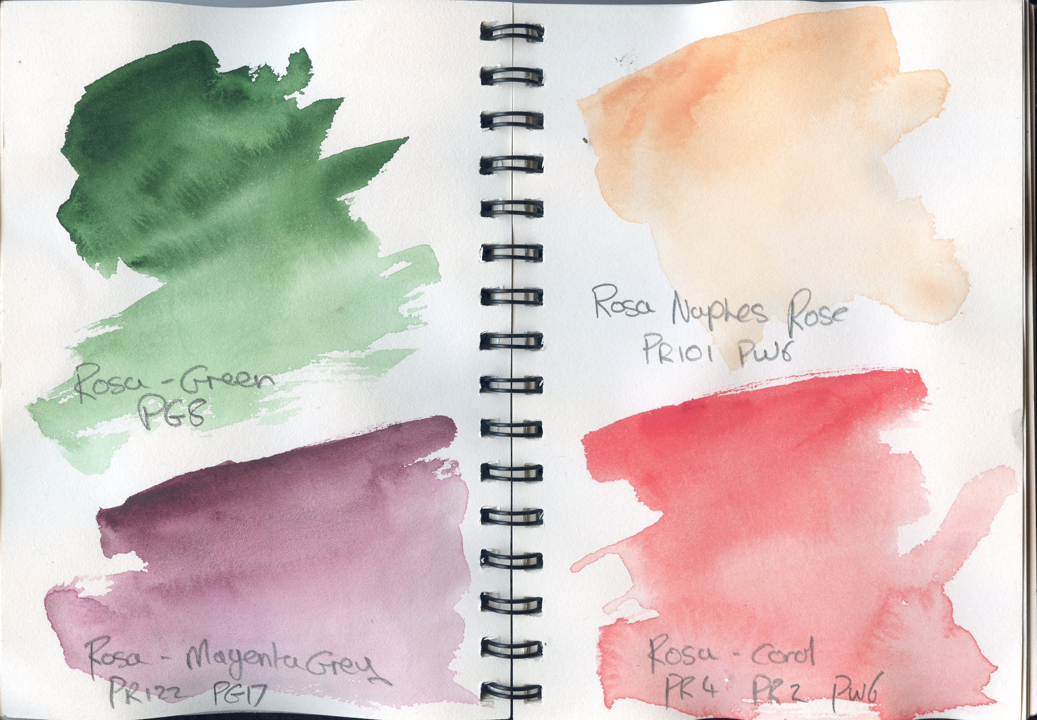
These are quick swatches from the colours I bought.
Green – PG8
This is a classic Hooker’s Green. This was actually one of the colours that led me to try out this brand, as I find Hooker’s Green a useful colour, but it is almost always a mixture. The Orginal Hooker’s Green was a mixture of Gaboge and Prussian Blue1, but was then often replaced by Napthol green – I have seen PG12 given as a designation for this (though I have lost the reference, and cannot find infomation on PG12 anywhere obvious) and also PG8 – Nitroso Green. Art is Creation gives a bit of the chemistry and shows this is a napthol based compound – sodium;iron(2+);1-nitrosonaphthalen-2-olate – the bisufite complex of 1-nitroso-2-naphthol reacted with ferrous sulfate and then with sodium hydroxide2. Technically this falls under the catagorization of Azo Metal Complexes and Bruce McEvoy comments3 it is one of the oldest chelated iron complexes so I wonder if this is the compound referred to. Anyway, I digress into geekery here.
This is a dark cool green with a very slight granulation, exhibiting gentle and pleasant blooming. I have not tested fully, but I would imagine it to be fairly staining4, as Napthol based pigments tend to be. It may not be as lightfast as it could be which is why I suspect many paint manufacturers used mixed pigments for this colour5. However, I am taken by this and it may find its way into my main “Single Pigment” pallete.
Magenta Grey – PR122, PG17
This was one of the mixtures that caught my eye. Mixed from PR122 – Quinacridone Magenta and PG17 – Oxide of Chromium this is a classic convenience mix. Oxide of Chromium has both blue violet and red reflectance and works well as a blend with staining purples and reds;6 this also gives some interesting granualtion effects as sedimetary opaques and stains can do when mixed.
It is a lovely purple grey, with light granulation and texture. I can see this for dusky florals and interesting shadows, or twilight skies.
Naples Rose – PR101, PW6
I have recently (under strict instructions not to lick it7) sourced some real Naples Yellow (PY41 – Lead Antimonide) to continue my exploration of early pigments but I thought I would also try this flesh pink mix. Similarly to the Mungyo Naples Yellow this is a mix of an earth with PW6 – Titanium White, in this case the earth is PR101 – Red Iron Oxide. This actually granulates less than I would expect (though the granulation from earth colours is vary variable) and is a lovely pale rose. The only caveat is that the presence of the white can lead to mud in mixes. But it very much has it’s uses and I can see it as a good flesh tone for manga style characters.
Coral – PR4, PR2, PW6
Another lovely pink – I brought this as my partner commented that I did not seem to have many pale pinks – of course many reds will create a pale pink in thinner washes, but until, say, a quinocridone coral this provides opacity albeit with the same caveat as before. It is a little like the pinks in the Mungyo Nostalgia of Pastels set (which I do beleive contain a white, even though this is not declared) but more vibrant.
The red pigments, PR2 – Napthol Red G and PR4 – Hansa Red R are uncommon (again possibly as they are not as lightfast as many others), but again for me this is of course of interest. This is a lovely coral pink, with a mild granulation though a slight tendency to backwash.
I did a couple of quick pictures to try these out.
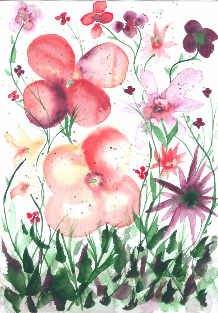
The first of these was a quick loose floral. I used only the 4 colours I bought for this. As I noted the mixed colours with the Titanium White did mute mixes a little, but mixing the magenta grey and the green provided some good darker muted greens – I will explore mixing this with its constituants to see how it can be used at some point.
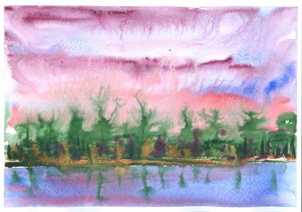
I also did a quick impressionist wet into wet landscape. For this I used a base of Ultramarine (my own preparation) in the sky and water, with touches of the magenta and coral. I used the green for the trees, with more of the magenta, and a touch of Quinacridone Burnt Orange (PO48, Daniel Smith) which did what it does and pushed the green about in a nice manner. What did strike me is how active these paints were when in a very wet wash, giving some interesting effects – though these would need to be controlled in more “classic” paintings.
All in all, I think I will explore more of the Rosa colours. I don’t think they will replace my favoured brands (Schminke, Daniel Smith, Winsor and Newton, and Rowney Artists) where these provide the same pigments, but where there are differing pigments or interesting blends I will certainly use them. They are highly pigmented and seem to work well, though the paint is a little “gloopy” rather than a more liquid or (ideally) buttery cosistency.
I bought these from Cult Pens who also deserve a special mention for the inclusion of a mini roll of Love Hearts in the package and the invoice clipped with a sweet little metal clip with a smiley face. Jacksons and Bromleys also carry Rosa watercolours.
- See https://www.oldholland.com/academy/prof-theo-de-beer-about-hookers-green/ and https://www.theparisreview.org/blog/2018/10/03/hookers-green-the-color-of-apple-trees-and-envy/ for some more on the history of this colour. ↩︎
- https://www.artiscreation.com/green.html#PG8 ↩︎
- https://www.handprint.com/HP/WCL/waterg.html ↩︎
- McEvoy, reviewing the Uchtrect hooker’s green agrees – ibid. ↩︎
- I have seen the pigments for this listed differently, and I wonder if they have changed the formulation – I may stock up on the PG8 version. ↩︎
- McEvoy ibid. ↩︎
- I really must be good here as I have a tendency to point my brushes in my mouth ↩︎