Nostalgia of Pastels
I bought this little set of watercolours from The Range which I visted when chasing Freightliners recently, as I was taken in by the interesting and slightly different colours. It’s a bit of a niche set, and certainly not useful as the only set one has, except if you want to work in very specific styles. The question is whether it could be a useful addition to my art box.
The first thing that’s clear about this is that while the colours are given traditional sounding names, these bear little relation to the actual pigments used. This does not nessecarily mean they are poor quality, but they are could be a bit of a dissapointment if you expect them to look how you imagine they will. Many are mixed pigments, limiting their use in mixing, and though it is not made clear it is possible they have a white pigment to make the colours more pastel – though they mostly claim to be transparent.
Lets have a look at the colours.
841 Raw Umber
Transparent
Light Fastness III
PR101 – Synthetic Red Iron Oxide
PB27 – Prussian Blue
PY14 – Diarylide Yellow
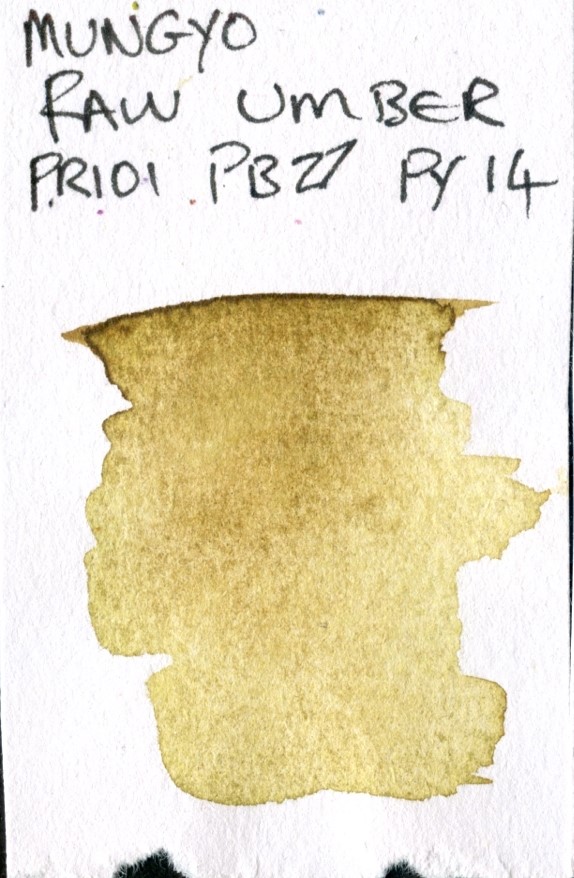
As is not perhaps suprising, this does not contain natural brown iron oxies as would a true Umber. The Brown created from a mixture of Synthetic Red Iron Oxide, Prussian Blue and a green toned Diarylide yellow; this latter is a pigment more often used in Inks.
PB27 Prussian Blue is a deep higly tinting pigment wisth some staining, and makes a good set of browns when mixed with Burnt Sienna, so the mixture is not wholly strange. I would imagine the Diarylide will ligten this without too much extra muddying.
In use there is some level of staining from the PB27 and, I suspect, the PY14 and a small level of granualtion – PB27 granulates, an PR101 may to some extent. This is not really a clean colour to mix with others, but is a reasonable green/brown in it’s own right.
851 – Transparent Brown Oxide
Semi-Transparent
Light Fastness III
PY 42 – Synthetic Yellow Iron Oxide
PR101 – Synthetic Red Iron Oxide
PB27 – Prussian Blue
This again is mixed from the three primaries to make a brown, the yellow this time from synthetic iron oxides. It is a little staining and granulating similar to the Raw Umber above (but in any paint of this standard the effects may be slightly more minimal due to a lower pigment load).
808 – Pyrrol Red
Transparent
Light Fastness 3
PO13 – Disazopyrazolone Orange
PR112 – Napthol Red
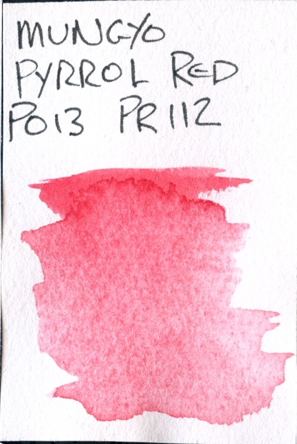
Again, there is no genuine Pyrrol red (PR252) in this colour, but Napthol Red (PR112) is a nice transparent red which blends well with white to make a pastel. This looks a little granulating in use, though neither pigment would be expected to do so to any extent and this may be binder. I am not convinced of the lightfastness of this as Disazopyrazolone Orange is very fugitive and this may change colour over time.
873 – Rose Madder Genuine
Transparent
Lightfastness 3
PO13 -Disazopyrazolone Orange
PR122 – Quinacridone Red
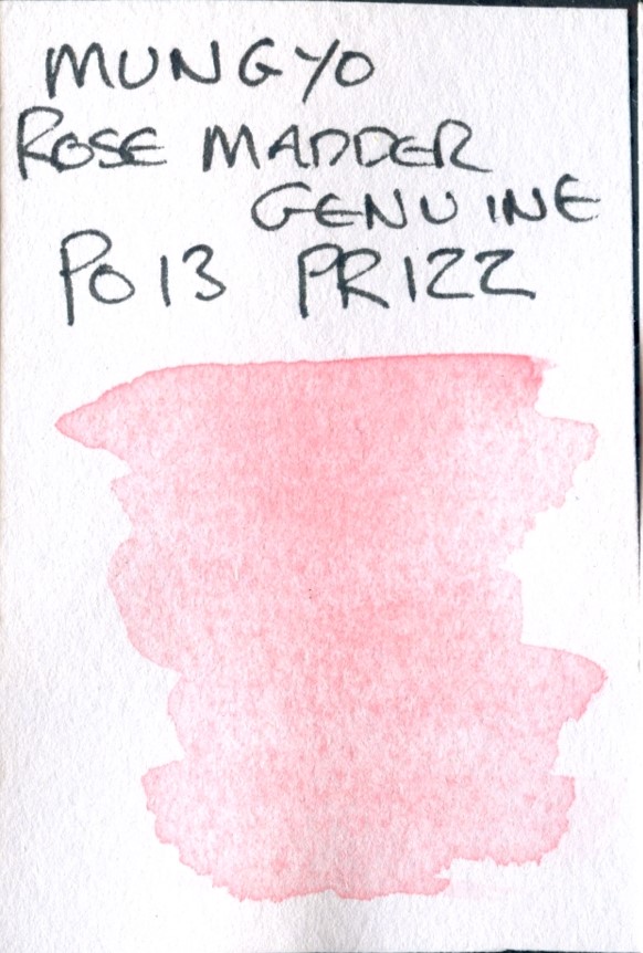
Also unsuprisingly this is not a genuine Rose Madder. However Disazopyrazolone Orange (PO13) is a good bright orange and Quinacridone Red (PR122) is a great vibrant staining colour (as are all the quinocridones). This seems quite transparent, and stainng, whereas genuine rose madder (which is a laked pigment) often granulates.
874 – Salmon Pink
Transparent
Lightfastness 3
PO13 -Disazopyrazolone Orange
PR122 – Quinacridone Red
This would seem to be very similar to the above, but likely contains an unlisted white pigment to lighten the tone somewhat – this could be causing the (very minor) sedimentation.
870 – Permanent Yellow Deep
Transparent
Lightfastness 3
PY83 – Dairylide Yellow
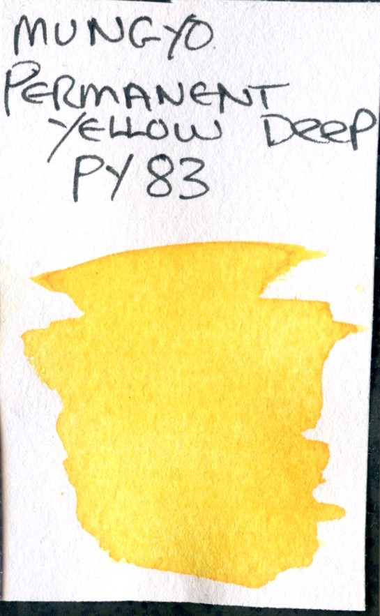
This is a very clean and useable warm yellow. PY83 – Dairylide Yellow has a good tinting strength, and this colour is relatively transparent and seems quite staining. As a strong, warm single pigment yellow tjhis could be very useful for mixing primaries.
871 Cadmium Yellow Right
Transparent
Lightfastness 3
PY3 – Hansa Yellow Light
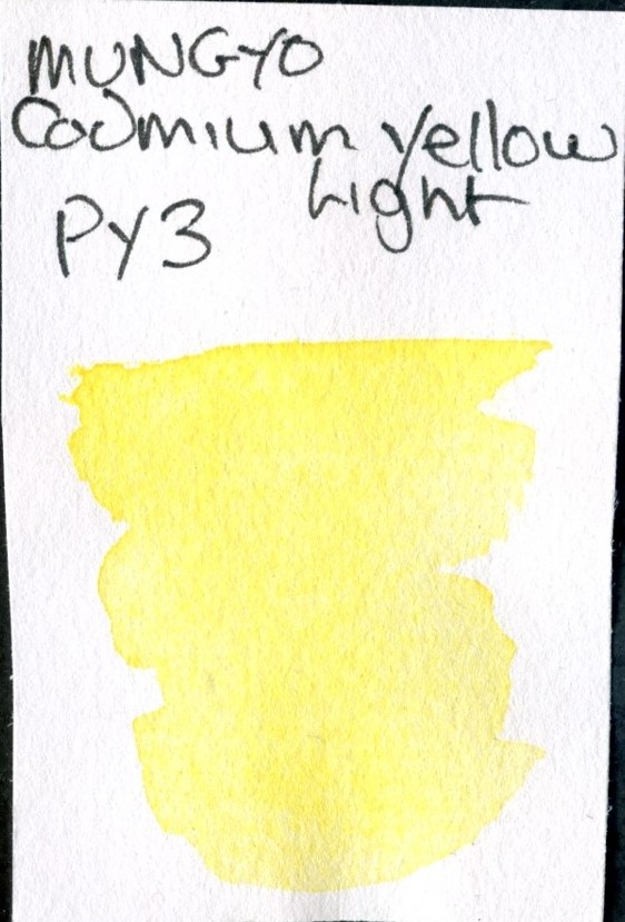
PY3 is an Azo pigment, rather than cadmium based, but it is a clean and zesty yellow, which is transparent with a reasonably high tinting strength, making this quite a useful colour. It’s certainly bright, stains well and has good coverage when I have used it. Another potentially useful mixing pigment – essentially this is a single pigment Hansa yellow – I do wonder why they didn’t just call it that as it is a pigment of perfectly reasonable repute.
Though I have written “light” on the swatch card, it is listed as Cadmium Yellow Right
821 Fuchsite Genuine
Transparent
Lightfastness 3
PB15:3 – Pthalo Blue (Green Shade)
PG7 – Phthalocyanine Green
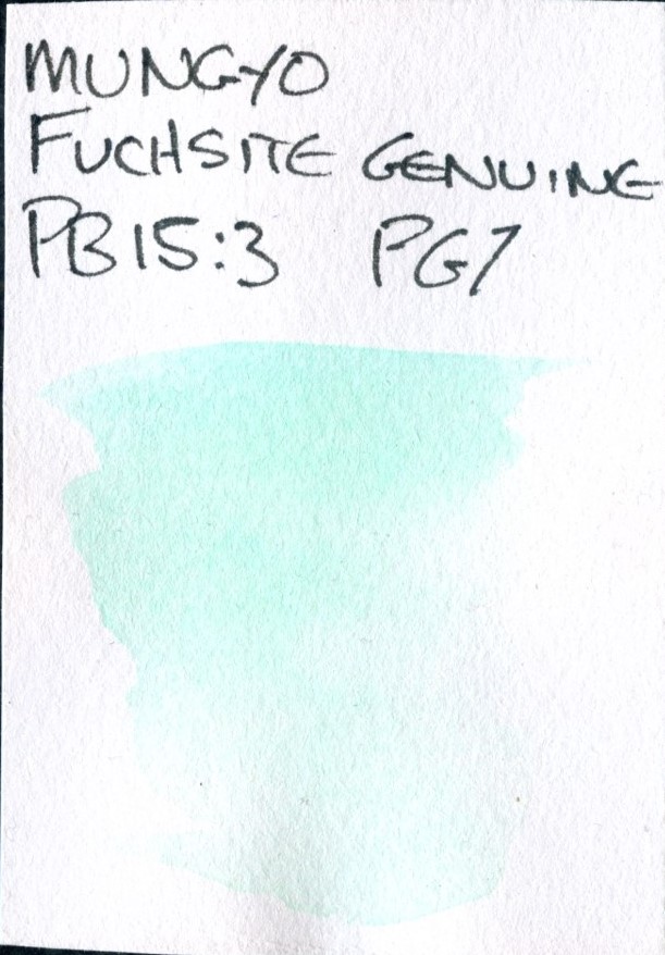
Again, this is certainly not Fuchsite, but it is a realtively clean blend of 2 transparent, staining pigments. PB15:3 is a greener shade of Phthalo Blue, and PG7 is a green phthalocyanine pigment, also transparent and staining. This is quite a weak colour, however, and I suspect there’s a lower concentration of both these pigments in the paint itself.
822 Cobalt Turquoise Light
Transparent
Lightfasteness 2
PG7 – Phthalocyanine Green
PY3 – Hansa Yellow Light
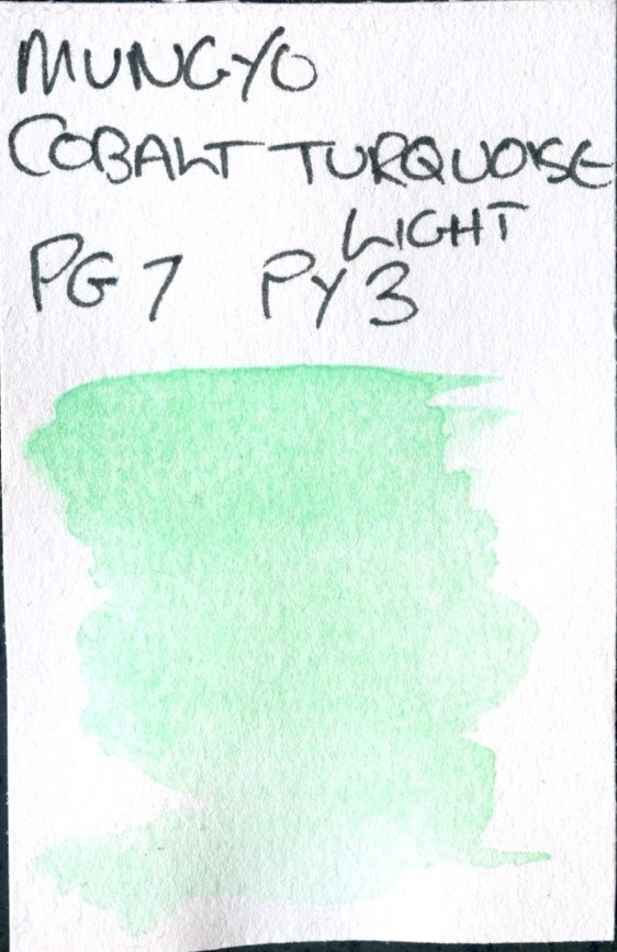
And again, this is not Cobalt Turquoise – nor in my opinion even that similar to it in colour. It is a mix of Pthalocyanine Green and Hansay Yellow – both transparent staining pigments. It’s quite a nioce colour, but again is wek in this paint.
824 – Manganese Blue Hue
Transparent
Lightfastness 3
PB15:3 – Pthalo Blue
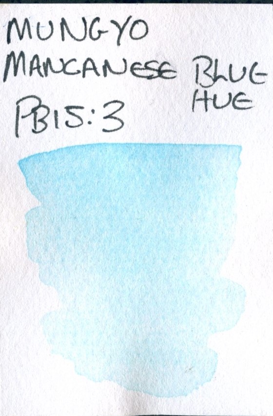
This Maganese Blue is a single pignment of PB15:3 – though I would suggest not much of it from the very transparent and pastel shade. It’s going to have quite low tinting strength, but in itself is a useful colour.
825 – Pthalo Blue Light
Transparent
Lightfastness 3
PB27 – Prussian Blue
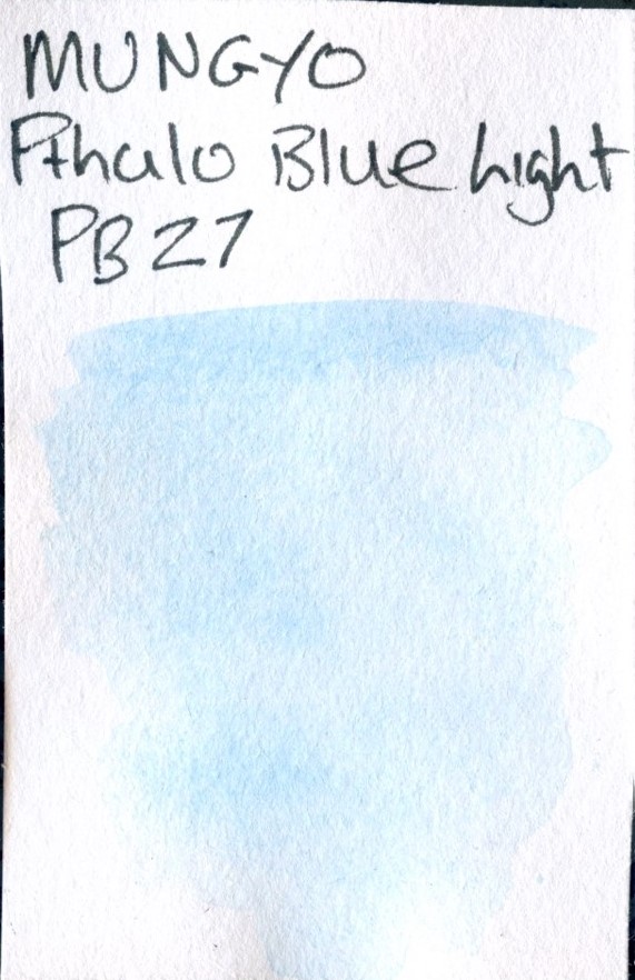
And after a number of paints made from Pthalo Blue, we have one named Pthalo Blue Light, made from PR27 – Prussian Blue, again, doubtless quite a low quantity. Prussian Blue is granualting with a high tinting strength, but I would doubt this paint has either as it’s very pale.
875 Ultramarine Pink
Transparent
Lightfastness 3
PB81 – Cobalt Tin Alumina Blue Spinel
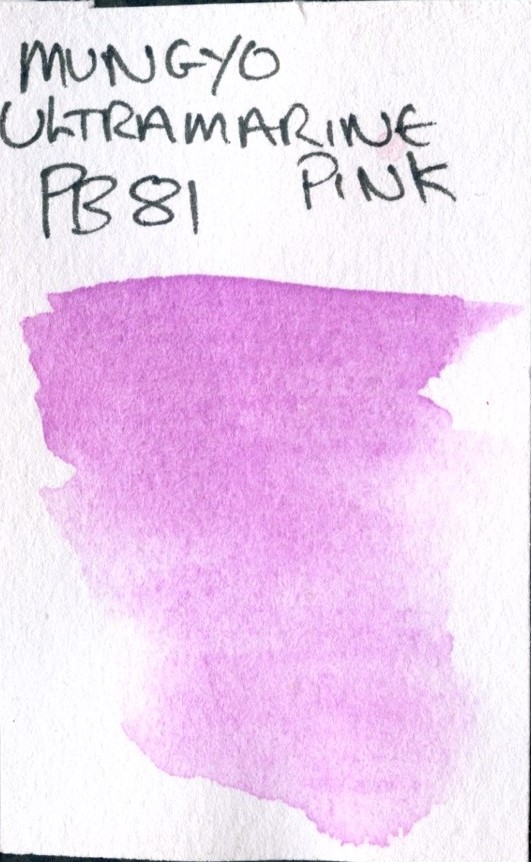
PB81 – Cobalt Tin Alumina Blue Spinel is listed as a bue pigment, but it is very purple. It’s not very common in watercolours, but this is nonethless a useful single pigment colour.
The Mungyo colour chart can be found here
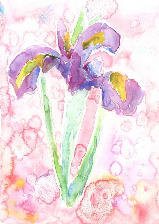
I painted this iris as an experiment to play with these. the pinks and yellows are very nice, though I have pulled into service some Dioxazine Purple and Ultramarine (both W&N Cotman) for the darks. Playing with salt has given some interesting flocculation effects.
All in all this set is a bit of a mixed bag. It’s plainly aimed at certain applications – obviously florals present themselves, and I think marketted very firstly at the kawaii fad.
There are some interesting pigment choices, both good and bad.
The actual pastels, particularly the blues, don’t quite do it for me – their weakness really limts their use in my opinion, though I can see some application in hi-key skies maybe, certainly with the single pigment colours. I suppose the other option is stronger levels of pigment and a huge dose of white, so it’s swings and roundabouts which is better.
The reds are a little better and the Pyrrol red is not a bad colour. The Earths are useful, but if mixing I think it would be important to stick with the pigments used – so for example increasing the Prussian Blue in the mix could create some nice tones.
For me the standouts are the yellows – both single pigment strong stains with a high tinting strength, even if one of these is an uncommon pigment for the medium.
1 thought on “Nostalgia of Pastels”