Image Rescue…
One of the benefits of shooting black and white film, is its latitude, the range of contrast it can reproduce. I am not going to go into great detail about this here, as for the purposes of this tutorial it is not necessary, read up on the zone system for a bit more information if you like. It is just enough to know that film can manage about 7 stops of contrast, and that in between these it has a wide gradation of levels. Even a cheap Chinese film like Lucky SHD 100, which I used for this image.
Black and White in Bradford
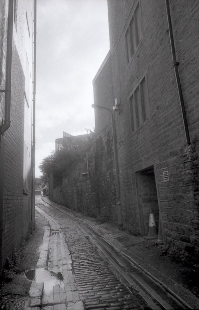
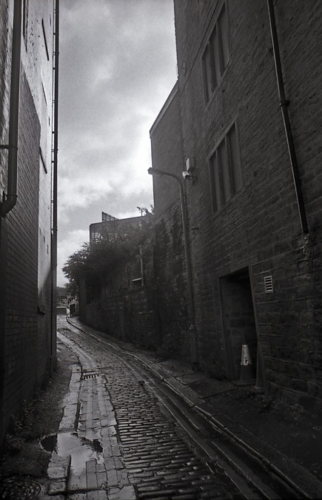
I shot this image in Bradford, by the side of the old Cinema near the Alhambra Theatre. It was taken using my Praktica TL-5B and Vivitar 28mm f/2.5. The film was Lucky 100 SHD, which is much maligned, but if used carefully can be very nice, if a little grainy. I normally use a yellow filter with this film, but I had forgotten it on this occurrence. It was developed in Rollei D74 for 6 minutes.
I metered from the walls – These would be about zone IV in the scene, a little darker than the midpoint. Of course a shot like this is impossible to control using a graduated filter due to the shape of the sky-line. In these a tend to meter for the dark areas as this is easier to solve.
I didn’t spend too long on the shot, as I was being hassled by builders, who were generally making obnoxious comments about my being a pervert with a camera. Some people are so idiotic…
Rescuing a troublesome shot
The image below is the original scan from the Eposn V500. This was done fairly simply, using the auto colour correct for black and white film, and setting the white and black points. As you can see, the sky is a little over exposed with not much detail, but there is still a bit of blocking in the lower right hand. I cropped this, but I did not spot-clean it yet, as I wanted to keep the image at 16bits for as long as possible.
Initial Adjustments
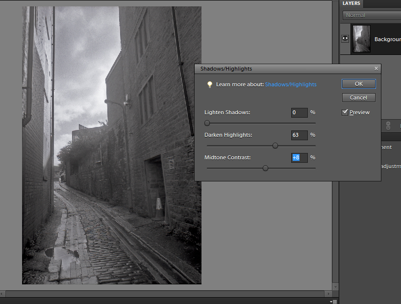
The first stage was to deal with the sky. Sometimes I will use a levels layer for this, but as there were no highlights in the rest of the image, I used the shadows/highlights tools. This tool basically lightens the shadow areas and darkens highlights, but it does this in a more complex manner than just making the areas brighter, it works on the luminance comparing to neighbouring areas in the image. As you can see here it is very good at bringing detail back into blown highlights,when it looks as if there is very little data to play with. In this image I darkened the highlights, but left the shadows alone, as I wanted to address them later using the curves tool. I did also boost the mid-tone contrast a little.
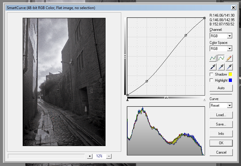
The next step was deepening the shadows a little all over, and boosting the contrast using the curves tool. Photoshop Elements does not have a full curves tool inbuilt (see later) so for this I used the Smartcurve plugin from Easyfilter. The curves tool works on the colour channels, so slightly boosts the saturation – even on a vlack and white (though RGB) image this adds a certain je ne sais quoi to images. Using this tool, I put in a standard s-curve – this boosts overall contrast by deepening the shadows and raising the highlights. This might seem counter intuitive as I just darkened the highlights, but the two tools work in different ways.
Local Adjustments
Now to deal with the shadows. It may seem odd to run tools which darken and then lighten, but they do all do slightly different things, and with care there is enough information to do this without introducing too many artefacts, in an image like this that is quite grainy and rough.
I used the Dodge tool to lighten up some of the corner, using a largish (~200px) soft brush at an exposure of 7%, on the shadows. These are powerful tools, so use them with care. This has lightened the shadows and dealt with quite a lot of the blocking on the wall – this shows the amount of data still available to work with.
As you can see, the image is starting to look a little more punchy. Now to do some more darkening!
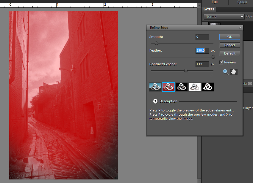
The next stage is to add in a vignette to the bottom of the image. This will act so that the eye is led from the darkened areas into the image.
I made a selection round the bottom, and then used the refine edge tool to modify this – I grew it a little and then smoothed the edges. I wanted a really nice transition, so set the feathering to the 200px maximum.
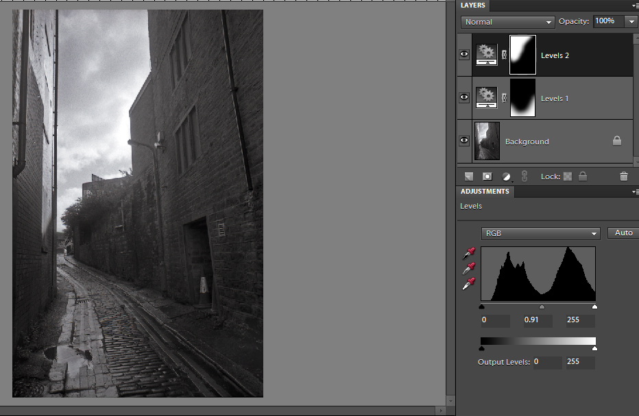
I created a levels layer from this selection, and pulled the mid slider down to 0.91. I then made a new selection with the same settings in the top corner, and created another levels layer also with 0.91 to just tame the sky slightly.
The image is now nearly how I wanted it, but there are a couple more things to do.
Finishing Touches
I now wanted to work on the whole image to do a couple of little finishing touches. So the next stage is to merge the layers to create a new layer with the results of my adjustment layers.
To do this, highlight the three layers, and in the layers menu hit Duplicate. You will now have 6 layers, 2 sets of 3. Make one of the sets invisible, by clicking the little eye symbol in the side of the layers palette. Now go to the layers menu again and hit Merge Visible. This will create the new layer you need, but keep a copy of the old ones in case you need to go back.
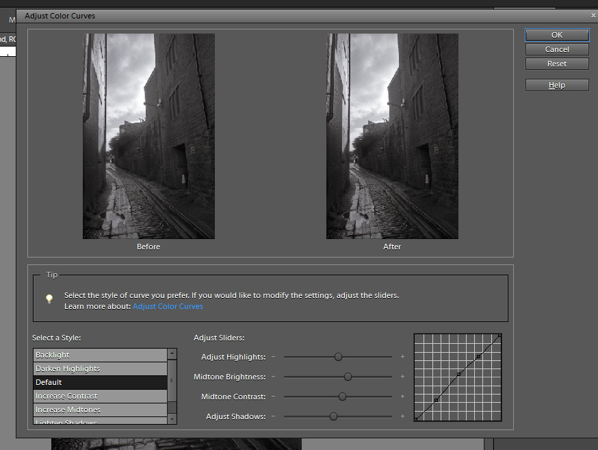
Make sure this new layer is selected for the final adjustments. I put in another curves adjustment, this time using the built in Curves tool (in Enhance>Adjust Colour), as it has a handy little preset slider for midtone contrast, and has a good before and after view. This final curves tweak seems to solidify the image and again give it some punch.
Now I had everything in place I cleaned any dust spots with the spot healing tool. I also used the Dodge tool again, this time working on the highlights and mid tones to bring out a bit of shine in the cobbles.
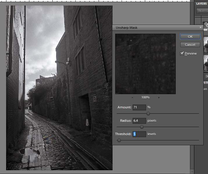
The final adjustment was a bit of sharpening. I used the Unsharp Mask tool (in Enhance) to crisp up the textures. You can see the settings I used in the image on the right, but you can do it to your taste.
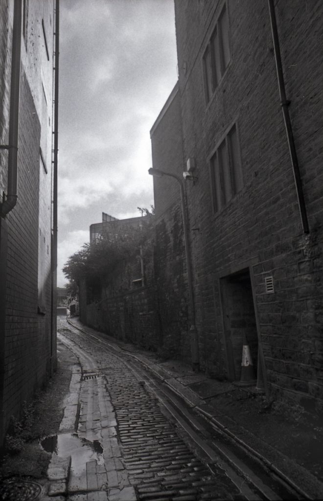
Final Image
And so here is the final image. I think it has worked quite well, with a nice moody atmosphere to it.
I am sure some film purists would object to this, but for me this is one of the great advantages of working with film, you have the best of both worlds.