Green With Envy
This was another Christmas list present last year, and while I’ve used the colours in various paintings I’ve not really sat down to write up a bit about them until now.
I’ve always been quite taken with the work of Jean Haines, particualry her floral paintings as there is a lovely loose expressiveness to these, and who does not need and love a good green…
The Marketing Blurb reads:
“I’m an artist that has always mixed my own green shades, but not anymore, now that I’ve discovered this fabulous DANIEL SMITH range of shades that will have many artists green with envy. With each amazing green jewel, you’ll discover how your art can be transformed. Leap into my world of exciting colour and allow your art to shine!”
Now, there is repeated commentary on the Marketing Romance from Daniel Smith, and this is perhaps no different – but what is the set actually like?
The first comment that I have to make is that for all Jean Haines blurb on mixing her own greens, which would to my mind at least suggest that this set is a set of fine convenience mixes to take the work out of that, only two of these are mixes, and both are quite niche – this is not going to give you your quality Sap Green or Hooker’s Green.
A further one is a single pigment, and the remaining three are Primatek mineral pigments, though as we will see, the question on the purity of this range rages on and on…
However, the paints are great quality, they do not visibly have too much of the “gloop” issue sometimes noticable due to the thicker binder Danial Smith can use (especially in the lower tinting strength colours in the primatek rage) and the colours are inspiring.
So, what’s in the box?
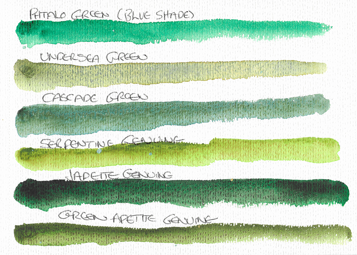
Pthalo Green (Blue Shade)
I mean, this does what it says on the tin. Phthalocyanine green is ubiquitous, relatively inexpensive, and indispensible. This is a dense and rich example, to my eye slightly to the warmer end of the “blue shade” (PG7) of this pigment, clean and transparent. It is smooth and non granulating, and very staining.
Undersea Green
This is perhaps my favourite of the set, and I’ll be posting some pretty intense explorations of results I have got from this this shortly. This blends Ultramarine (PB29), Quinacridone Burnt Orange (PO48) and Nickel Azo Yellow (PY150). The swatch above does not actually do it justice in masstone in which it is very vibrant, pulling out to subtle orange/brown flecks in a green wash when diluted – this in itself is interesting as Daniel Smith descrobe it as a blend of Ultramarine and Quinacridone Gold (which following the demise of the single pigment) is made from PO48 and PY150 in their range, yet the colours that pull out seem to combine the Ultramarine and the Azo Yellow more intimately.
Cascade Green
This is a blend of brown ochre (PBr7) and Phthalo Blue (PB15) creating a rich piney textured green, great for evergreens, ivy and so on. It’s cool, pulling out slightly blue shaded yet with the subtle brown of the ochre. It’s a nice colour, though not indispensible.
Serpentine Genuine
This is an interesting green. Daniel Smith’s Colour Stories booklet1 states this to be Stichtite which is actually a purple mineral commonly found alongside and in combination with Serpentine. The paint certainly does display some delicate pink flecks in the wash of somewhat billious2 green. I rather like this one.
As has been discussed elsewhere, whether there is something other than crushed gemstones in this remains a mystery, but as can be seen in the swatches, there does appear to be heavy sedimentary pigment, along with something much lighter which is more active in wet.
Jadeite
I already have a tube of this, from the Primatek set, and it is one of my favourites from what I have in that range. It’s a great dark, intense green, great for pines in more impressionist works. Again, given the value of Jadeite as being between $50-300 per carat even at lower grades, there must be some question on whether this is made solely from the pure gemstone.
Green Apatite Genuine
This is perhaps the most natural looking green of the three Primatek colours, a more muted olive green flecked with brown when pulled into a wash. Apatites are a group of minerals, and the source is not listed in the Daniel Smith Literature. Overall it is a useful colour, though again nothing that conventional pigments could not provide.
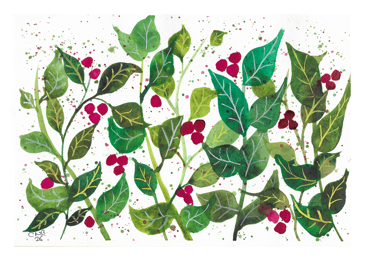
As I noted, while I had used these quite a lot, I’d not done a specfic test picture from the set, so here’s a little image, inspired by Inga Buividavice’s work.
Since this, I have been using the Undersea green very specifically, based on a further experiment, that I will post about shortly…
So, the verdict. All in all is is a nice set, and the opportunity to get a few inetrersting colours which to be fair will all be of used to painters working an contemporary and impressionist nature and Landscapes. I think in many ways, the marketting and reality may have been better met by some other of Daniel Smith’s convenience greens making this a more balanced set. However, ongoing discussion on the Primatek colours aside this is a good product and an interesting addition to my paints, if not an essential item.
- https://danielsmith.com/wp-content/uploads/2025/01/DSColorStories0125.pdf ↩︎
- Anyone else remember that ghastly yet wonderful acrylic colour from Citadel Miniatures..? ↩︎