Acrylic Experiments
I have always had a bit of a journey with acrylics.
While it has been around in use by artists since the 1960s, Hockney being a key early adopter, I do not recall it really being about in the 80s and early 90s when I was at school at school. Among the model painting fraternity there was always a big debate about acrylics versus enamels (I was the latter for a while, until I saw the error of my ways). I always get the impression that acrylics have had a rep as being the preserve of “modern”, “pop-art” or less traditional artists and cheap shops abound with cheap sets, but this is very much not the case and all the major brands do create good quality materials.
I think this is also slightly churlish, as they have so many qualities. The first thing I will say is cheap acrylics can be very decent. Cheap sloppy ones, that come in a huge tube for a quid will often dissapoint, though they have their uses and we have used them often for crafts and home applications. However even cheap-shop artists sets can actually be ok – as I’ll show later.
Acrylics can be varied. They can be thick and buttery, textural, thin and free slow. They dry fast. They can (depending on the texture) be used impasto or almost like a watercolour. They can be mixed wth various media. What is not to love?
I have always had sets around, mostly at the cheaper end that I have used for art, modeling and crafts for many years – here’s one from the archives, painted in about 1997.
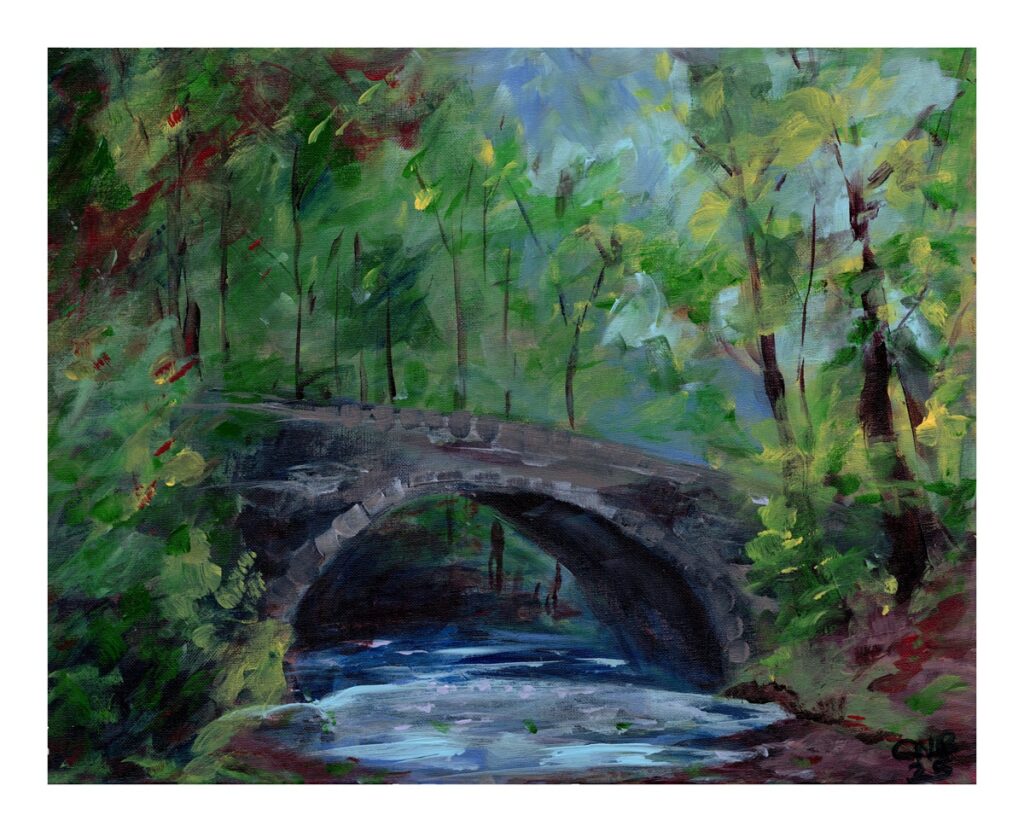
Just before Christmas I was in Søstrene Grene doing some Christmas shopping and bought three little sets of acrylics – what drew me to them is that they were arranged in themes, with muted colours on a spectrum from Red to Yellow, Green to Brown and Blue to Grey/Violet which gave me some ideas to work on a set of three images on each set (still to do). However I found a tutorial in The Artist for an acrylic painting of a forest bridge which I decided to work from, though I put in a slightly more detailed traditional impressionist approach in the end. I found the muted colours really worked creating this slightly understated scene.
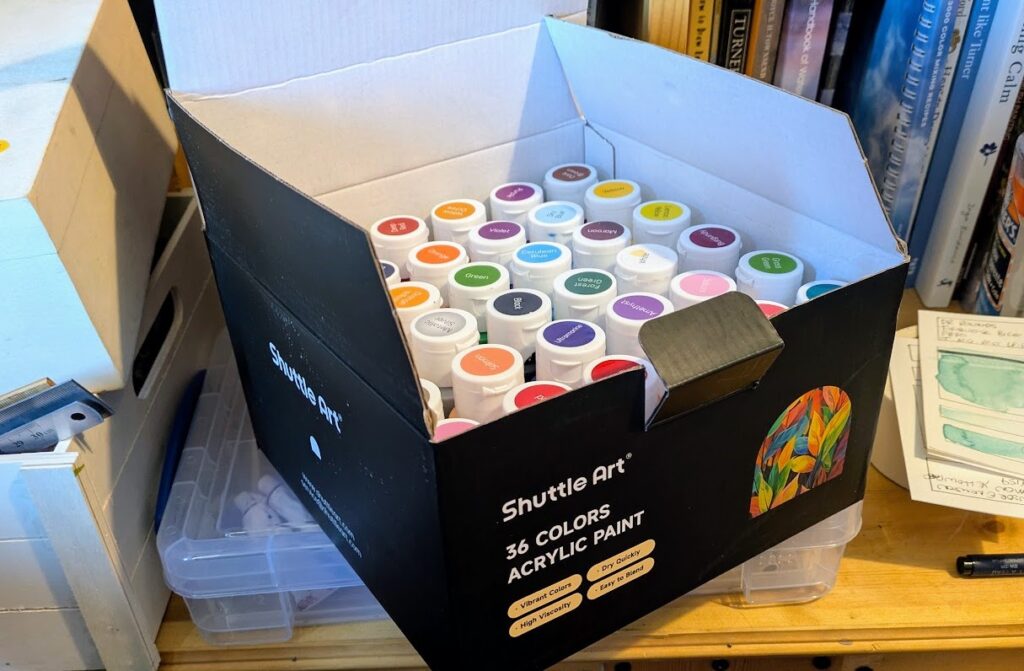
For Christmas I was given a huge box of acrylics from Shuttle Arts. While obviously not professional level, these have pretty solid reviews amongst the hobby painter and craft communities and are pretty good. They are free-flow acrylics in 60ml bottles, in a great range of colours.
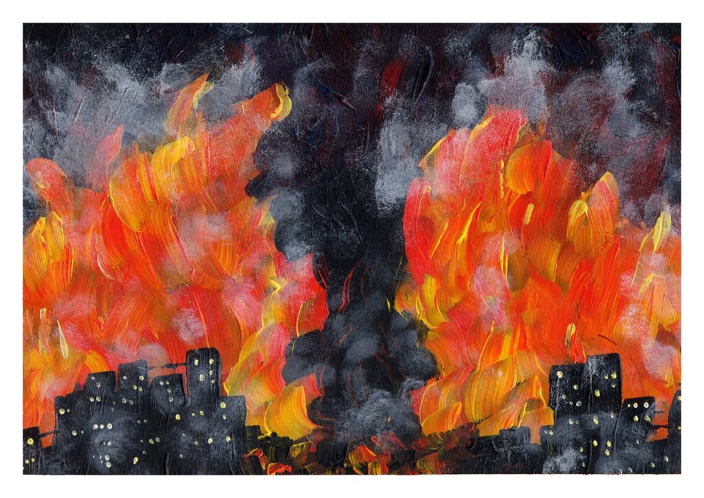
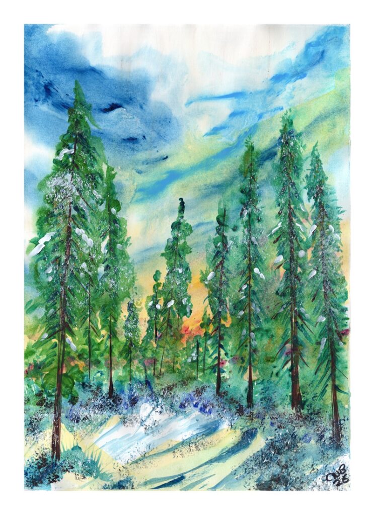
With a lot of the acrylics I have used so far being heavier bodied, I set about looking to use these in different ways. I picked up a huge 40 x 58 cm acrylic pad in The Range shortly after Christmas and this gave a perfect support. My aim with these was to see how far I could get away with diluting the acrylics to wash about like watercolour, before using thicker strokes later on. As you can see, this has worked really nicelt on these vibrant contemporary compositions.
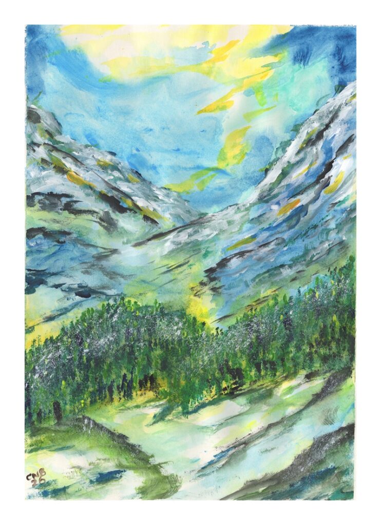
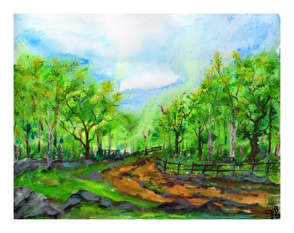
I moved to canvas for this next one, using the same wash techniques as I would start a similar image (and I have played with this theme in watercolour a few times) before moving to more standard acrylic techniques of opaque layering of colours, scumbling and so on. The way the paint has moved on the canvas is subly different to watercolour, giving a really vibrant effect. This, of course talks to my Idyll project in watercolour.
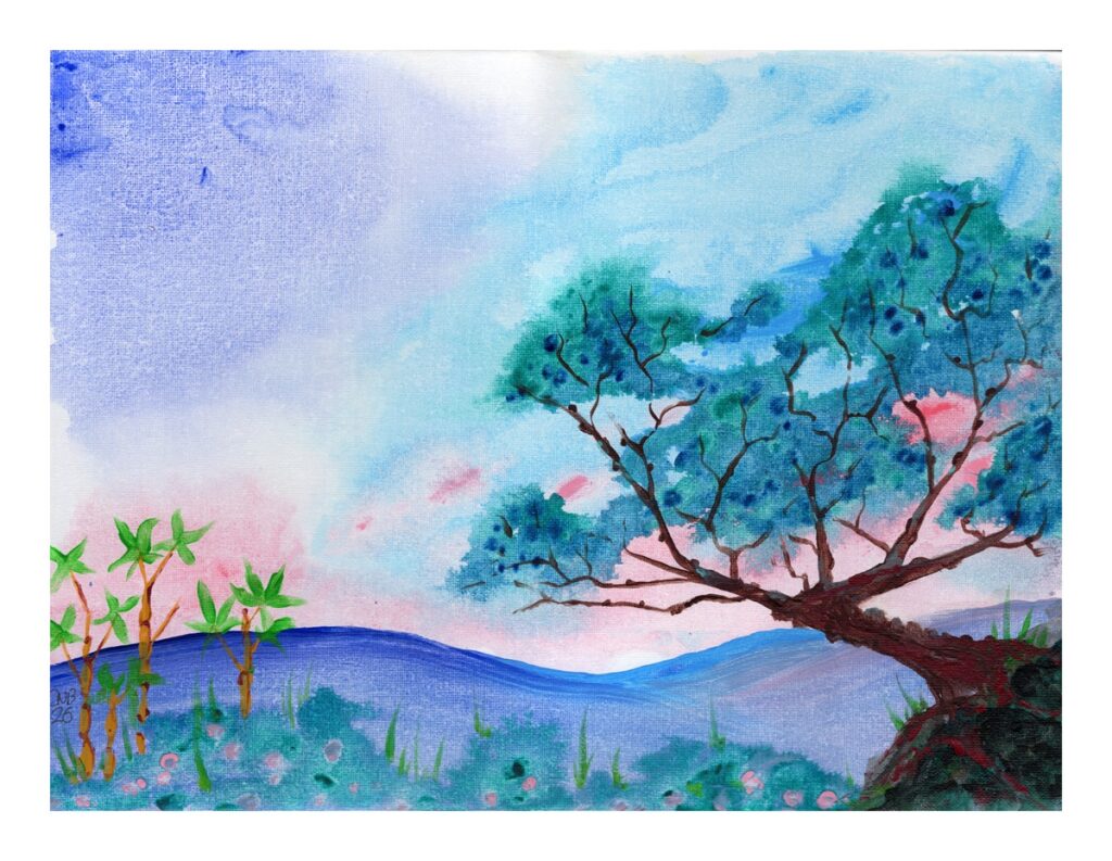
For this last example, sitting between my minimal landscapes and Sumi-e inspired pieces, I played with a varied wash, as I would in watercolour again. There’s less blending of the colours than with watercolours, and some interesting effects dropping different colours into a pre existing wash. I reallt like the sort of organic cellular textures these have created.
So, Acrylics are definitely back in the repetoire for a while and I look forwards to playing some more with these kind of ideas – what I love is their ability to work in a large scale without using much paint – something that can be expensive in watercolour.