Lemon Yellow (Nickel Titanate) – Winsor and Newton
This is a series of posts exploring specific watercolours in greater depth. The posts may be edited over time as I experiment more with the product. They will be indexed here: https://christianbodden.co.uk/watercolour-database/
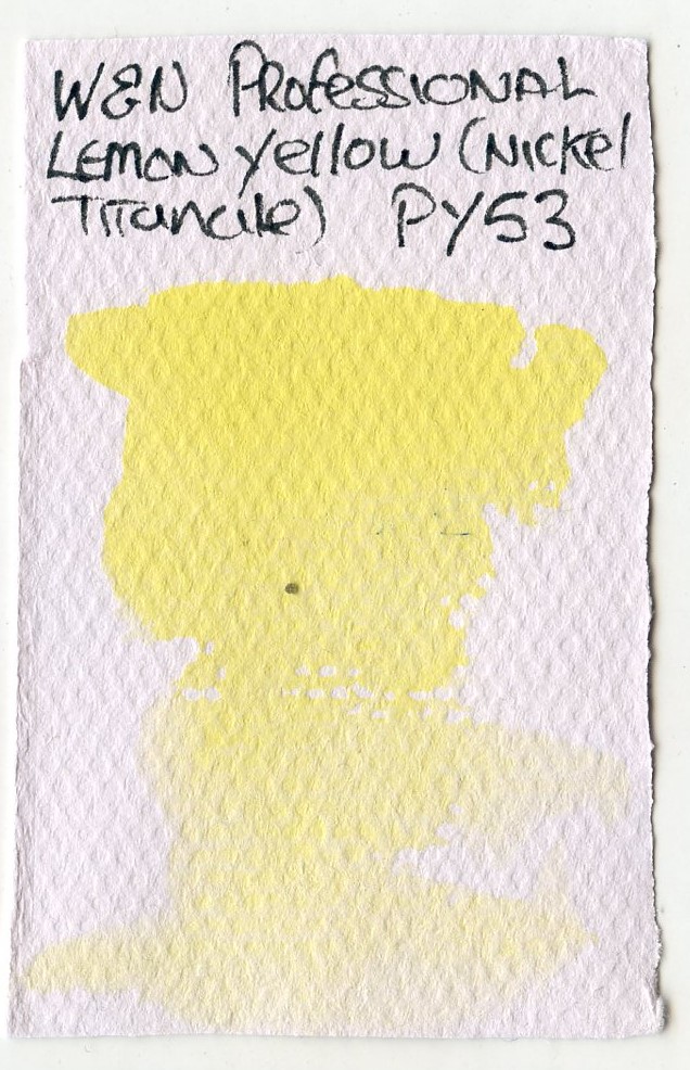
This is a cool yellow containing PY53 as a single pigment.
It is:
- Semi Opaque
- Slightly Granulating
- Staining
- Low Tinting Strength
- Resistant to Blossoming
- Low Diffusion in Wet
Pigment(s)
PY53 was developed in the 1960s and is may be known as as Nickel Antimony Titanium Yellow Rutile or Nickel Titanium Oxide. It has the chemical formula NiO·Sb2O3·20TiO2 – this is a lattice of rutile (titanium dioxide) with the nickel and antimony ions bound within.
PY53 is often written off as rather dull (it can tend to grey in masstone), weak and even “nasty”. The Winsor and Newton Lemon Yellow (Nickel Titanate) is certainly towards the green end of the range of yellows.
Aside from the yellow earths, Py 53 is pretty much the only yellow pigment of exhibit any ganulation1 which is one good use for it. It works well as a true yellow to include in an earth pallete. The Winsor and Newton Nickel Titanate yellow granulates slightly.

In use
As a single pigment paint it’s good for mixing, but the tinting strength is not high. The granulation is probably not enough to make this a useful property in mixes. Dropping the W&N paint into a wash of an organic staining pigment can make for some great effects as the Lemon Yellow drops and then diffuses pushing the (often more active) stains out into the wash, a little like salt dropping.
Based on various reading, the following are suggested. Mixing with white (if you do that kind of thing) can create nice opaque creams. Mixing with black (and perhaps some white) can produce a variety of greys. Warming with A reddish Sienna can produce a replacement for Naples yellow. Interesting greens can be proiduce with Cobalt Turquoises and Cerulean Blue.
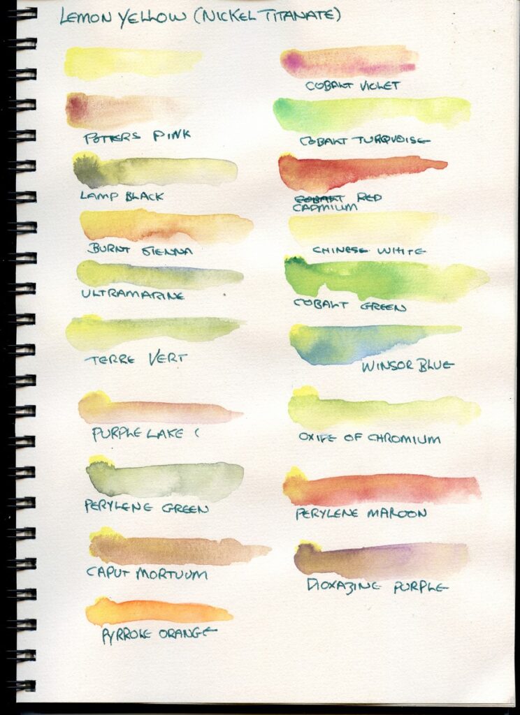
Based on Keene Wilsons notes on Jim Kosvanec’s Transparent Watercolour Wheel I think this falls as a semi-opaque and in my mind it behaves somewhat like a cadmium pigment. Thus it should tend to mix reasonably well with other opaques, dull with stains, but work ok with transparent non-staining pigments. With this in mind, but also bearing in mind that paints don’t always need to mix well to create interesting effects, especially mixed on paper I produced these examples.
These are obviously quite light mixes, so as not to overpower the lemon yellow. These are mixed on paper as this is how I most often work.
I started with a few (semi)opaques and granulating pigments, as I realy like the effect of 2 granulating pigments interacting. Cobalt Violet (PV14) did not mix too well, but made an interesting texture, as did Potter’s Pink (PR233) and Caput Mortuum (PR101). Lamp Black (PBk6) bloomed and back-washed – I can see how mixing on the pallete would create some interesting greys.
Cadmium Red (PR108) worked suprisingly well, in light of the general opinion that cadmium’s don’t like to mix with anything other than cadmiums – this solidifies my feeling that Nickel Titanate behaves in quite a similar way.
The mix with Roman Szmal Burnt Sienna (PR102) worked well, and made nice deep yellows, and the mix with Chinese White produced creams as expected.
I tried a few granulating and opaque greens and blues. Ultramarine was a little dull, but Cobalt Green PG26), Oxide of Chromium (PG17) and indeed Terre Vert (PB28, PG18, PG23) made some nice green shades – The W&N Terre Vert contains cobalt pigments in addtion to green earths.
Semi-transparent stains, unsuprisingly achieved varied results. Winsor Blue (PB15) didn’t mix well and bloomed. Cotman Purple Lake (PV19) worked quite well, but was dull. I had hopes for Perylene Green (PBk31), as a black/green pigment, but this didn’t want to mix nicely and bloomed (which is a tendency of Perylene Green anyway). Perylene Maroon (PR179), however, worked quite nicely. Dioxazine purple (PV23) was duller than I had hoped, though in a weaker wash has promise for greys. Pyrrole orange (PO73) has also made a nice mix – Pyrrole orange is quite inert, and can resist mixing in my experience, but this has resisted blooming, but given just enough movement and self gradation to give a lovely effect.
Overall I love this pigment, though it is one with very specific characteristics. There’s a few more tests I will do, which I will update later.
- PY159 Zirconium Praesodymium Silicate Yellow is another, but is uncommon in current use. ↩︎
