Mungyo “Passion for Masterpieces”
After picking up the Munyo “Nostalgia of Pastels” set a while ago I was interested to find a larger Mungyo set in The Range for £11.99. While I keep a large “professional standard” pallete it’s always nice to have a few more paints, and I do like a bargain.
The Nostalgia of Pastels set, while not the “Professional Watercolour” it claims to be is quite interesting and perfectly adequate quality, so I hoped for the same from the larger set.
I have not been disappointed.
I did a basic swatch into my sketch book. So lets talk about the colours.
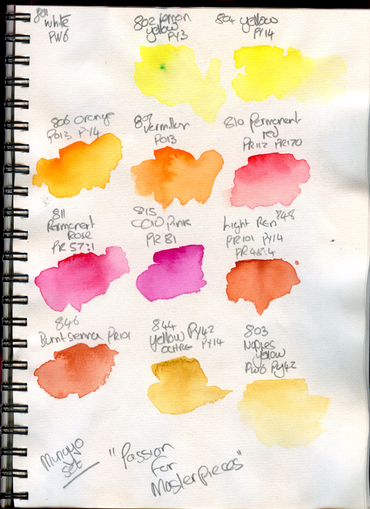
The Colours
801 – White
PW6 – Titanium white, Lightfastness ***, Opaque
This is s plain and simple titanium white – it is as opaque as any other student range, and will handle light highlighting (if you do that kind of thing) or mixing pastels.
802 – Lemon Yellow
PY3 – Arylide yellow 10G, Lightfastness ***, Transparent
This is a nice cool lemon yellow, very similar in tone to a real Nickel Titanate (PY53), though it becomes a little warmer than PY53 in a wash. I can see it having uses for when I would like that colour without the chalky opaqueness of the latter, and PY3 is used by various manufacterers in professional rages for this. PY3 is moderately staining, and has a reasonable tinting strength, though I am not sure it’s lightfastness stands up to the claims here.
804 – Yellow
PY-14 – Diarylide Yellow, Lightfastness ***, Transparent
This is a warmer yellow which cools slightly in undertone. PY14 is more often used in ink, though Holbein use it in a couple of paints. This is relatively staining, and has a fairly high tinting strength, though again lightfastness is suspect.
806 – Orange
PO13 – Benzidine Orange, PY4 – Arylide Yellow 13G, Lightfastness ***, Transparent
This is a warm and brilliant orange, which tends to a slightly cooler undertone. PO13 (also often called Disazopyrazolone Orange) is a moderately staining, reasonably high tinting strength pigment, though again the lightfastness may be suspect. The PY4 is similar to the other Arylide yellows, and gives the undertone in this paint – it is an interesting choice over PY3.
807 – Vermillion
PO13 – Benzidine Orange, Lightfastness ***, Transparent
This is interestingly named, as it’s much more of an orange than a true vermillion colour. I suspect the Benzadine ornage to be quite active in wet, as this has exhibited some backwash, which seemed a little tempered in the mixed colour above.
810 – Permanent Red
PR112 -Naphthol Red AS-D, PR170 – Naphthol Red AS, Lightfastness ***, Transparent
This is a deep slightly cool scarlet, tending to pale blush in undertone; it strikes me as cooler than the pigments would suggest. Both these Napthol reds are somewhat impermanent, but are widely used in watercolours. They are staining, active in wet, and exhibit very fine granulation, which is apparent in the rather nice paint.
811 – Permanent Rose
PR57:1 – Lithol Rubine, Lightfastness ***, Transparent
This is a clear, cool pink, exhibiting subtle granulation. Lithol Rubine is a pigment more commonly used in food, drugs or cosmetics, though a couple of companies use it in paints. Again this is a fairly fugitive colour.
815 – Cold Pink
PR81- Rhodamine 6G, Lightfastness **, Transparent
This is a nice bluish pink, reminiscent of some quinocridone colours – it is intense, but relatively low tinting and quite transparent. Rhodamines are flourescent dyes, often used in flouro paints and by this definition are fugitive.
848 – Light Red
PR101 – Synthetic Red Iron Oxide, PY42 – Synthetic Yellow Iron Oxide, PR48:4 – Permanent Red 2B, Lightfastness ***, Semi Transparent
This is an interesting paint, somewhere between a Burnt Sienna and English Red in colour but with a more opaque undertone from the pR48:4, which is again an intersting choice; it is a mono-azo dye on a manganese lake. All of these pigments create a subtle granulation
846 – Burnt Sienna
PR-101 – Synthetic Red Iron Oxide, Lightfastness ***, Semi Transparent
This does what it says on the tin, albeit that it is a synthtic pigment, it is a single pigment iron oxide, as such it granulates pleasently. It is a deep orange red, with a peachy undertone. The lightfastness, at least, can be trusted.
844 – Yellow Ochre
PY42 – Synthetic Yellow Iron Oxide, PY-14 – Diarylide Yellow, Lightfastness ***, Semi-Opaque
This is a nice, standard Yellow Ochre colour, with a little more undertone than one may expect, presumably from the PY14. I would suspect the colour to change with light, due to this latter pigment.
803 – Naples Yellow
PY6 – Hansa Yellow 3G, PY42 – Synthetic Yellow Iron Oxide, Lightfastness ***, Opaque
This is a muted colour, relatively true to other Naples Yellow examples, and fading to a very pale and thin beige in washes. I did wonder if the PY6 is a misprint, for PW6 due to how it looks, but I am unsure.
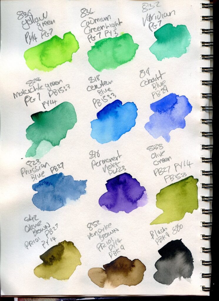
836 – Yellow Green
PY-14 – Diarylide Yellow, PG7 – Phthalocyanine Green BS, Lightfastness ***, Semitransparent
This is a pleasing, if slightly garish green, somewhere between a lighter sap green and a flouro. Pthalocyanine pigments naturally granulate, but this is normally inhibited in watercolours, though this shows subtle granulation. The undertone tends quite towards a cool yellow green, the mass tone is greener. Pthalocyanine pigments are also very staining, intense and have a high tinting strength, something this paint shows.
834 – Cadmium Green Light
PG7 – Phthalocyanine Green BS, PY3 – Arylide yellow 10G, Lightfastness ***, Transparent
This is not, of course, a true Cadmium Green, but then neither it seems are the few other watercolour preparations with this name so far as I can see. Again in the paint, the PG7 granulates slightly and the intensity of the Phthalocyanine colour is evident. This is a pleasing bright and intesne green tending to an almost minty green in undertone. Note the colour chart lists a slightly different formulation, this concurs with the packaging.
832 – Viridian
PG7 – Phthalocyanine Green BS, Lightfastness ***, Transparent
This is again, not a true Viridian, but the Phthalo green that is used very commonly for viridian hues. It does pretty much what it says, it is a deepish, intense, cool green tending slightly to the blue. The PG7 makes this a very staining pigment.
828 – Malachite Green
PG7 – Phthalocyanine Green BS, PB15:3 – Phthalocyanine Blue BGS, PY-14 – Diarylide Yellow, Lightfastness ***, Transparent
This is a deep green, as the name suggests, which tends to a slight grey-green in undertone. Our old friend Diarylide Yellow is back in the mix, along with Phthalo blue, but the overall colour is very consistent. A nice colour for deep greens and one that could make a nice mixing based adding more of one or other of the constituents in a sigle pigment colour.
818 – Cerulean Blue
PB15:3 – Phthalocyanine Blue BGS, Lightfastness ***, Semi Transparent
This is not Cerulean Blue, and neither does it look like it, in my opinion unless very diluted, but it is a good Phthalo blue, intense and staining, as can be seen in “Aurora”, below.
819 – Cobalt Blue
PB29 – Ultramarine, Lightfastness ***, Transparent
Not Cobalt Blue, but a perfectly good PB29 Ultramarine and I don’t know why they didn’t just call it that. It granualtes as an ultramarine should. It is a bit prone to backwashing.
823 – Prussian Blue
PB27 – Prussian Blue, Lightfastness ***, Semi Transparent
What it says it is. Not the deepest of Prussian Blue paints, but a Prussian Blue nonetheless. Granulates and Stains as it should.
816 – Permanent Violet
PV23 – Dioxazine Violet, Lightfastness ***, Semi Opaque
This is again, what it says. It is a decent Dioxazine Violet – in comparison to Cotman, for example I think this has the edge. Like any Dioxazine Violet it needs to be kept under control as it is intense and active.
838 – Olive Green
PB27 – Prussian Blue, PY-14 – Diarylide Yellow, PB15:3 – Phthalocyanine Blue BGS, Lightfastness ***, Transparent
This is an interesting mixed colour. It covers the spectrum of what one could consider to be Olive Green, from a deep olive, to a more subtle yellowish green in washes. The yellow undertone is no doubt from the PY14, and it has subtle granulation from the PB29. A nice convenience colour for landscapes.
842 – Olive Brown
PR101 – Synthetic Red Iron Oxide, PB27 – Prussian Blue, PY-14 – Diarylide Yellow, Lightfastness ***, Transparent
In a similar vein this Olive Brown does the same thing, with the Red Iron Oxide creating a browner hue. A little more granulation than the Olive Green is evident.
852 – Vandyke Brown
PR101 – Synthetic Red Iron Oxide, PY-14 – Diarylide Yellow, PBk6 Ivory Black, Lightfastness ***, Transparent
Mixed, like Most Vandyke Browns nowadays, this is a useful convenience colour – A bit redder than a sepia (or indeed many other Van Dyke Browns) but useful for tree trunks and other landscape features.
860 – Black
PR6 – Ivory Black, PBk6 Ivory Black, Lightfastness ***, Opaque
Ivory Black is perhaps an interesting choice for a black, but as most Ivory Black is now made from carbonised bones it’s likely a cheaper option from by products of the meat industry. It obviously goes without syaing this makes the set non-vegan. The colour is a deep warm black, tending to a slightly pinkish grey in washes, exactly as one would expect.
The Verdict
All in all this is a good set. These are perfectly good student quaility paints.
Many of them are mixed pigments, though there are some single pigment colours. The choices are sometimes interesting – I suspect that they veer towards cheaper pigments, but they don’t seem to massively skimp on them or pile the paints full of mostly fillers. Even at the full £24.99 listed on the box, you are paying less than a pound a pan, and the performance in use is good.
The main concern would obviously be lightfastness – though Mungyo claim many are three stars on their scale, looking at the pigments I cannot see how many that claim this would be as lightfast as others claiming the same level. But if you are not selling work, this is perhaps less of an issue.
They provide some interesting takes on common colours and a few suprises of their own.
Examples
I set myself a task to paint only with this palette a set of pictures to really explore what it can do. I broke that rule slightly as you will see, but essentially these are pictures using the “Passion for Masterpeices” palette.
Using a lot of staining colours, these are free flowing and pretty vibrant – especially the Phthalo Colours. For some reason my partner was waffling on about “A Magnificent Jellyfish” which prompted this picture.
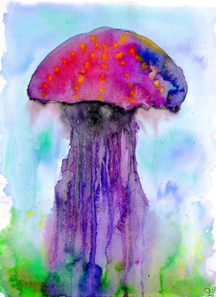
I used 4 or 5 layers on much of this, building wet into wet washes, tipping the paper to allow the paint to run own for the tentacles and generally splashing things about quite a bit. Even with this much messing about, the colours have remained incredibly clean and vibrant – Obviously there’s a trade off, but a set mostly made from Organic Semi-transparent staining pigments has it’s uses here.
I painted this impressionist style flower meadow on the Bao Hong 300gsm Cotton from Temu. I actually love this paper (I will review this in a bit more detail soon). I masked the grasses and flowers before stating. I wanted to see how the Ultramarine granulated and lifted – and it was all as it should. To test the paint further I did something I would not normally tend to and floatedn in some of the White for the clouds.
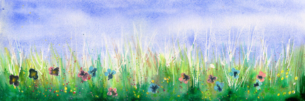
I did also use the Mungyo “Nostalgia of Pastels” for some of the flowers ion this one, as I wanted the pinks and blues (I think this is allowable, even in this test). I am impressed with the depth of colour on the various greens.
For the last painting I thought I would really test the intensity of the staining colours. I watched this video by Paul Clark the other day where he does a pretty intese Aurora, so I thought I’d give this a go.
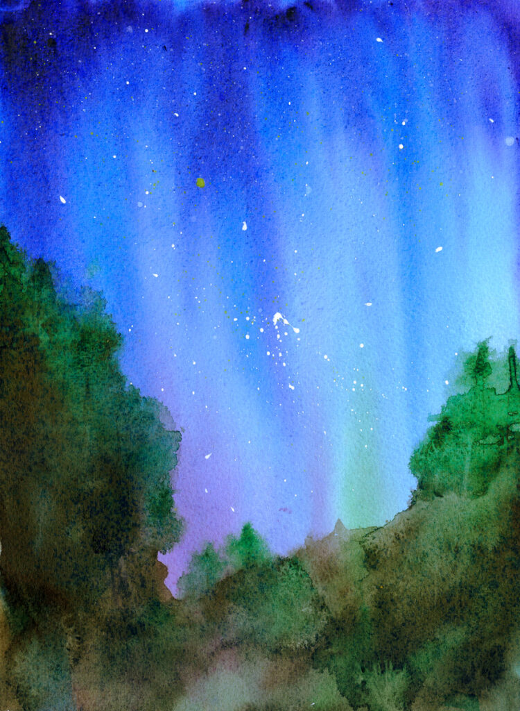
I painted the skies with the blues and purples tilting the paper back and forth a few times, with 3 or 4 layers, and then blacked in the forground before dropping in successive wet on wet of green. I used some Rowney Luma Process white for the stars.
I really like how this one has worked.
All in all I am pleased with this set. I wouldn’t hand them in the sun, or sell originals, but they are a very fun set for illustration work, and well worth little more than a tenner…
3 thoughts on “Mungyo “Passion for Masterpieces””