Hebden, Tod, Wallace Seymour, again…
We decided to make a further attempt at Hebden Bridge and Todmorden the other day not, of course, not prompted by the aquisition of more Wallace Seymour, but solely by the suggestion of slightly better weather.
After something like 41 days of solid rain in the UK it was actually really nice weather, and not even ridiculously cold and being not a Tuesday either things were actually open! Mostly…
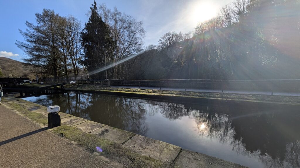
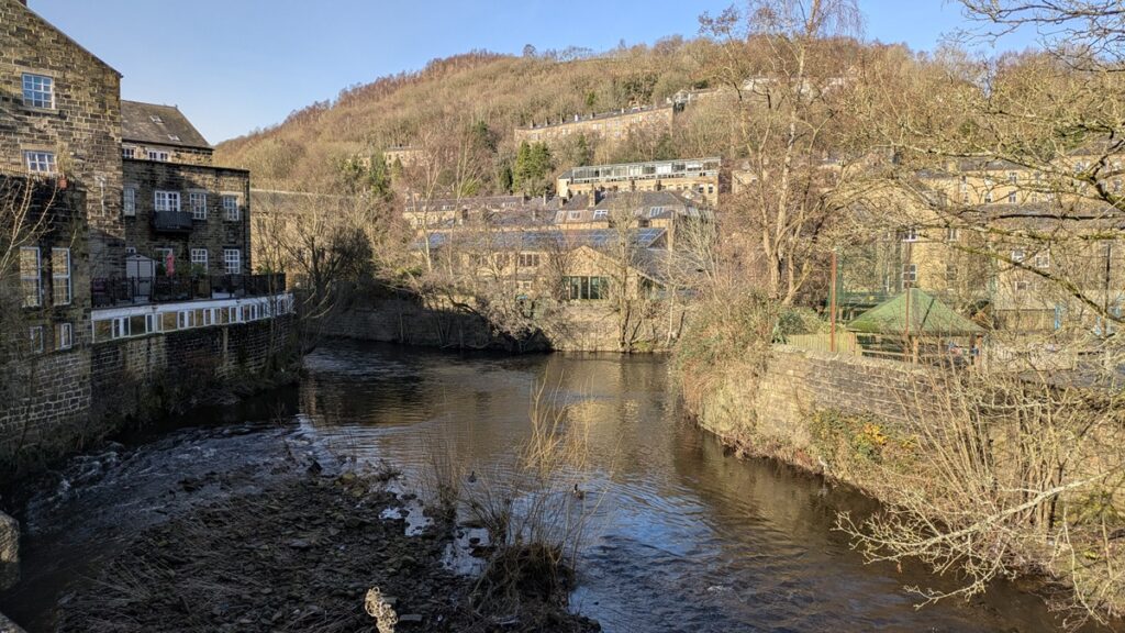
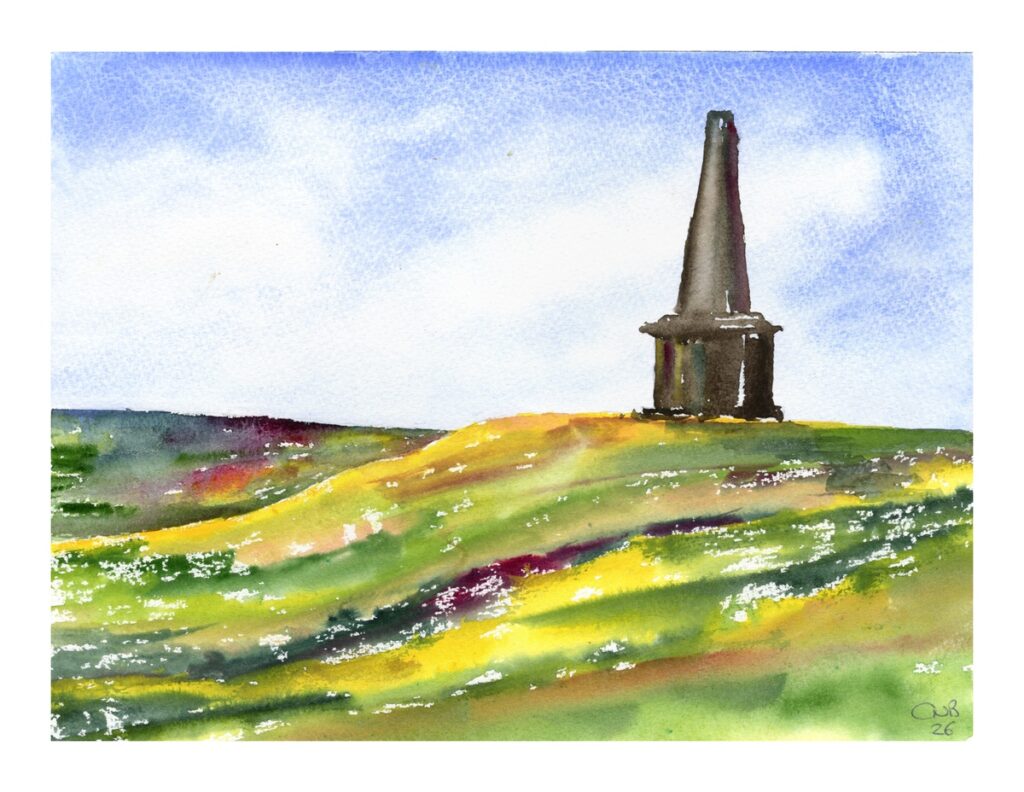
I actually meant to take my camera this time, but due to certaain faffing about involving teenagers before leaving I managed to forget, but heres just a few phone pictures to show how lovely the weather actually was, and as I do plan to paint some works based on Hebden Bridge soon.


It was nice to go into Valley records in Hebble end, and visit a few more of the shops. No watercolour books this time, though I bought a copy of Hokusai’s Fuji which will be great inspration for the exploration of Chinese and Japanese elements in my work.
We went over to Tod to try and have dinnner at the same Greek place, but it was full – though it was nice to explore the Market and enjoy the Market Tavern which is a wonderful little place. Not booking on Valentines day was an error. We went back to Hebden and had Thai though which was very good indeed.
Anyway, we’ll cut to the chase after my little ramble. More Wallace Seymour.
Here’s the most recent few.
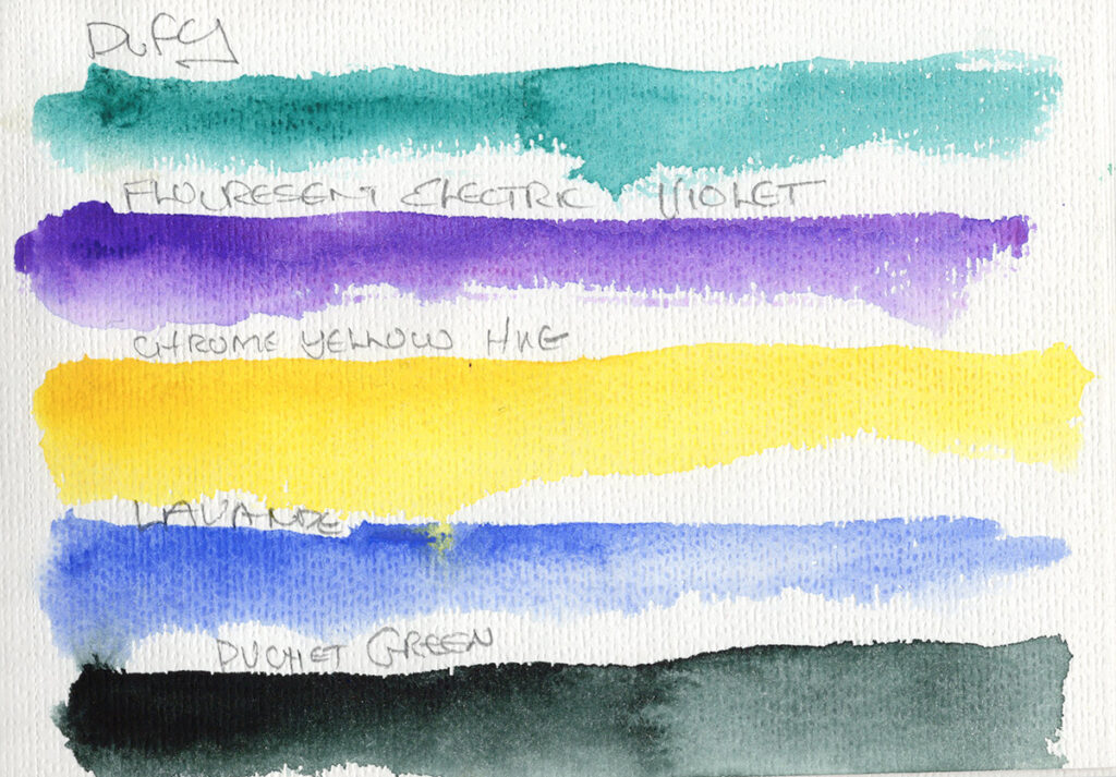
Dufy
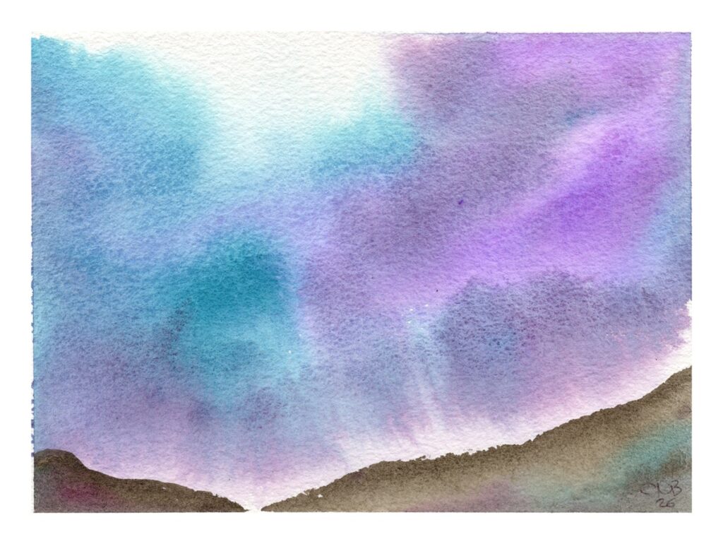
This mixed Phthalocyanine blend of PB15 and PG7 is no doubt inspired by the French Fauvist painter, Raoul Dufy and his brightly coloured works. We love a good turquoise here and this is certainly a great colour, it’s clean, bright, brash and pulls out to a lovely staining wash.
Fluorescent Electric Violet
Though I have made my own Neon Pink, and experimented with the Culture Hustle colouriest colours, I don’t tend to use flouro much in my work (though I have a few ideas brewing that may change this) but I was interested in what Wallace Seymour made of these, as fluoro is not often something that one finds in higher end materials. This purple also looked useful for skies – adding just a little extra into the mix. To be fair it is not bombasticly fuorescent, and as you’ll see below is a very useful purple – though with anything fluoro, lightfastness needs to be considered.
Chrome Yellow Hue
A part of the prompt for seeking out more Wallace Seymour paints was to get some Yellows – and I did buy one… This hue is a blend of Hansa Yellow (PY3) and Beta Napthol Red (PR4 which make a gorgeous sunny yellow hue – It’s very smooth and consistent, but as I’ll show in a future post, can be coaxed to gently seperate to interesting effect. It is sunshine in a tube!
Lavande
This is a muted, slightly violet Ultramarine from a specific supply from France. It does what ultramarine does, with a slightly different tone.
Dughet’s Green
Presumably a homage to Gaspard Dughet this is perhaps my favourite of this bunch. Blended from Phthalo Blue (PB15) and Pyrazolone Orange (PO34) this is an intense almost black in masstone, pulling out to a deep green with a brown undertone in washes. It’s what Perylene green should have been…
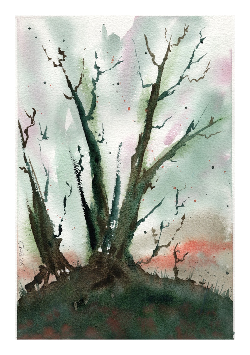
You can see the effects of some of these colours in the small landscapes below.
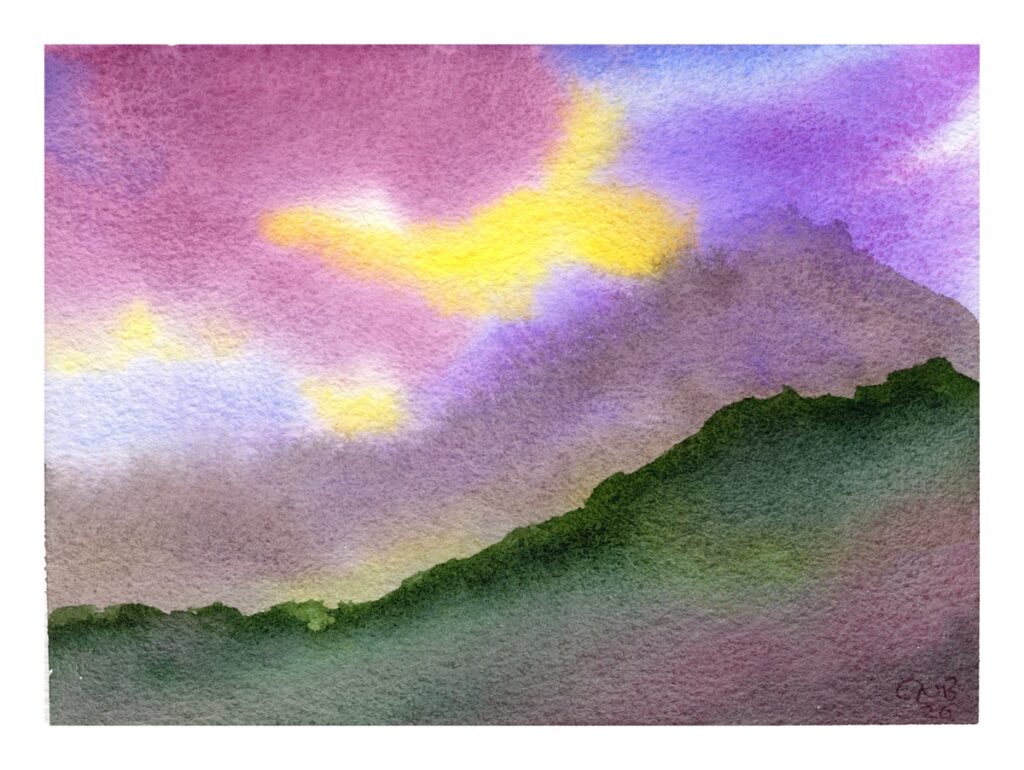
Inspired by these colours and Calderdale itself, I did this little sketch of Stoodley Pike from a photo I took some time ago, using my Wllace Seymour colours extensively.
And just to show off the Dughet’s Green a little more, here’s a sneak preview of a little theme I am starting off, The Darkwoods. As you can see this will be a dark fantasy inspired landscape project, bringing inspiration from several of my previous woodland ideas. Watch this space…