Dr. Round’s Pigments of Distinction Edition 1
As has probably been obvious, I have been acquiring quite a few interesting and exciting pigments over the past couple of years, starting with some earths to compliment the foraged earths that I have been collecting, and then branching out into creating some of my own colours.
Inspired by my purchases in London I began building up a selection of interesting single pigment colours, both traditional and historic and more modern, which I have christened “Dr. Round’s Pigments of Distinction. I have finally completed a first edition of this.
The idea is to use some key colours, along with some less common and more niche pigments to build a useable and interesting set.
So I present you, Dr Rounds Pigments of Distinction Edition 1.
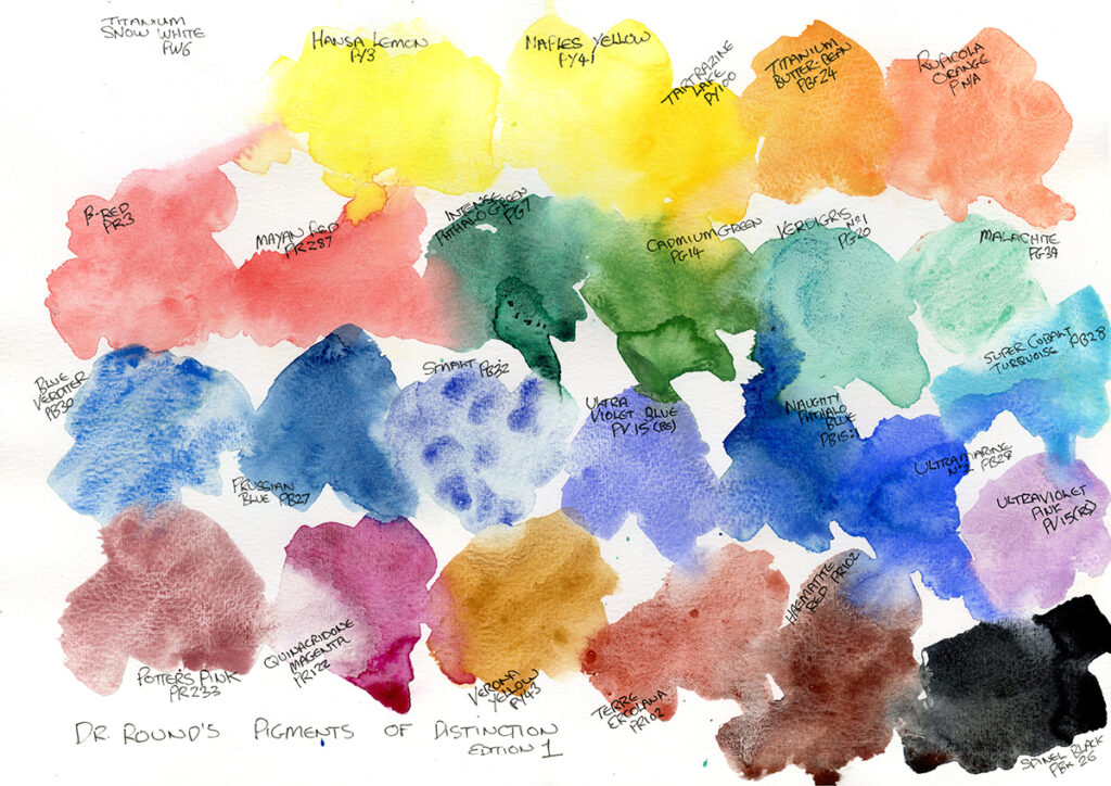
Lets dive right in with the colours1.
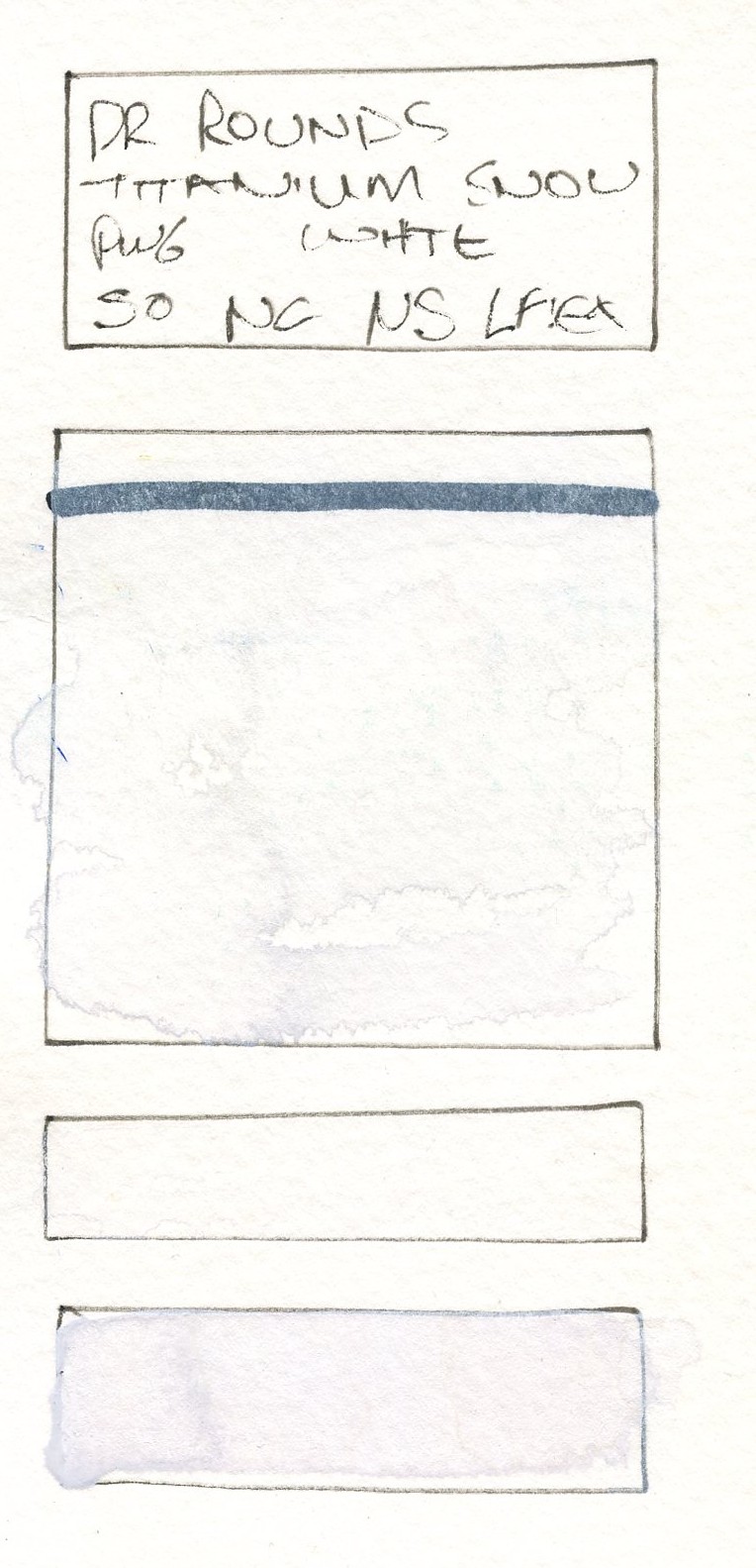
900 – Titanium Snow White – PW6
This is exactly what is says it is. Titanium Dioxide from a chemical supplier. I know that many people frown on the use of white in a watercolour pallete, but I think it does have its uses, both in creating granulating pastel shades, and for highlights, stars, snow etc. It is just about getting the correct white.
This is a bright, brighter than unbleached paper, opaque white with great coverage.
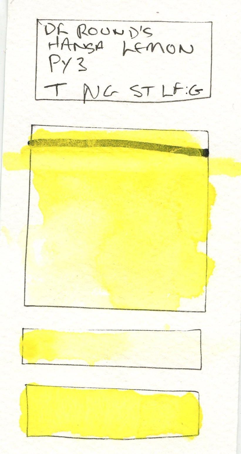
104 – Hansa Lemon – PY3
This is made with Hansa Yellow 10G which I source from Jackmans. This is a bright, intense cool, slightly greenish yellow. Mixed in the Schmincke binder I use is is quite active in wet, and is also staining and can be glazed over easily. It creates some brilliant zingy greens.
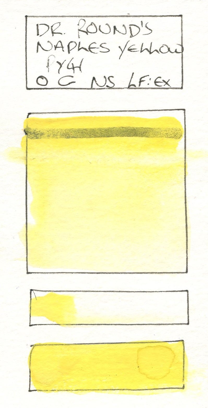
103 – Naples Yellow – PY41
Yes, you read it correctly, this is the real deal, lead antimonate, again sourced from Jackmans. It is a light, buttery yellow, slightly duller and a tiny bit warmer than the Hansa Lemon. It is also heavy (a half pan takes nearly 10g of pigment!) and very opaque, making it useful to use for leaf highlights on its own and in mixed greens. It exhibits mild granulation. It must be noted this is considered a toxic pigment (C-D)2, though the acute risk is pretty low. Just don’t lick your brushes.
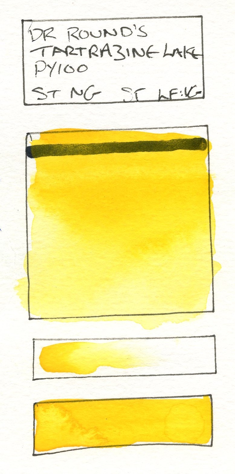
102 – Tartrazine Lake – PY100
This pigment came from Cornelissens in London. Tartrazine is not a common pigment in watercolour, being used far more for hyperactivity inducing orangeade in the 80s and Indian food. It is marketed here as a replacement hue for Indian Yellow. This is a deep warm yellow, almost orange in masstone, cooler in tints. It’s surpsingly fluid for a lake, and quite active in wet, with a tendency of pushing heavier pigments out of the way in lovely blooms.
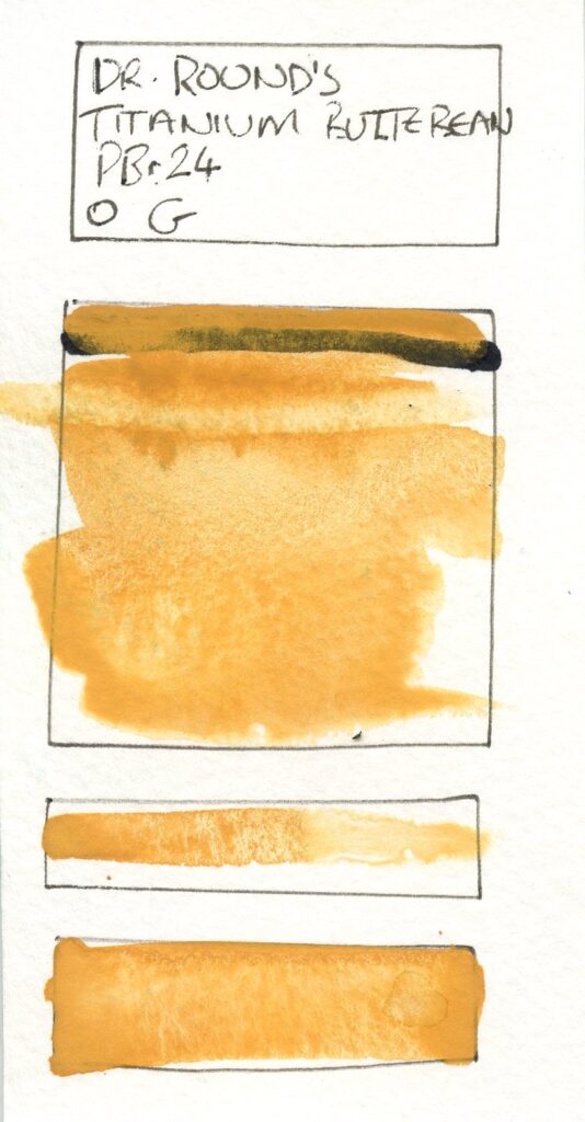
201 – Titanium Butterbean – PBr24
Often used as a replacement for Naples Yellow, this is a dull, yellow-orange opaque pigment3, Chrome Antimony Titanate. It is possible to coax out some greens and it makes interesting oranges. It is heavy and granular.
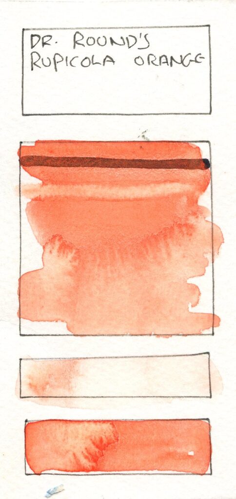
202 – Ruplicola Orange – Pn/a
This is an orange pigment produced by Ochres de France, available in the UK via a couple of sources such as Coloured Earth Pigments. It is listed as a blend of Azo pigments, but does not give a clear pgment code. It is a warm, slightly peach coloured bright orange, with subtle granuklation, though a relatively low tinting strength. It creates is a good modifier for the yellows, and tending to almost red, creates nice muted violets.
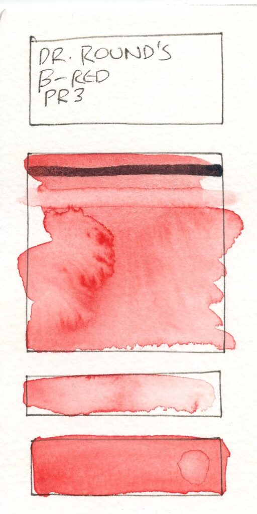
306 – β-Red – PR3
This is another pigment sources from Ochres de France, via Coloured Earth Pigments as Vermillion Red, it is Beta Naphthol Toluidine. It is a cool pinkish red, relatively weak, and a pleasent pink in tints. It granulates subtly.
308 – Mayan Red – PR287
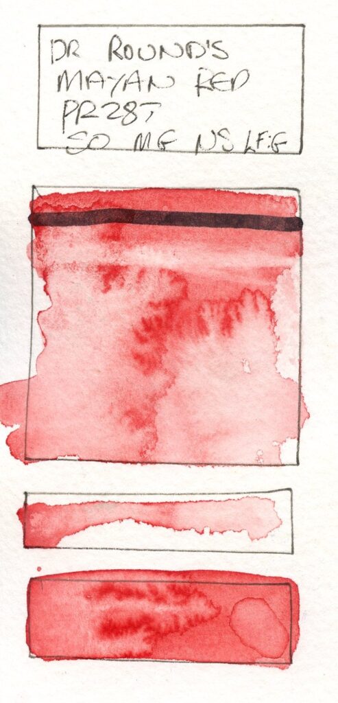
This is one of those reds that appears subjectively a little cool, but actually has a slight yellow bias. It is MayaCrom Red R2051, a relatively new pigment developed from research into Mayan Blue, details on the actual composition are not readily obtainable. It also granulates slightly. This is produced by Natural Earth Paint in Oregon and obtainable in the UK from Babipur in Porthmadoc.
605 – Intense Phthalo Green – PG7
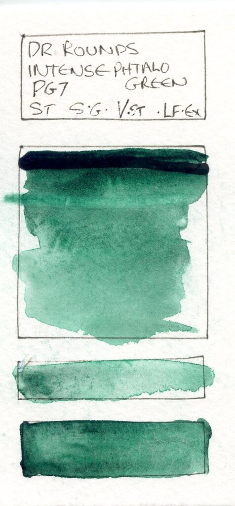
All killer no filler, as they say. This is made from Phthalocyanine Green (Blue Shade) from Jacksons Art – many preparations of this have some filler, even if progfessional ranges due to the strength of the colour, this is the pure pigment. It’s intense, dark in mass tone, transparent, active… It’s a dark cool green, which is actually surpisingly versatile for mixing.
601 – Cadmium Green – PG14
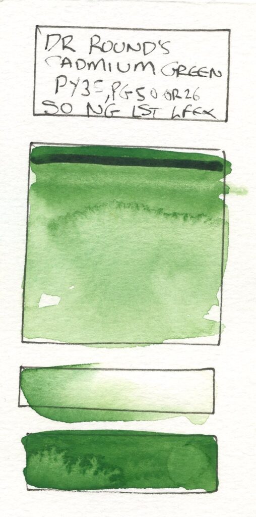
This is an enigma. Various different preparations historiocally have been listed as Cadmium green, most commonly a mixture or co-precipitation of Cadmiun Yellow and Cobalt Blue4; these being the ingredients listed by Cornelissens which is where I obtained it. It is a bright, opaque yellow-green, which through quite virulent does not look unnatural if used carefully.
603 – Verdigris No.1 – PG20
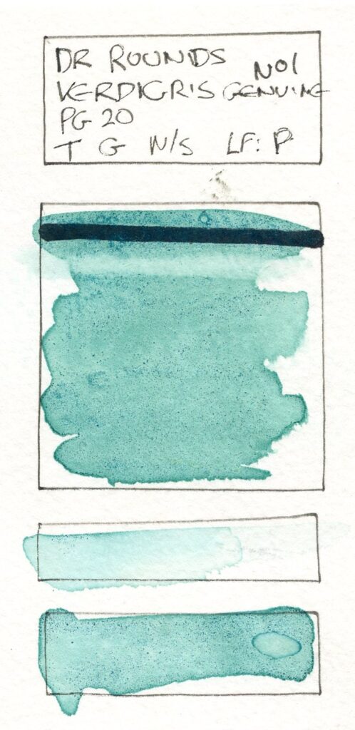
This is my own preparation of Verdigris, made from evaporating copper acetate solution. Like I have found of many copper pigments it sets very hard and takes some re-wetting, but creates a blue-green transparent pigment, with some particles. It can be coaxed into mass tone, but works ideally as a wash or glaze over other colours, especially yellows.
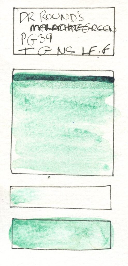
602 – Malachite – PG39
This is prepared from Synthetic Malachite (Basic Copper Carbonate), obtained again from Cornellisens. It is a pale unsaturated cool green (I remember my father repeatedly scraping this from the copper boiler of our old immersion tank). It is tranparent and grainy and again makes a great glaze, or could be used in places where one may use Terre Vert.
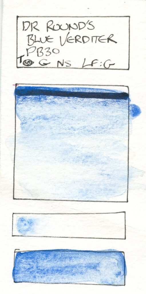
502 – Blue Verditer – PB30
Another copper pigment, again from Cornellisens, this is a slightly unsaturated cool(ish) blue, again it is granulating and transparent. It can be scrubbed enough to get mass tone colour, but excels to texture skies and as a glaze.
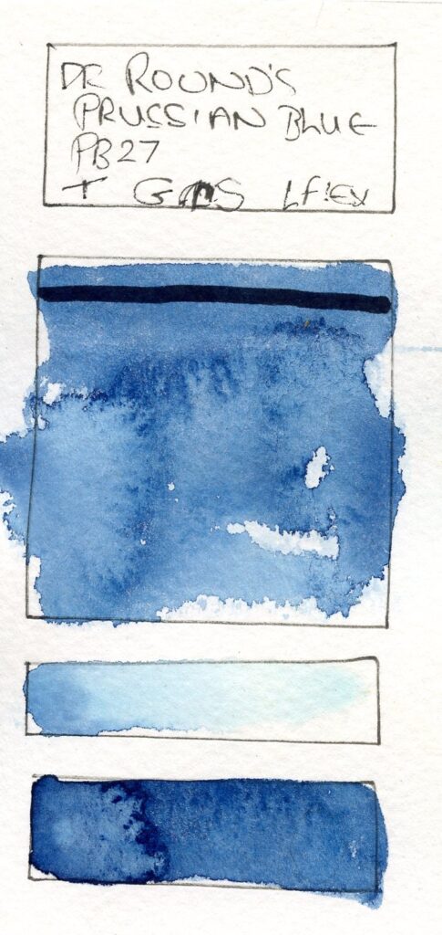
506 – Prussian Blue – PB29
This is produced from Kremer Pigmentes Prussian Blue Lux, of which I have happened upon quite a large quantity. A little warmer than the Daler Rowney Prussian blue I use pre-made, it is nonetheless a good example of the pigment – a dark, very slightly cool, yet also hinting at purple blue, great for night time skies and deep shadows. It is active in wet and granulates pleasantly. It has a very high tinting strength.
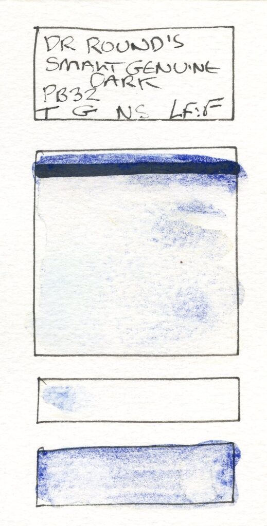
503 – Smalt – PB32
This is genuine Smalt, obtained from Cornellisens again. This is a cobalt glass, and as such is granular and transpraent, in a deep blue. It’s great for understated skies and glazing.
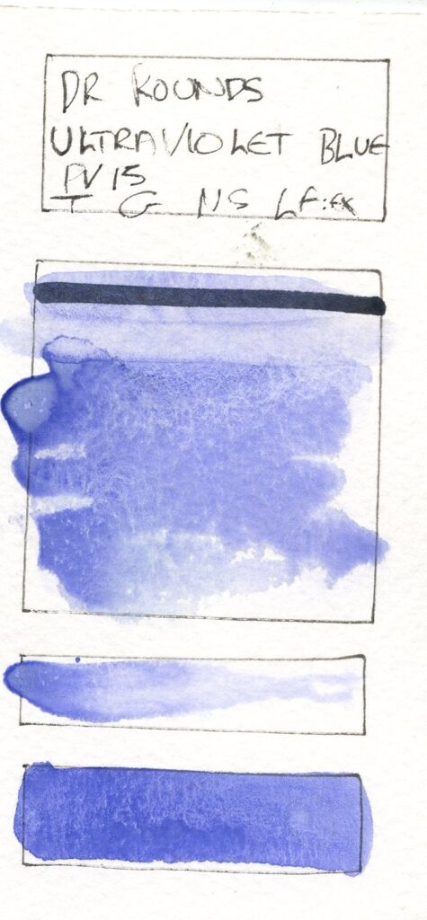
601 – Ultraviolet Blue – PV15
This is Ultramarine Violet (Blue Shade) from Kremer and is a pleasant dusty violet-blue. It granulates heavily and is great for stormy skies and shadows. PV15 is interesting in that quite small variations create very different colours, from pink (as you will see later) through warm violets to warm blues almost like a typical (PB29) Ultramarine.
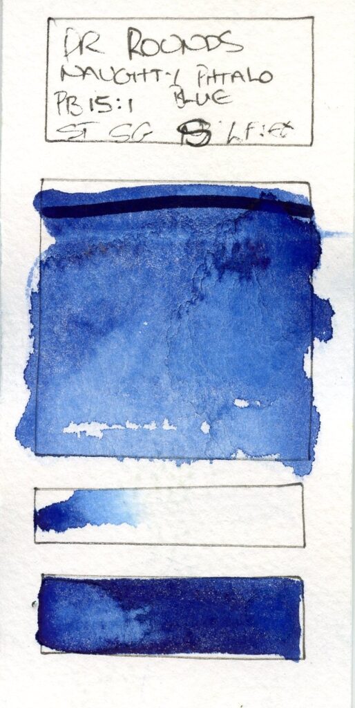
507 – Naughty Phthalo Blue – PB15:1
Another name with a story behind it. Along with the Prussian Blue I ordered 50g of Phthalocyanine Blue. The Aim of this was to create some indigo type darks or modern variations on Paynes Grey – with a staining blue and a granulating black. Oh, how this sparked chaos.
Firstly I was sent 100g. Bargain. However 100g of this stuff is almost 3/4 of a litre. It is light, fuffy, fine and gets EVERYWHERE. And it stains like nothing on earth. It is also so hydrophobic it seems to sense water with the acuity of a rabies patient and run away with superfluid dexterity.
By the time I had tried to get some sort of paint from it, my hands, arms, clothes, workspace, the sink, the bath, the toilet (please don’t ask) were all covered in blue, I was In Trouble, and the paint was not even that good.
I need to develop this one more. I tried rinse aid, and isopropyl alcohol as wetting agents, neither with huge success. I have a few more ideas, but I think these will wait until summer when I can do this out in the back allley (oh, actually the back alley and the bins are phthalo blue too, but that’s another story).
This is interesting. In the pallate it seems to look both warm and cold at the same time (this I think is the slight copper sheen that can be noticable in mass tone). It is a descrtibed as the red shade of the pigment, but to my mind still a cooler blue (it’s just to the green side of the 270° pure blue of the CIELAB a*b* plane, with an PB15:1 having average hue angle of 245°)5. Phthalocyanines are very strong pigments and are often used with fillers or modifiers and as such can be given different properties in the paints themselves. Without these (wetting agents, again) they can flocculate (due to the hydrophobic properties) and this is evident in my preparation.
At least I have enough of the bloody stuff to experiment more.
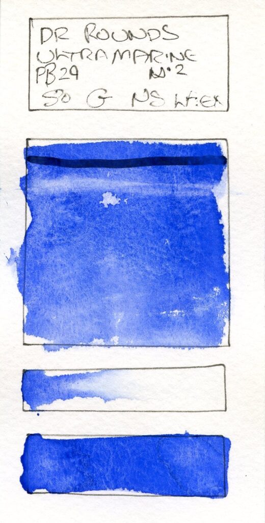
504 – Ultramarine No.2 – PB29
I make this from ultramarine pigment from a cosmetics supplier on Amazon – it’s every bit as good as the Jacksons Ultramarine pigment I have previously tried – slightly purer blue and a softer granulation. I don’t think Ultramarine needs much more explanation!
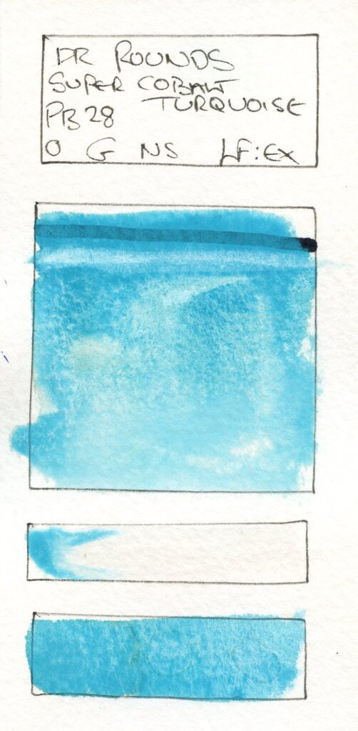
508 – Super Cobalt Turquoise – PB28
Cobalt Turquoise is more commonly Cobalt Titanante (PG50) or in some cases Chromium Cerulean (PB36) but this preparation from Kremer is PB28, yet it is every bit as turquoise as the PG50 Schmincke Cobalt Turquoise. It’s a wonderful granulating cool blue or cyan, great for contemporary seascapes, and mixes beautifully with Titanium White.
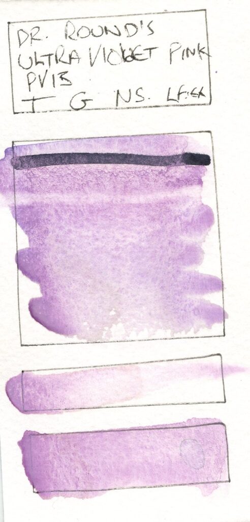
402 – Ultraviolet Pink – PV15
This (red Shade) version of Ultramarine Violet also comes from a Cosmetic Supplier on Amazon, yet also behaves as nicely as my shop brought preparations of this pigment.
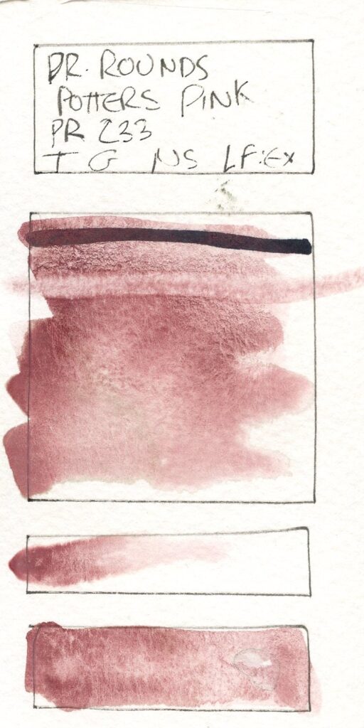
305 – Potters Pink – PR233
This is from a batch of Potters Pink (PR233) from Jackmans. I brought this mostly to create a granular background for some mixes I had ideas for (something that Potters Pink excels at), but I decided to make some as a pure colour, mostly to put in a tube as I find that in a pan (as I have it from Winsor and Newton) it is often too frail. In a sense this kicked off the whole Pigments of Distinction project. It is of course the watercolourists secret weapon, for adding texture and warmth.
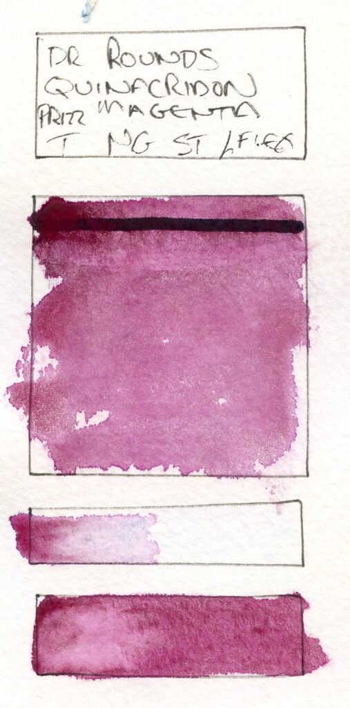
403 – Quinacridone Magenta – PR122
This, again, was mostly brought for mixes, but I do not have a pure Quinacridone Magenta (PR122) in my pallate (I’ve tended to use Quinacridone Violet more) so again I made a pure colour. This is Jacksons pigment. Quinacridone Magenta is of course a great staining pigment that can create the red in a cool triad.
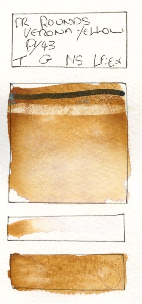
100 – Verona Yellow – PY43
This was one of the first dry pigments I bought, when I was embarking on the journey of making my own foraged pigments. It’s an italian yellow ochre, somewhere between a raw sienna and a transparent ochre in colour, with a lovely warm caramel glow to it. This originally was in my earth pallete, until I decided to bring these into the Pigments of Distinction theme.
303 – Terre Ercolana – PR102
This was another earth pigment, like the Verona Yellow also from Jacksons and also Italian – a red earth with a deep crimson tone – it will hold its own quite well as a red as well as an earth colour and as expected gives a subtle granulation and mixes nicely with greens to make earty tones.
302 – Haematite Red – PR102
This is another Red Iron Oxide Pigment from Jacksons. Haematite (Fe2O3) is interesting as a pigment as the colour can vary from the classic red-oxide brown to darker black, and it’s possible that natural sources have traces of other iron oxides or impurities. This is a great example as in masstone it is a classic red-brown, but pulls out in washes to show specks of various tones right down to black6.
800 – Spinel Black – PBk26
This is an uncommon black pigment, Manganese Ferrite Black (PBk26). It’s often described as a pure black, refleting almost no colour, though not as black as supre blacks like Vantablack, so perhaps better described as reflecting all colours equally as a very low level. To my eye it looks slightly cool, indicating a slight blue reflectance. It is a great pigment to work with for creative applications where a pure black is useful.
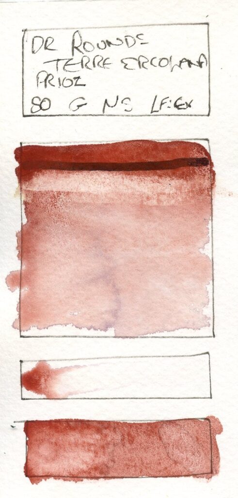
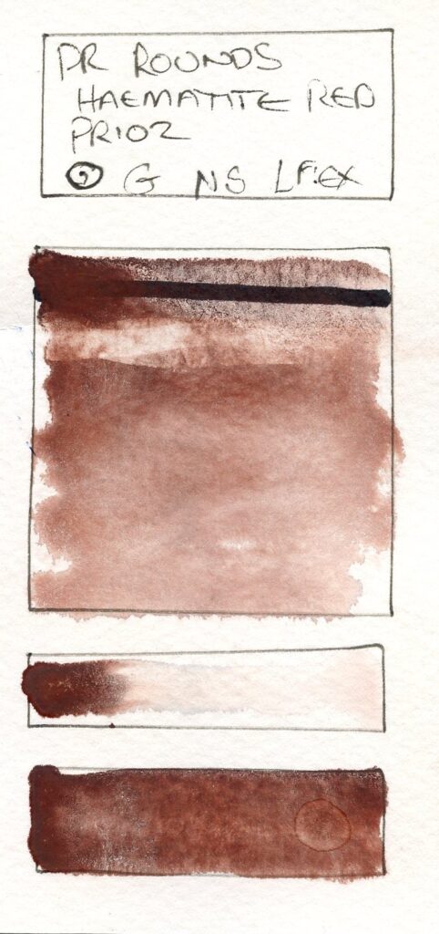
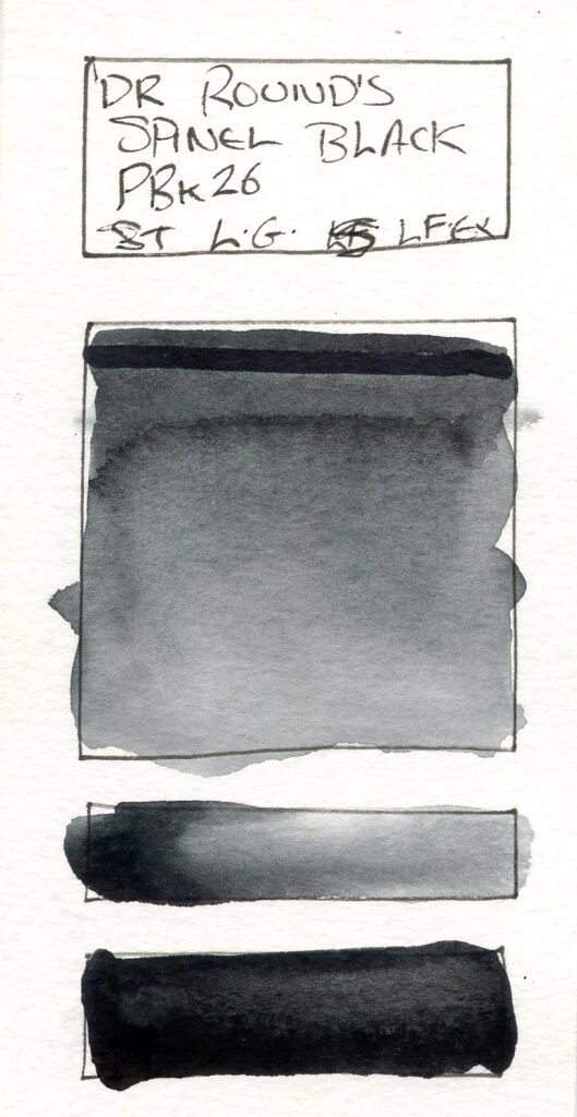
Of course, the proof is in the use. I’ve used these pigments consistently in various works, just interspreced with my other paints and I will post some of these and perhaps create a mini project exploring limited pallate works from this set.
What I have done is some extensive tests of secondaries and mixes from these, mixing on paper (as I normally work).
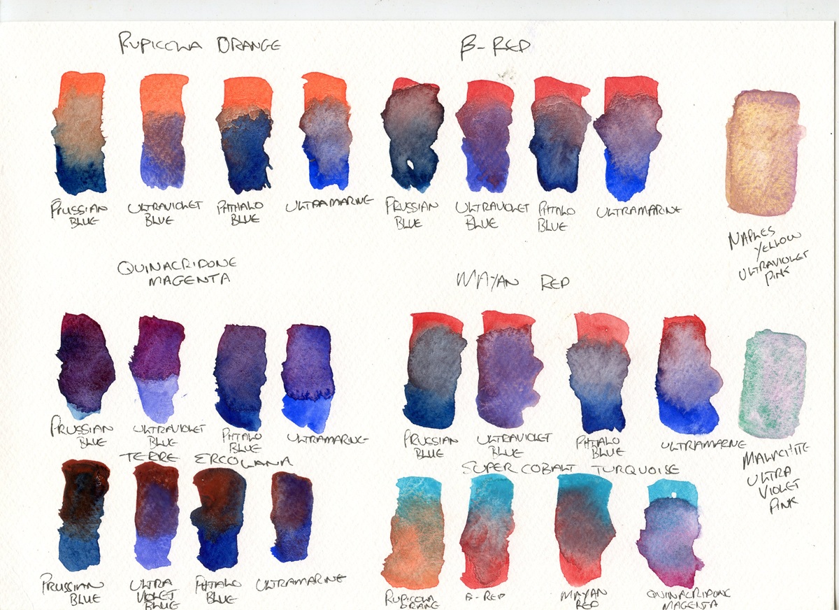
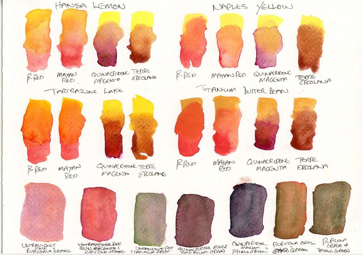
The first page is a set of red/blue mixes, showing the good variety of “purples” – I did these based around the reds, but added mixes with the Super Cobalt Turquoise as an after thought.
Rupicola Orange: I like the way that the Ultramarine Violet and the Ultramarine seperate and granulate with the Rupicola orange – thinking on the warm/cool spectrum Rupicola is a clear orange, and therefore could be used as a red or a yellow, but it maintains some purple rather than going to grey with these mixes. It is interesting how the Phthalo blue simply barges this aside. The Super Cobalt Turquoise does not reallt make a purple, but a very useful grey.
β-Red: Though it is, to my eye a slightly cooler red, this has also mixed best with the warmer blues again. with interesting granulation. The Prussian Blue has taken this over. The Cobalt Turqouse again creates an interesting more grey tone.
Quinacridone Magenta: This is, of course, a classic mixing cool red when using cool primaries (as in the CMKY colourspace) and as can be seen in the examples, creates the cleanest secondaries especially with the cooler Phthalo Blue, but interestingly with the Ultraviolet Blue as well. As would be expected, the Cobalt Turquoise which is pretty bang on cyan creates a pretty perfect violet.
Mayan Red: Being more muted, this tends towards grey in the mixes, but with the warmer Ultraviolet Blue and (to a lesser extent) the Ultramarine creates some nice violet tones. With the Cobalt Turquoise an almost chestnut maroon is created.
Terre Ercolana: While this could better be catagorised as an earth, the Terre Ercolana carries enough red to be useful in this way. As would be expected with this deep earth red and a cool blue the mix with Prussian Blue creates a lovely dark tone, which could replace black, as does the Phthalo Blue. The Warmer blues tend to grey in this mix, creating great neutrals.
To fill space, I tested some wild card mixes – Naples Yellow and Malachite with Ultraviolet Pink, which create some interesting granular mixes.
Next up, reds and yellows.
Hansa Lemon: this is a pure cool yellow and one that mixes very cleanly with many colours. The β-Red and the Mayan Red create lovely sunny oranges. Suprisingly, the Quinacridone Magenta is more muted – I expected this to be a purer orange as these are very close to the CMKY colours, Terre Ercolana creates a pleasent and usable brown, lifting the earth red somewhat.
Naples Yellow: The warmer yellow here mixes well again with the β-Red and the Mayan Red, creating soft peach tones. The Quinacridone Magenta is again more muted. The Terre Ercolana becomes more grey.
Tartrazine Lake: This is a very warm yellow, almost into orange territory itself, and with the β-Red and Mayan Red creates fiery vermillions. The Quinacridone Magenta and Terra Ercolana are again more muted and tending to brown.
Titanium Butterbean: This is a great opacifier, and with the β-Red it creates a warm opaque cinnamon. It overpowers the weaker Mayan Red slightly. It does not, at least on paper mix smoothly with the Quinacridone Magenta – unsurprising as they are very different textures, and it gets a little lost in the already quite opaque Terre Ercolana.
Along the bottom are some more wild-card mixes – deep purple greys from the Quinacridone Magenta with the greens, mossy seperating browns with the Rupicola Orange and greens.
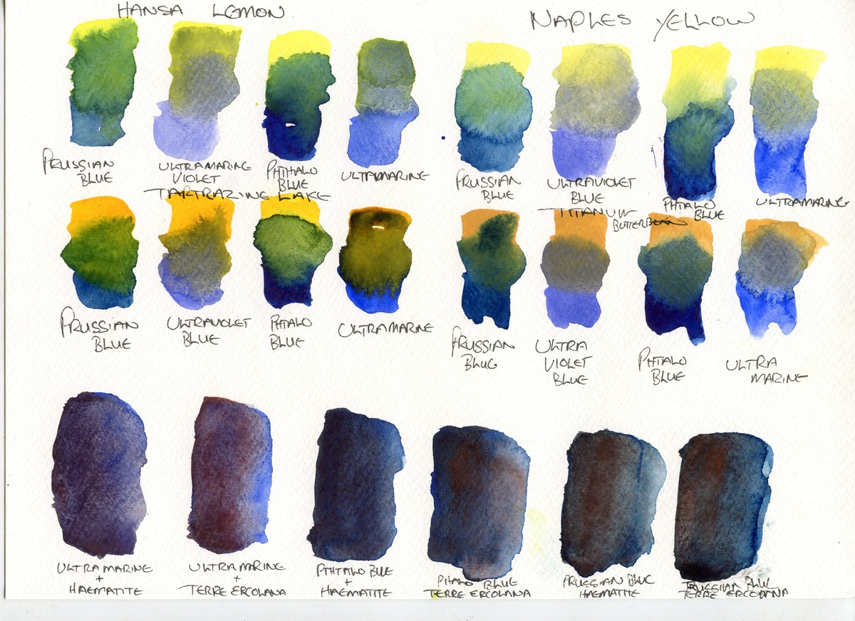
Now for the yellows and blues…
Hansa Lemon: This, as could be expected mixes well with the Prussian Blue and the Phthalo Blue, tending to greyer hues with the warmer blues.
Naples Yellow: As again expected from a more muted yellow this creates quite muted grey-greens, though the Ultraviolet Blue creates more of a grey-mauve and the Phthalo blue bullies the Naples yellow out of the way (I suspect due to the huge difference in density the Phthalo simply floats on top).
Tartrazine Lake: Though almost orange, this works great with the cool blues, creating some deep greens, while with the warmer blues these are muddier.
Titanium Butterbean: The mix with Prussian Blue creates a muted, yet natural piney green, while the others, including the Phthalo are much greyer.
At the bottom is a comparison of the results from the classic neutral/shadow mix of red earths and ultramarine.
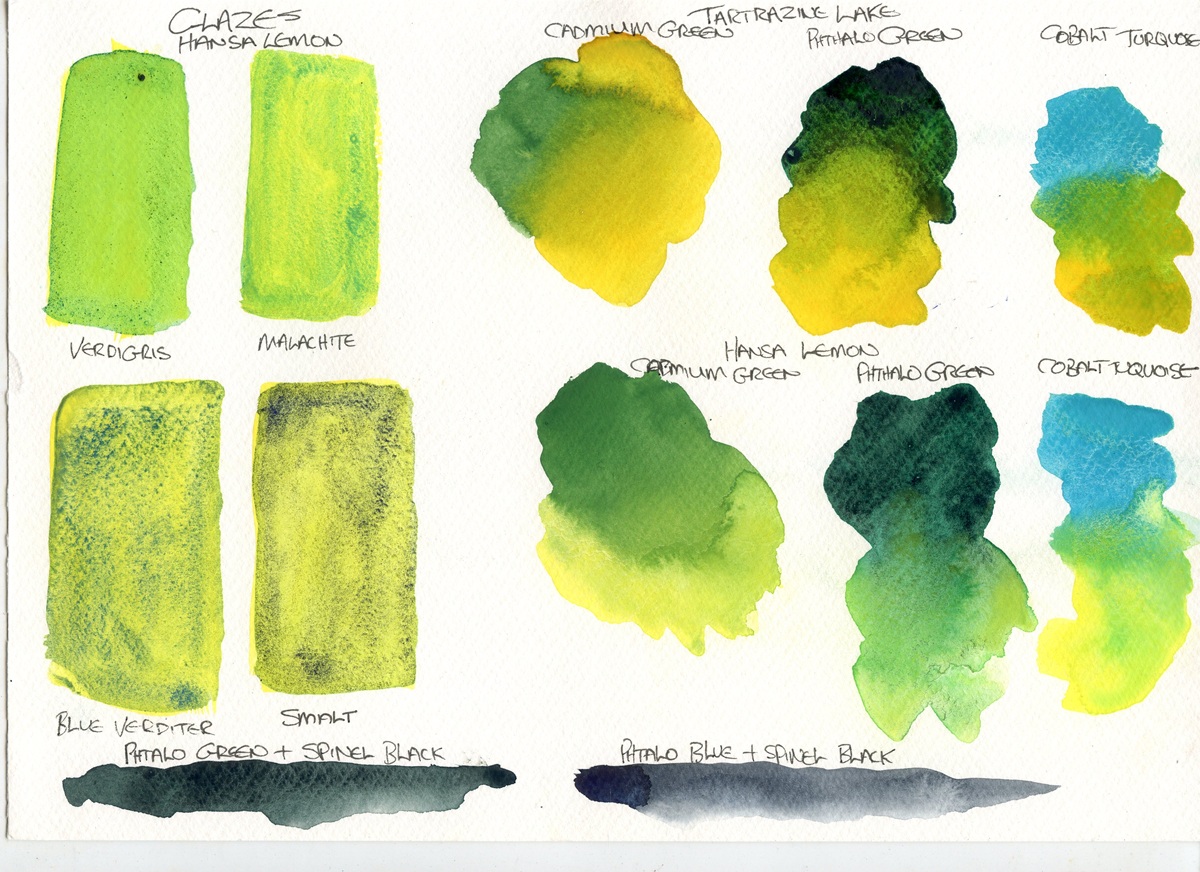
Next, some more experiments with greens. First are some tests glazing the transparent greens and blues over Hansa Lemon, and (on the next page) Tartrazine Lake. I also tested the Hansa Lemon and Tartrazine Lake with the greens and the Cobalt Turquoise. The Cadmium Green was hard to mix, but the yellows did bring out interesting textures. The Phthalo Green is very intense, and worked (suprisingly) better with the Tartrazine. The Cobalt Turquoise mixed great with both, as a good cyan should.
At the bottom, Phthalos and Black, tests for some mixed colours I have in mind.
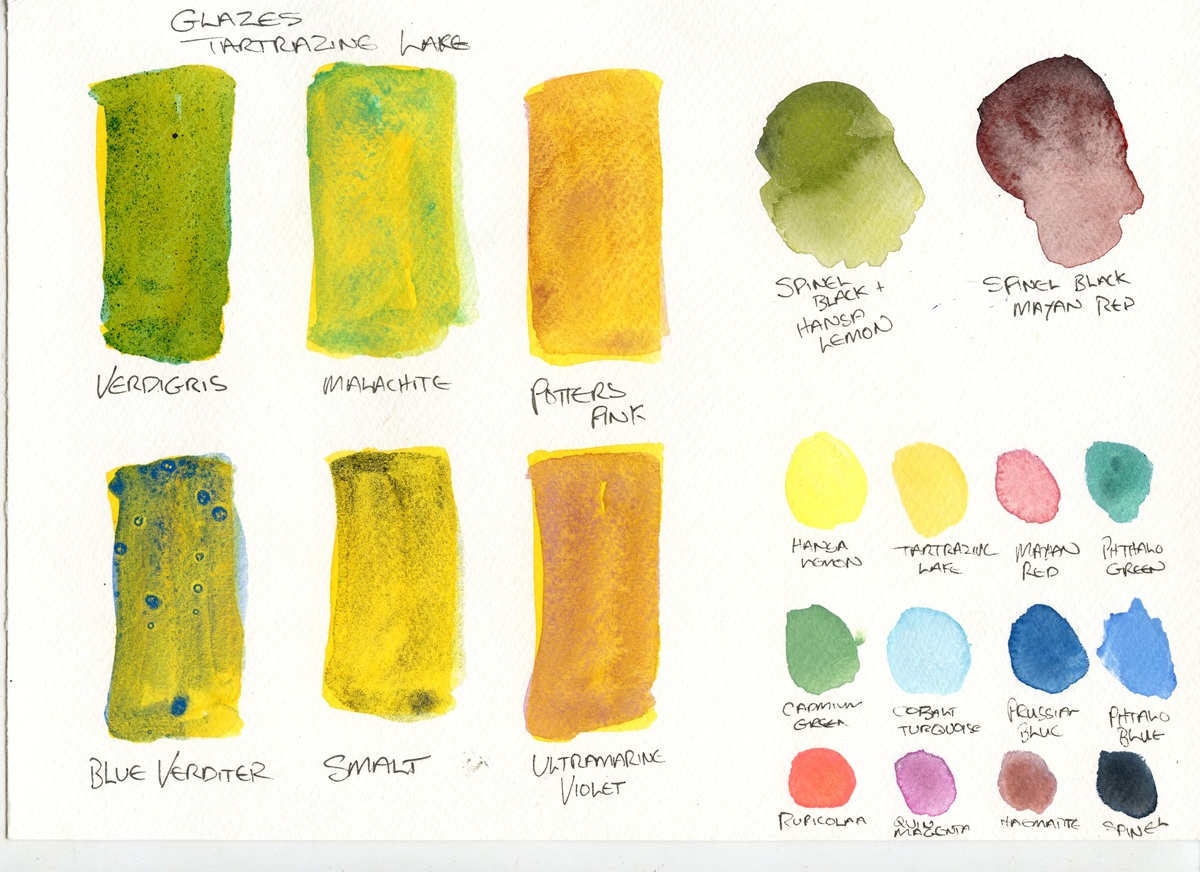
On the last page, the Tartrazine glazes, inclduing Potter’s Pink and Ultraviolet Pink – the Blue Verditer was interesting here, hold it’s blue colour. A couple more black mixes, and a set of pastels with the Titanium White.
All in all, I am pleased with this set – obviously for a fully curated set of mixing colours some (the copper pigments and Smalt) would be superflouous, but this was built up while making and exploring the pigments and is, for me a good experiment in making single pigment colours.
- Yes, I have given them production codes now… ↩︎
- See https://www.artiscreation.com/yellow.html#PY41 ↩︎
- I explain the name here ↩︎
- https://www.artiscreation.com/green.html#PG14 ↩︎
- MacEvoy https://www.handprint.com/HP/WCL/waterb.html ↩︎
- c.f the Daniel Smith Haematite ↩︎