More Wallace Seymour Goodness
As seems to be not uncommon with my brain, I find something, I get obsessed.
I’m talking of course about more Wallace Seymour watercolours. To be fair, these are not going to become my primary materials, but there is something about them that speaks to me – I think partly the rarer pigments that Pip and Rebecca have sourced and the whole ethos, the idea of making paint from some very obscure sources and the imperfections. These are skillfully made, but they have character – the texture of the pigments shines through.
Prompted by the need to look for a specific ring for a specific present, we went to Otley shortly before Christmas (And grabbed a big pile of half price Rowney Georgian Oils from the stationers) and then – ude to the market not being on like it was supposed ot, on to Ilkley where The Art Shops have a shop, and where one can get Wallace Seymour…
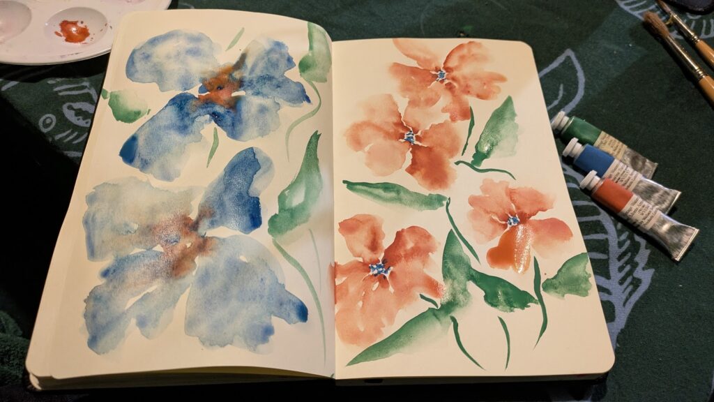
The colours from that trip were Ultramarine Turquoise, Cinnabar and Cobalt Green. I’ll talk a bit more about them shortly, but here’s a quick sketchbook experiment.
To my surprise (haha, no I hinted) some more appeared at Christmas.
So here’s the run down of the new colours:
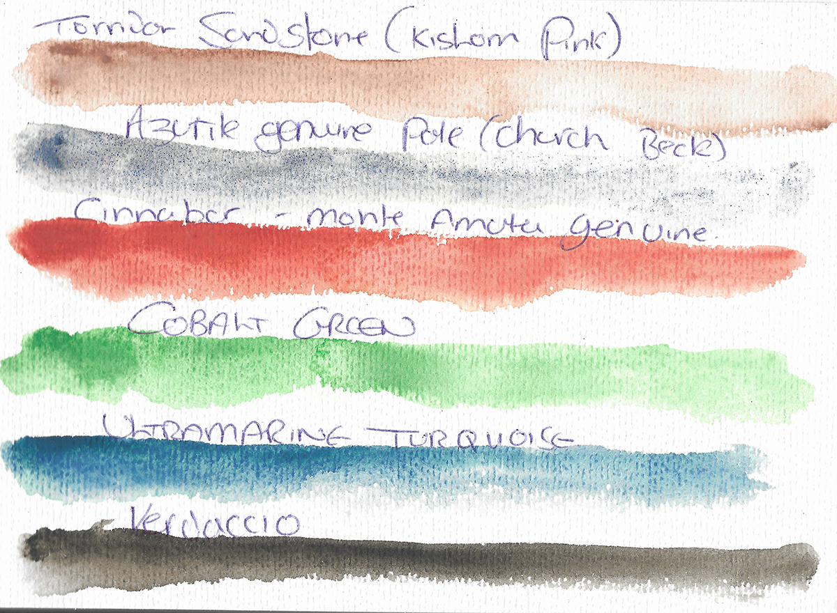
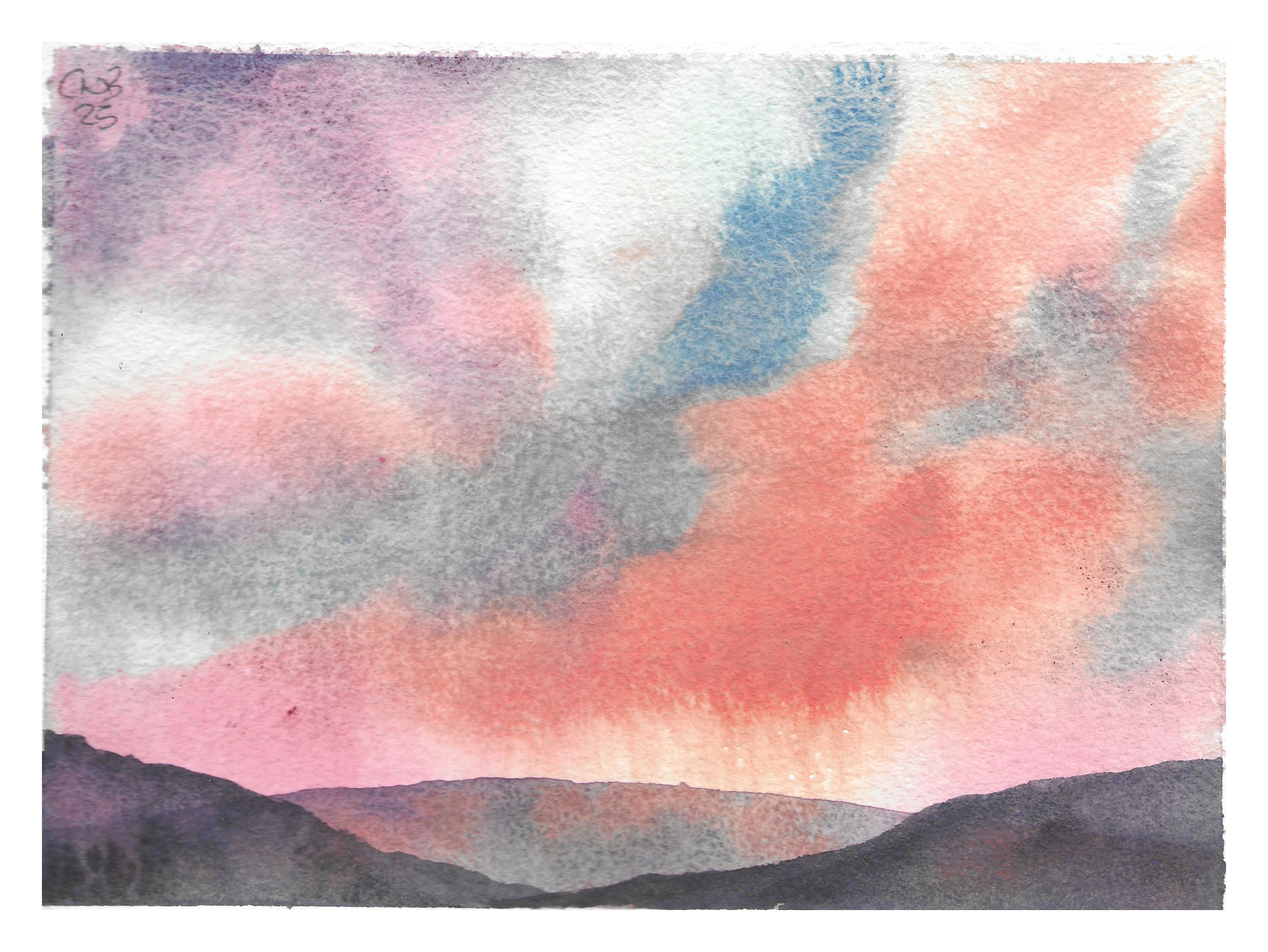
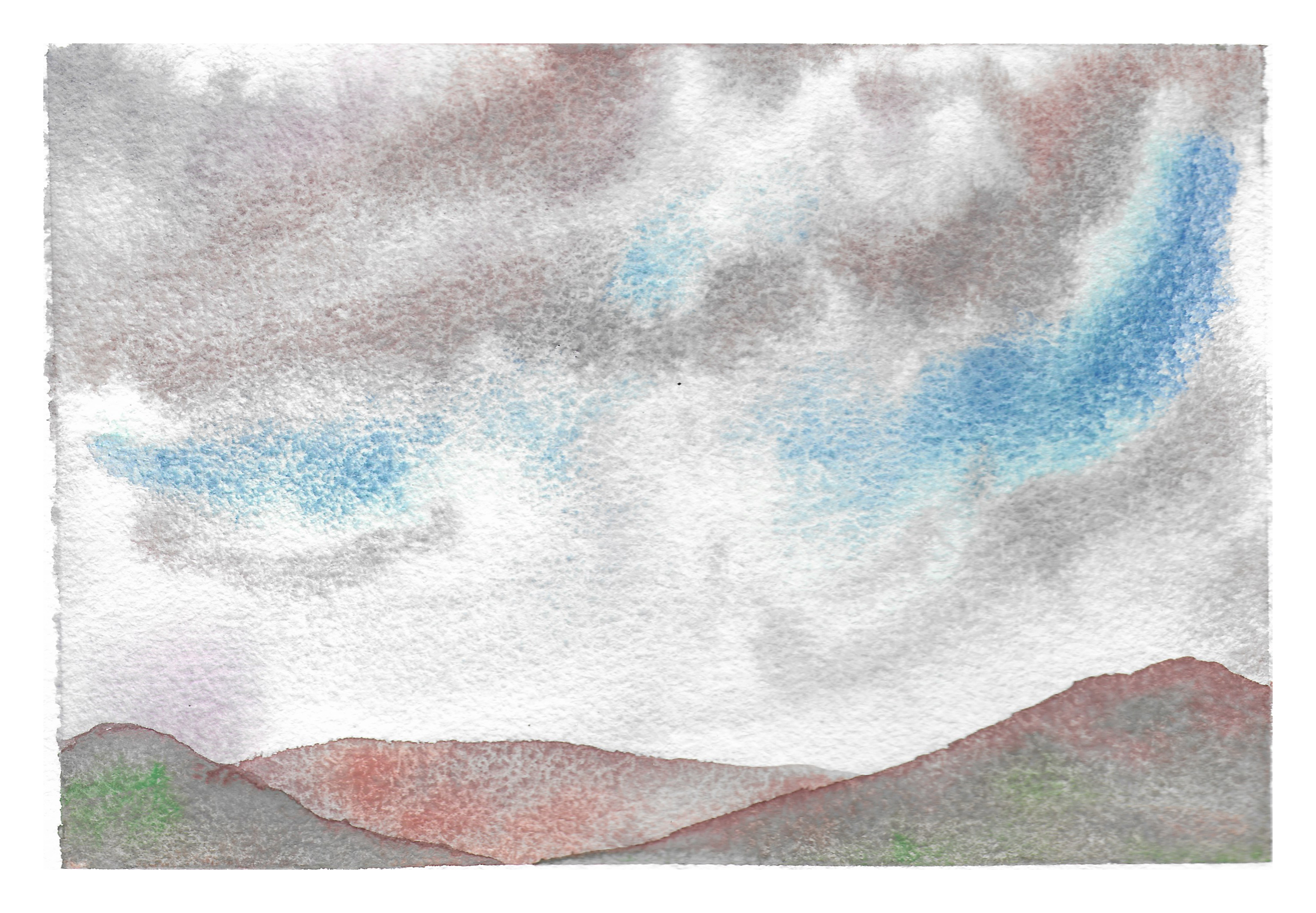
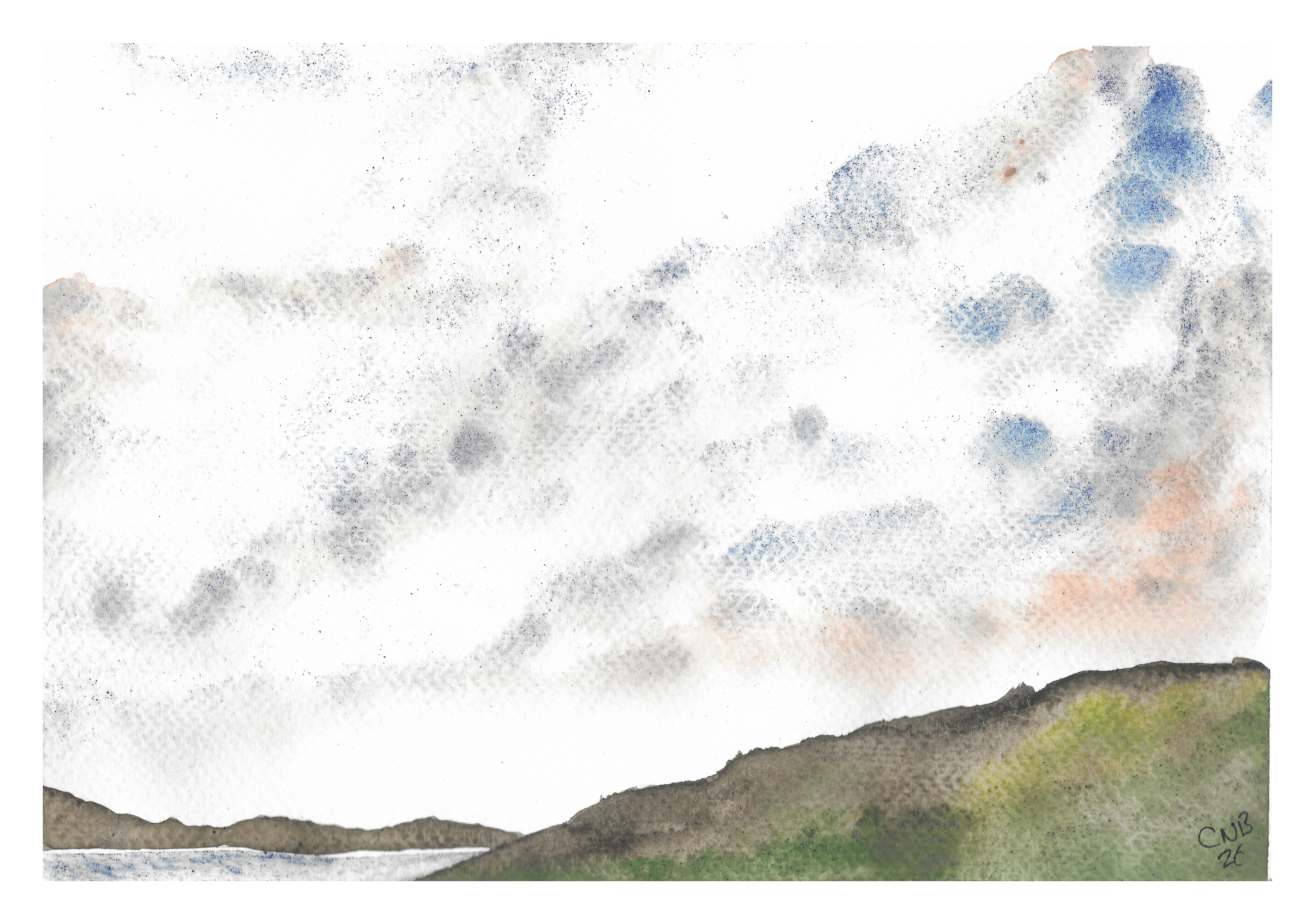
Torridon Sandstone (Kishorn Pink)
Torridon is a sedimentary rock from deposits in North West Scotland, and Mined at Torridon Quarry, hence the name. As you can see in the swatch below this is a gorgeous, granular pale earth – I’ve made some similar from pink sandstones from Meanwood Beck. This is of course great for that kind of landscapes in paintings and even in skies.
Blue Azurite Genuine Pale (Church Beck)
Azurite is of course a copper carbonate pigment, something that I am very interested in at the moment, and this is naturally sourced in Chrudh Beck in Conniston – historically a source of quality Azurite and Malachite. This, though very pale and extremely low in tinting strengths is a great grey blue (a bit like Ultramarine Ash). This exemplifies what I mean about imprefections – this is left to shine in it’s natural, slightly gritty state, a great texture colour.
Cinnabar, natural vermilion. Monte Amiata, Italy
Here we are getting into the realy exciting stuff. Cinnabar (PR106) is an historical pigment used since at least Roman time – it’s the classic red of Roman Frescoes. It is Mercuric Sulphide, a chemical name perhaps striking a bit of fear into anyone with basic chemistry knowledge. To be fair, unless you eat it it is unlikely to be too much of a problem1, and Cinnabar was long used as a gemstone. But then Copper Aceto-Arsenite was used as wallpaper colourant and even in foods for many years, with tragic results2. As with many pigments, don’t lick brushes, used paint water water away with plenty of water, and wash your hands after use (masks and gloves should be used when handling dry pigment).
As you can see this is a lovely warm orange red, with the texture of an earth colour, and is great for florals, and indeed skies.
Cobalt Green
This is an interesting one, as this is Cobalt Titanate (PG50) – far more commonly a bluer turqoise pigment, though as in this paint it can be very green. A word of warning with this one – heavier pigments can settle in the tube and I think with smaller niche products like this potentially there is not the mass turnover – quite a lot of medium came out of this before the pigment – it’s worth maybe upending the tube and leaving for a bit (or give it a good squeeze from the sides before opening.
It’s a gorgeous green (I’ll just note here the scanner, my partner’s office scanner) as rendered these a little lighter than on the paper) – zesty, opaque and bombastic!
Ultramarine Turquoise
This is a very green leanding shade of the ubiquitous blue (PB29) – the specific source is not mentioned, but this shows the subtle (or less subtle) variations of different preparations and batches of the same pigment. This is one of my favourites, just keeping it blue and not turquoise in my mind, but certainly very very cool and green leaning. And it granulates gorgeously!
Verdaccio
Verdaccio is the practice of underpainting green to temper flesh tones, particularly in Rennaisance Italy (where a green earth would have been used) or in Flemish painting (often using Ochre and Umber). The preparation is an Ochre and Vine Black blend – similar to my eye to Van Dijk Brown, and very useful for earth and trees.
Here’s a few little text miniatures, and I have shown the paints used in the captions.
- The story of the Mad Hatter perhaps comes from Cumulative Merrcury poisoning, leading to neurological issues, as Vermillion, the processed form was used to make red hats… ↩︎
- https://en.wikipedia.org/wiki/Paris_green ↩︎