A. Gallo – YInMn Blue
In my quest to try every weird and wonderful pigment under the sun, I have of course had my eyes set on acquiring some YInMn Blue (PB86). For those who don’t know, YInMin Blue (also known as Oregon Blue, or Mas Blue) is a relatively new pigment, discovered in 2009 while researching novel compounds for electronic purposes. Chemically it is a lattice of Yttrium, Indium and Manganese with the formula YIn1−xMnxO3.
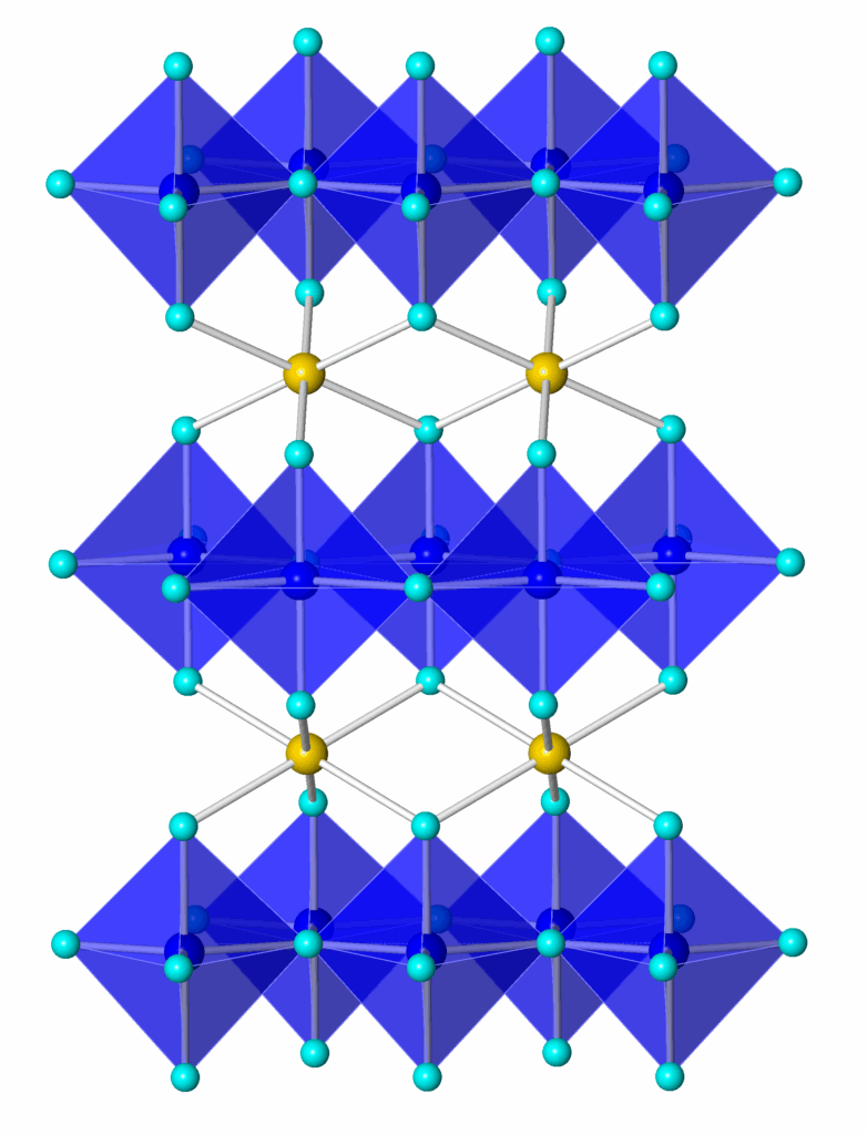
A perculiar property of this blue is that it has almost total NIR reflectance, so has technological use in keeping surfaces cool. It was licensed to Shepherd Colour in 2014, and licensed for Artistic use in 2017.
It’s actually relatively easy to make with a suitable tabletop kiln and can be obtained from Kremer Pigments or via A. P. Fitzpatrick in the UK. Several companies have made limited paints with the pigment, the most easily obtainable at the moment being A. Gallo.
The best anniversary present is of course something you love but would not really justify buying yourself (at £39 for a half pan, ouch) and so for that reason I have come to own a small half pan of the A. Gallo paint.
Optically, it sits somewhere between Ultramarine and Colbalt Blue. It is claimed that YInMn Blue is the closest pigment synthesized to pure spectrum blue as dispute it’s NIR reflectance it reflects virtually no red – though it is, just, a worm blue for those who like to use the warm/cool mixing methods.
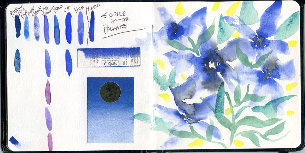
Here’s a first quick test I did in one of my Seawhite sketchbooks – alongside a comparison to some other single pigments blues (done mostly becasiue I had done my common thing of forgetting their order in the pallete) – these are from my own preparations and are, left to right, Prussian Blue (PB27), Blue Verditer (PB30), Smalt (PB32), Ultramarine Violet BS (PV15), Phthalo Blue (PB15:1), Ultramarine (PB29) and Moroccan Nila (NB1) (the others are commercial versions for comparison).
There’s also the packaging glued in. The Flower picture includes various copper greens – Bice (PB30), Synthetic Malachite (PG39) and Verdigris (PG20) – and Hansa Lemon (PY3).
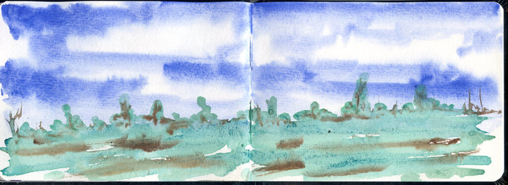
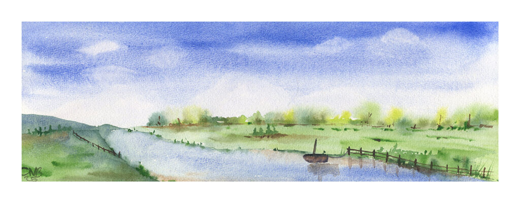
Still playing with Copper Greens I did this little sketch to explore YInMn Blue’s use in skies – it granulates really nicely, as many heavier inorganic pigments do, and the pure specturm colour is certainly appropriate for this usage.
I did a few mixing tests, mixing on the paper (as I prefer to do) with various yellows. Of course as we know mixing blue and yellow never actually makes green but often creates some interesting off green effects…
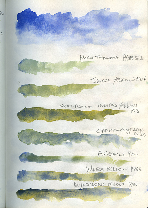
The first swatch is just YInMn blue, to really test it’s colour and properties in a nice juicy swatch. Then mixes with:
- Daler Rowney Nickel Titanate (PY53) – this has made a slightly lacklustre Grey-green, reminiscent of lichen.
- Schmincke Turners Yellow (PY216) – a similar but perhaps more useful lichen colour, as it shows slightly greater seperation.
- Daler Rowney Indian Yellow (Nickel Dioxine, PY153) – these have really not mixed much, but have made a nice seperated effect.
- Daler Rowney Cadmium Yellow (PY35) – these again have not really mixed (as Cadmium pigments tend not to, sinking to the bottom of the puddle) but has greated a nice optical mix whcih could be very useful for distant foliage.
- Sennelier Aureolin (PY40) – perhaps the smoothest mix, and a relatively useful, if a bit swampy, green.
- Winsor Yellow (PY65) – again, little mixing, but an interesting texture.
- Rosa Sunshine Yellow (Isoindolone Yellow, PY110) – very similar to above.
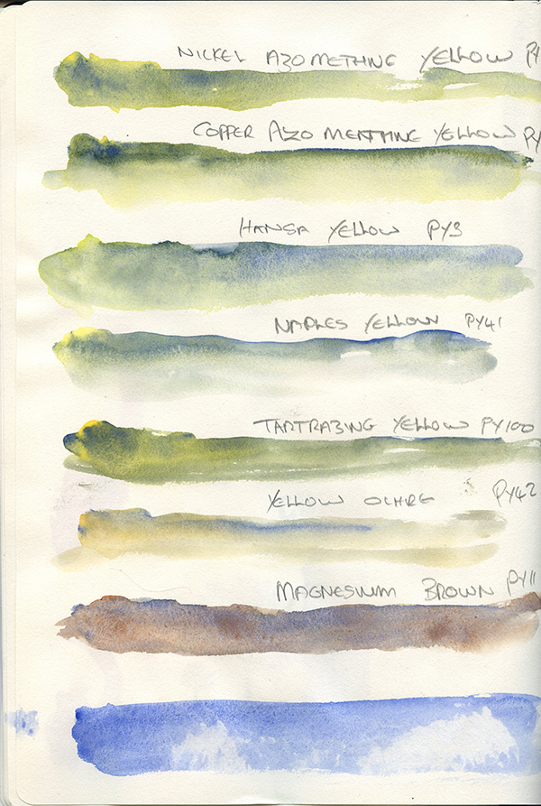
Above are:
- Schminke Transparent Yellow (Copper Azomenthine, PY150) – a more useful mixture, though wtill exhibiting a pleasent seperation.
- Van Gogh Azomethine Yellow (Nickel Azomethine, often called Green Gold, PY126) – The YInMn has seemed to darken in this mixture, perhaps due to the greenish undertone of the Azomethine.
- Dr Round’s Hansa Lemon (PY3) – this has made an almost grey blue, with seperation.
- Dr Round’s Naples Yellow (PY41) – perhaps te cleanest mix, as I think both these pigments are quite heavy, and an interesting grey-blue
- Dr Round’s Tartrazine Lake (PY100) – very similar to the Winsor Yellow, or the Isoindolone
- Dr Round’s Transparent Yellow Ochre (PY42) – an interesting seperation of colours
- Winsor and Newton Magnesium Brown (PY119) – pushing the definition of yellow, though it is a yellow pigment in the index, this has perhaps made the most interesting mix, which I can see myself using for rocks and stones.
Below these is a quick lifting test.
I turned to mixes with reds.
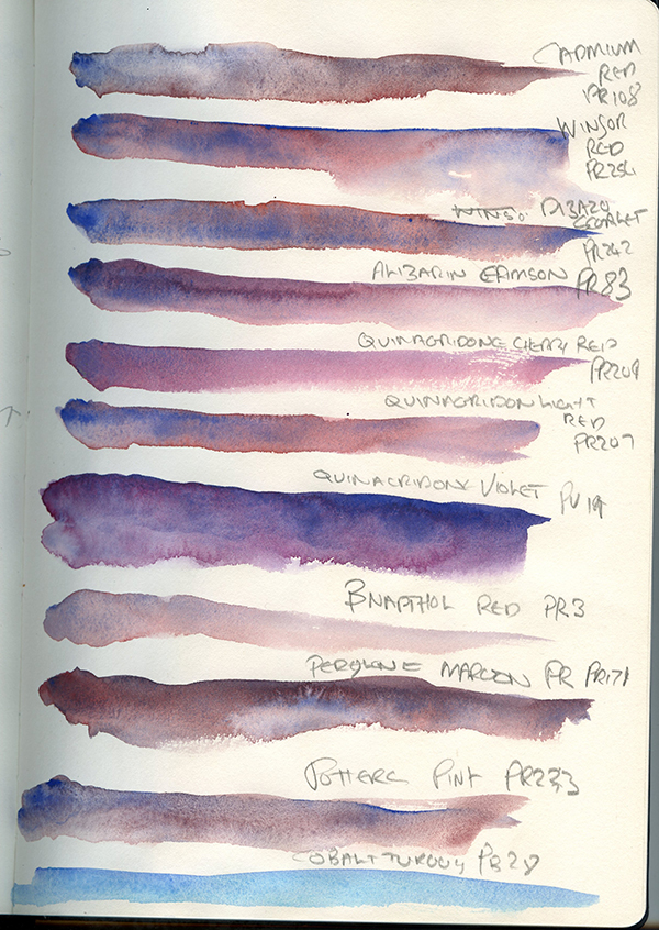
These haver perhaps worked better, as optical mixes of red and blue seem a little more homogenous.
- Schmincke Cadmium Red Deep (PR108) – This has made a nice mottled purple, I could see myself (if I ever get YInMn as a pigment using this for a granulating paint.
- Winsor Red (Pyrrole Red, PR254) – as expected, the YInMn has settled into the lighter organic Pyrrole, making a nice seperated blend.
- Jacksons French Vermillion (Disazo Scarlett, PR242) – very similar to the above.
- Winsor and Newton Alizarin Crimson (PR83) – this has blended quite well to a pleasing violet.
- Roman Szmal Quinacridone Cherry Red (PR209) – this has made a lovelt subtly textured violet.
- Schmincke Quinacridone Light Red (PR207) – similar to above with a bit more visible texture.
- Schmincke Quinacridone Violet (PV19) – This is a beautule granulating purple and one I would make up myself.
- Dr Round’s
β-Red (PR3) – the β-red is quite subtle and this has led to a nice pink wash. - Schmincke Perylene Maroon (PR179) – this has made a very nice deep violet, though backwashed as Perylenes have a tendancy to do.
- Dr Round’s Potter’s Pink (PR233) – Potters Pink and Ultramarine is a classic blend, and this has created something very similar.
- Dr Round’s Cobalt Turquoise (PB28) – predominantly included as I sploshed YInMn in the turquoise, but serendipitously a gorgeous blend!
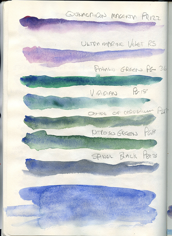
More reds and violtes and some greens:
- Dr Round’s Quinacridone Magenta (PR122) – this has blended very nicely, deepening the magenta with a gorgeous seperation.
- Dr Round’s Ultraviolet Pink (PV15) – Another gorgeous seperating mauve.
- Winsor Green Yellow Shade (Phthalo Green, PG36) – this has created a gorgeous deep sea green blend.
- Winsor and Newton Viridian (PG18) – a more subtle green blue, perhaps not helped by the fact that Winsor and Newton Viridian is a ballache to re-wet, and is weak enough as it is.
- Winsor and Newton Oxide of Chromium (PG17) – This has made a useful, if dull grey-green, I can see this as useful for mosses and lichens.
- Rosa Green (Nitroso Green, PG8) – a less virulent, and arguably for most purposes more useful, version of the Phthalo Green blend.
- Dr Round’s Spinel Black (PBk26) – this has made a useful grey, similar to a blueish Paynes Grey.
At the bottom was a drop test – though it lifts well, the Gallo preparation does not bloom to badly.
I did a quick painting to really test this colour in a sky.
So, the verdict.
The A. Gallo YInMn Blue is certainly interesting. It is a gorgeous colour which is transparent, non-staining, granulating and very lightfast. It has quite a low tinting strength. It lies quite close to Cobalt Blue in my mind, and of course if one does not wish to pay the hefty price Cobalt Blue will do just fine. But it has a character of its own, and is certainly a pleasue to use.
- Image from Wikipedia https://commons.wikimedia.org/wiki/File:YMnO3_P63mmc_Wiki_Image.png ↩︎