Wallace Seymour and The Holy Grail
Ok, so this sounds like some weird Monty Python extrapolation, and I guess I am being a little abstract here, but hey, that’s my brain.
As is very obvious, I have developed a bit of an obsession with sourcing the weirdest and wonderfullest, or perhaps the rarest pigments around, and one of these has to of course be Manganese Blue – production of the ceased in the 1990s due to environmental concerns, but there are a few remaining stocks, and I noticed that Wallace Seymour had some on their pigment site – and then that a couple of places do have some watercolours… And to be fair, this is quite a Holy Grail for watercolourists. Of course I had to see if it lived up to the hype…
I got mine from ArtReq. It is one of the more expensive series, but I am not phased by 19 quid for a tube any more, and I think with some of these extinct pigments it is a case of Carpe Deim… Ok, any excuse, Christian…
Of course, I had to buy a few…
So here they are:
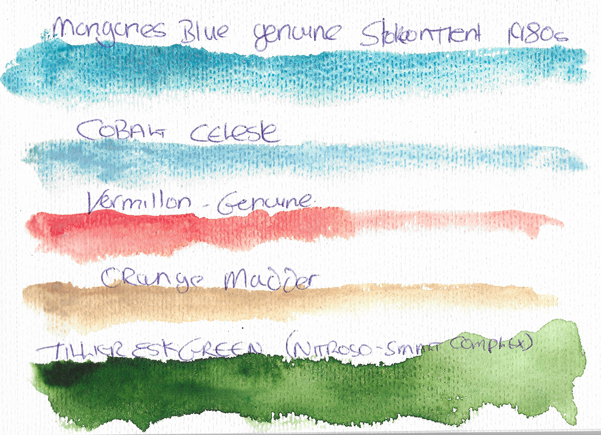
Mangansese Blue
So, Manganese blue (PB33) – what’s the deal? The pigment is Barium Manganate (BaMnO4) on a barium sulfate base, and as I mentioned above was discontinued in the 1990s due to genuine environmental concerns from waste from the production process. It is a beautiful pigment, while the colour can of course be matched reasonably well, the way that is granulates and settles and it’s transparency and vibrance is hard to match. It sits to the greener side of cerulean blues, but does, in my mind have a very distinct character of it’s own. If not essential, it’s amazing to have.
Cobalt Celeste
This is a rare form of Cerulean Blue (Cobalt Stannate) with the addition of Silver in the matrix, there’s little info even on the Wallace Seymour site, but it is listed as a lmited source of a specific batch of pigment.
Ok, another bucket list pigment. It’s a gorgeous muted blue, with great granulation – warmer and more muted than the manganese and other ceruleans (the closest match in my mind is Zirconium Cerulean), and very pastoral.
Vermillion Genuine
Pushing the boundaries this time of the most toxic pigments I am allowed to have in the house, Vermillion (PR106) is another pigment which is quite hard to find (or rather to get hold of unless you can provide proof of archival need). It is Mercuric Sulphide, the same as the natural form Cinnabar and while it does sound nasty (do not, repeat not, lick it) the bio-availible free mercury is limited and sensible practice is really all that’s required for safety. I would not use the dry pigment with my availible PPE, but in a paint I am comfortable. It is a bright, slightly muted red, similar to Cadmiums but less sedimentary.
Orange Madder Genuine Natural
This is an interesting pigment again, a dye blend of Reseda and Madder, laked on to alumina. I will say this is the first Wallace Seymour that was a bit of a dissapointment, in that it is not really as orange as it appears on the listings. However it’s a lovely subtle alternative of siennas. Of course this is not fully lightfast, which will need to be accounted for in use.
Tillier Esk Green
This is a special preparation developed for the Middlesborough Artist William Tillyer and is a blend of Nitroso Green (PG8) and Smalt (PB32) – an interesting idea. Nitroso Green is one of my favourite greens – uncommonly used due to lightfastness concerns, but availible from Rosa as a watercolour – I feel it has a slight character edge over the insanty of phthalo greens. The Smalt adds a subtle granualtion with limited tinting and creates a very interesting paint. Named of course after the River Esk, which discharges at Whitby.
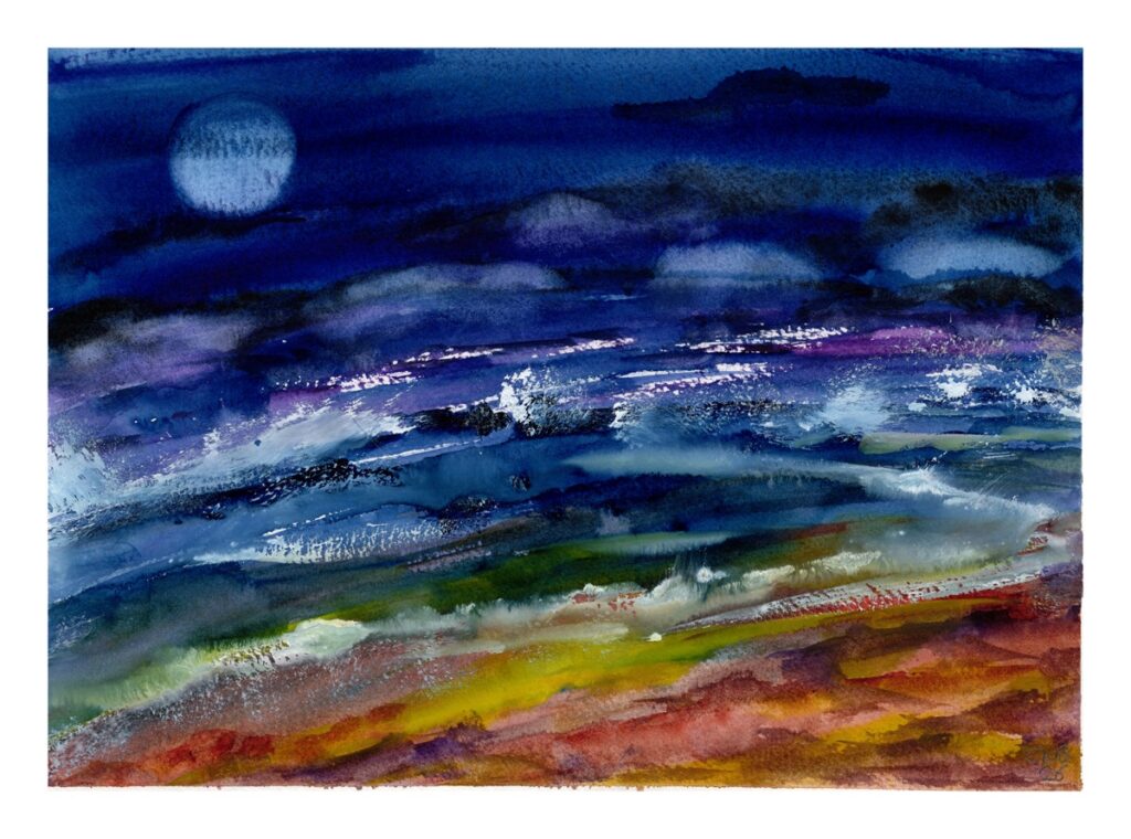
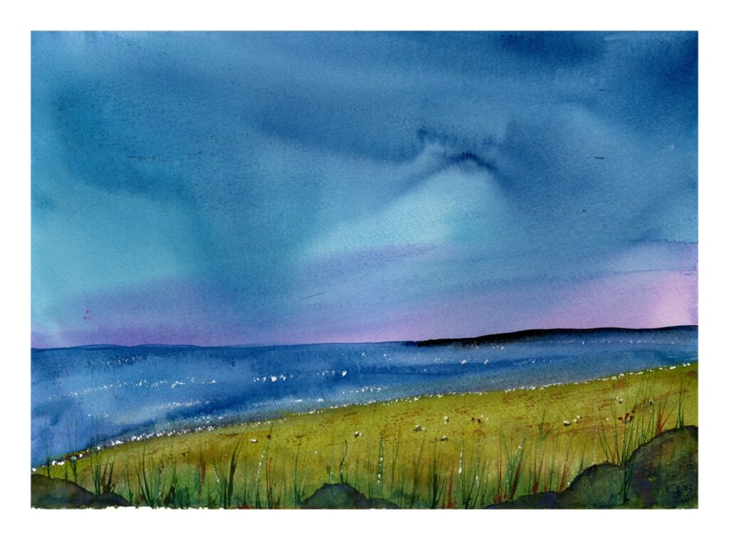
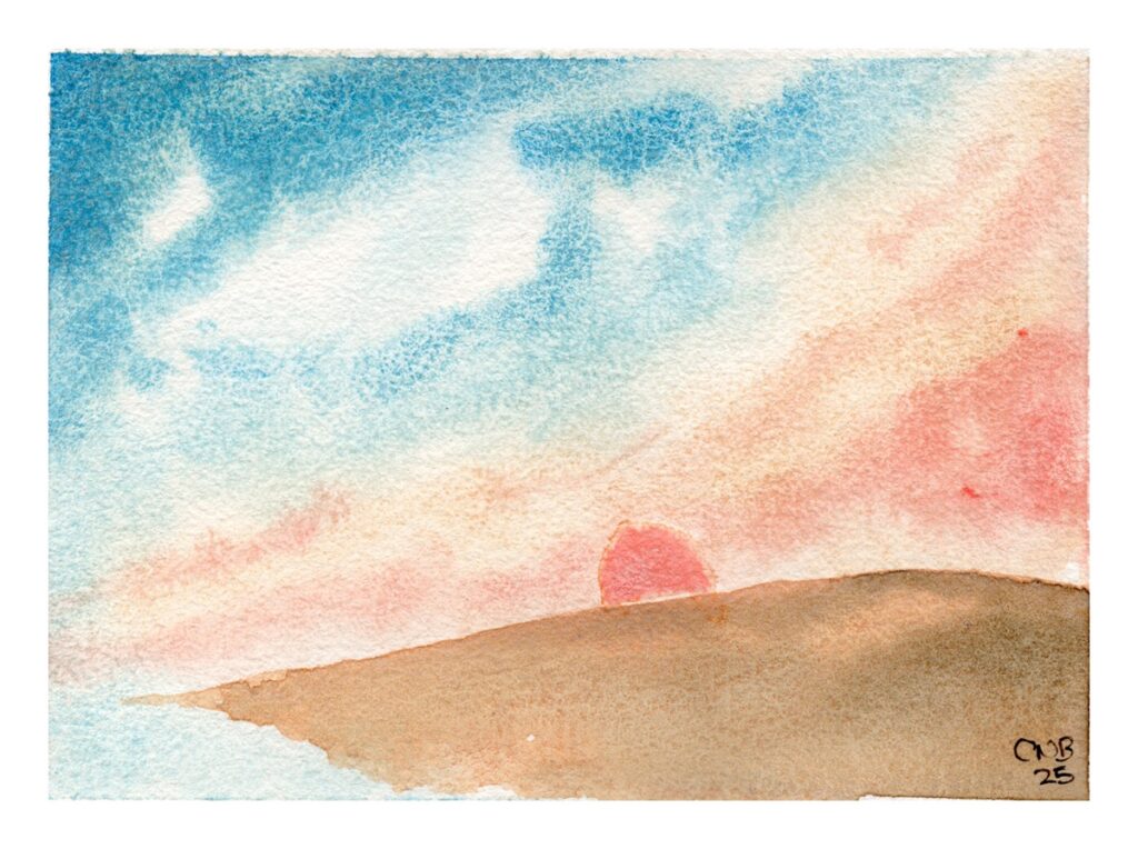
The two pictures below are some more of the little miniatures I have gravitated towards to explore and test my Wallace Seymour paints – creating a little project of their own, on Bao Hong 300gsm Rough which as a lovelyt texture and relatively hard sizing allowing the colours to really shine. The left is Cobalt Celeste and the right is Manganese Blue, both with Orange Madder and Vermillion involved.
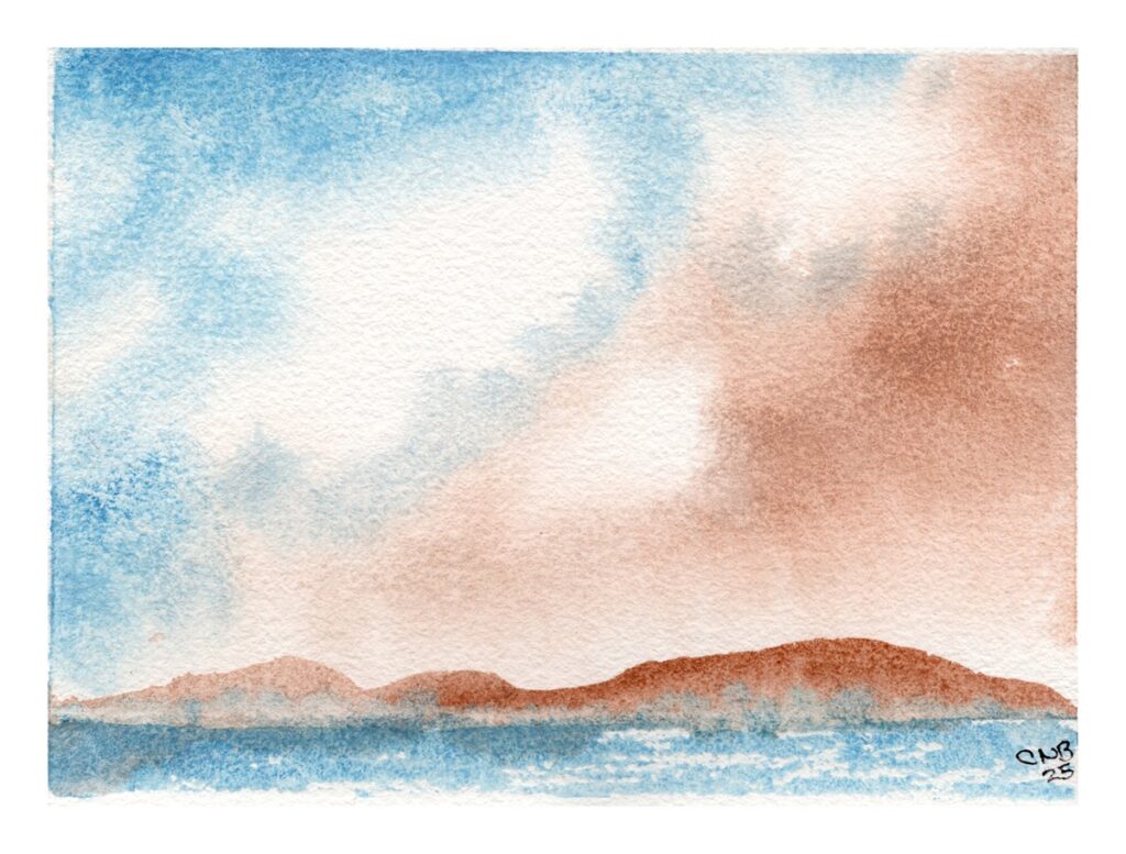
Though not directly intensely these paints, I’ll just add these two images below (and the second uses the Tiller Esk Green and some of the Wallace Seymour colours, and both involve my own preparation of Prussian Blue as both these were in part inspired by some of Tillyer’s acrylic works, and in the case of the first a heavy dose of Turner’s chaotic application of colour…