Building Palletes Part 1 – Primary Triads
This is the first in a series of posts, leading up to a display and discussion of the various palletes (of which there are many) that I have acquired, put together and use in my watercolour practice.
Both for the purposes of adding my opinions to the general discussion on the matter, and a learning activity for myself, I am starting this going right back to the start of the debate, and looking at the most basic pallete that could conceivably be put together. A set of three primary colours.
Many of us were taught, right back in primary school, that the three primary colours (of paint) – that is red, yellow and blue, can be mixed to produce any colour. I distinctly remember the putrid oranges and swampy greens produce by mixing these colours of powder paint, duly mixed with washing up liquid to make it less hydrophobic and I can sympathise with Bruce MacEvoy’s characteristically bombastic assertion that “[…] the traditional primary triad — red, yellow, and blue — is obsolete and should not be taught.1
Moving forwards, anyone with a glancing acquaintance with graphic design, or even who has owned a basic computer printer will know that for many applications a triad of yellow, magenta and cyan (which with black included is the CMYK colour model) is much more usable and that, certainly with pigment on paper, red, yellow and blue falls down significantly. However it is only with more modern pigments that this has become truly achievable.
The triad of red, yellow and blue has been prevalent in artistic practice for some centuries, however, because at least in principle it allows the mixing of any colour on the colour wheel, along with a reasonably dark shade from all three.
The yellow, magenta, cyan model works better as it allows mixing of every colour with the maximum chroma. For the purposes of this post I am not going to go into detailed discussion of why this is (mostly because it is a route to mental indigestion and not necessary for the exploration of triad pallates in watercolour). A very simple thing to note is that if you start with the base point of a mid yellow at the top of a colour wheel (0°), the colours at the two other equidistant points (120° and 240°) are a cool red and a cool blue – magenta and cyan (or turqoiuse)2. But mostly is simply necessary to remember that this is the case, and from this that “cool” colours will tend to work better.
But this is of course an oversimplification.
While the “true” primaries of magenta, yellow and cyan will in most cases produce the mises with the highest chroma (i.e. the brightest) it is case that often it will be artistic choice that informs the choices of colours used.
I will present a number of these here.
As ever, before researching this I did some tests, and experiments of my own.
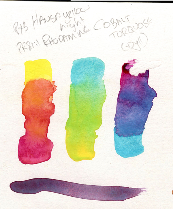
Mindful of the basic knowledge that cyan, magenta and yellow was a good start point, I tested a triad based around these, of a cool yellow, a cool blue and a magenta.
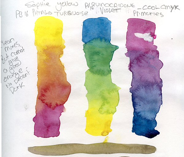
The colours a chose for this are: Sennelier Yellow Sophie (PY93), Schminke Quinacridone Violet (PV19) and Winsor and Newton Phthalo Turquoise (PB16). The Yellow Sophie is a recent acquistion, and has made me realise I do in fact lack cooler yellow staining pigments, so I wanted to try this (and indeed it comes into many of the experiments later)
As you can see, this triad excels at greens, provides some rich (and surprisingly warm purples) but is a little lacklustre on the orange. The dark, though in a dilue wash in this example is also slightly weak, and this perhaps explains the need for the black in the CMYK printing process.
For my next experiments I warmed things up.
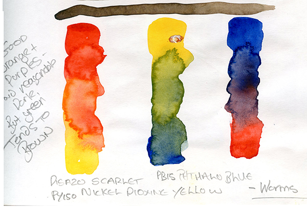
For this I used Jacksons French Vermillion (PR242), Rowney Artists Indian Yellow (PY153)3 and Winsor and Newton Winsor Blue Red Shade (PB15). The warm red and yellow have produced a much more impressive orange, and the warm blue and yellow a more natural, if more muted green. Where this is less impressive is the purple which tends a little to grey4. However, it would be perfectly possible to use this triad to create a relatively natural looking painting.
For a different version of this I warmed the yellow, and slightly cooled the red. These are Rosa Golden Yellow (PY110), Dr Round’s Ultramarine No.2 (PB29)5 and Winsor and Newton Winsor Red (PR254). The orange here is very intense (while the pyrrole red of the Winsor red is cooler, it is still warmish), while the more muted and granular ultramarine mutes the green significantly and the purple, though atractive is less intense.
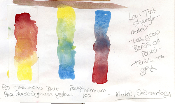
Finally I went to a wild card – exploring some far more textural paints. These are Winsor and Newton Lemon Yellow Deep (PY159) – a new purchase I wanted to try, Winsor and Newton Cerulean Blue (PB35) and Schmincke Cadmium Red Deep (PR108). These are all slightly dull colours, and the real effect here is textural, with most of the blends even duller – the orange is a muted fawn, the green a yellow-grey and the purple very grey. However for an effect triad, this is very pleasant.
Keene Wilson6 suggests a set of more “traditional” triads, based around Kosovic’s work on “The Transparent watercolour Wheel”7, the first of these being a “transparent, non-staining” triad, of Aureolin, Rose Madder and Cobalt Blue.
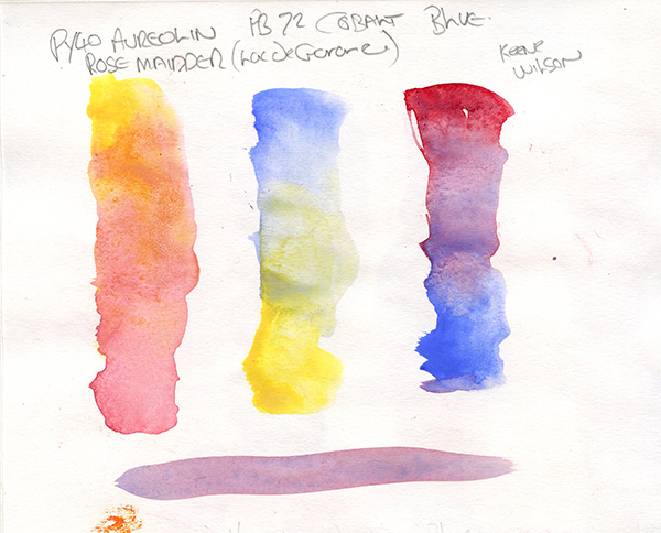
For this I used Jacksons Aureolin (PY40), Wallace Seymour Lac de Garance (PR83)8 and Jacksons Cobalt Blue (PB72). Again this is a very textural triad, and (as Wilson notes, one perhaps for glazing). The Orange is a pleasent peach, the green muted and textural and the purple a pleasent mauve.
His next two are more modern staining traids.
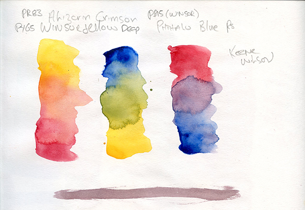
The first of these – more transparent – lists Winsor Yellow (or New Gamboge), Alizarin Crimson and Thalo [sic] Blue. This is slightly ambiguous, as the yellow and blue could perhaps be various shades thereof – I used what I had which is Winsor Yellow Deep (PY65)9, Winsor and Newton Alizarin Crimson (PR83) and Winsor Blue Red Shade (PB15). This is a cool red with a warm yellow and blue, giving a weaker orange, a muted but natural green and a good purple.
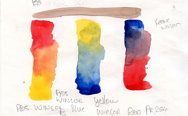
Wilson provides a more opaque option, though very similar of Winsor Yellow, Winsor Red and Thalo blue – I used the same Yellow and Blue with Winsor Red (PR254). In my mind the results are very similar, though the orange is more intense.
Wilson also provides some sedimentary10 triads. The first of these lists Indian Red, Yellow Ochre, and Cerulean Blue.
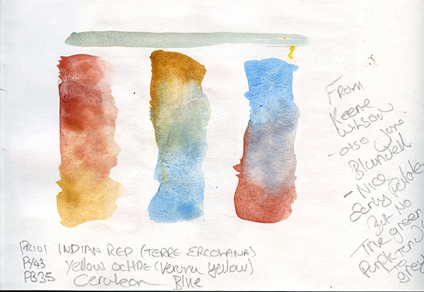
I used Terre Ercolana (PR102) and Verona Yellow (PR43) both my own preparation, and Winsor and Newton Cerulean Blue (PB35) for this triad. It’s immediately obvious that the colours from these duller earths are far more muted. Though, from this traid this is the aim.
Wilson’s final set is a basic traditional primaries.
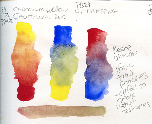
I used Daler Rowney Professional Cadmium Yellow (PY35), Schmincke Cadmium Red Deep P(PY108) and my own Dr Round’s Ultrmarine No.2 (PB29). Of these, the orange is the best. I think the other two, certainly when mixed on paper are slightly affected by the fact that Cadmiums do not really like to mix well with anything other than Cadmiums. The purple is marginally better than the green.
At this point I am going to delve a little deeper in to theory, largely and unashamedly rehearsing the work of MacEvoy. Dissecting the palate choices of Jean Grastorf, MacEvoy11 makes some observations. The first of these is that any set of visible primary colours (that is a colour that can be reproduced in a specific medium, be that watercolour, light, or anything else) can never produce all the other colours visible in that medium by mixing. Thus a choice of primary colours is not the perfect pallete, it is one of many – As I noted above one makes choices based on the results wanted; a specific set of three cannot be considered “the best”, simply “the best for the job”.
Often a good point to start with choosing primaries is the yellow:
- a green yellow (cool) with brighten the green and dull deep yellows
- an orange yellow (warm) will dull greens, but can make them more attractive and natural.
The “red” is not normally red, but magenta, and often this is chosen to be as far from the yellow as feasible, to distrubute the colours around the wheel and give higher saturation in mixes, and the yellows will come into play again with:
- an orange yellow will allow darker warm values
- a green yellow will create bright Earth tones.
Notwithstanding the usual choice of magenta, it’s clear from my experiemnts that:
- an orange red (warm) will allow brighter and more saturated oranges, especially with a warm yellow
- a magenta (cool red) will provide cleaner purples.
The final choice is the cyan, or blue, and the choice here will obviously affect the greens and purples.
- a blue, or even a violet blue (warm) will provide more saturated purples, but will dull bluer grees, with yellow greens noticably more saturated
- a green blue, or turquoise, will provide deeper and more intense greens, but purples will be more grey.
All of this is clearly apparent in my experiments above.
MacEvoy12 does helpfully suggest a set of the basic primaries that coould be used here.
- primary light yellow : Benzimidazolone Yellow (PY151 or PY154) or Hansa Yellow Medium (PY97)
- primary magenta : Quinacridone magenta (PR122) or Quinacridone rose (PV19)
- primary cyan : Phthalocyanine Blue GS (PB15:3) or Phthalocyanine Cyan (PB17) – This latter no longer appears availible, but PB16 (Phthalocyanine Turquoise) is a good substitute.
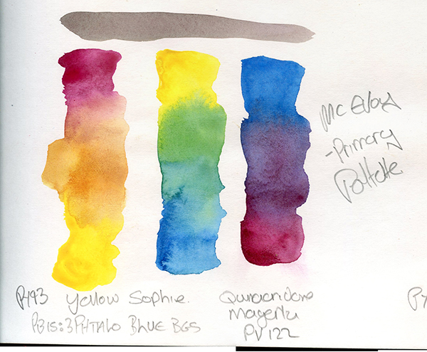
By some strange omission I do not actually have a Benzimidazolone Yellow, or Hansa Yellow medium, having gone for Winsor Yellow Deep so far – and this is something that as a result of this set of experiments I am planning to change. So I have used my Yellow Sophie (PY93) again which as a disazo condensation pigment is not dis-similar chemically and in colour. The blue is Mungyo Cerulean Blue, which is in fact a perfectly reasonable Phthalocyanine Blue BGS (PB15:3) and my own Dr Round’s Quinacridone Magenta (PR122)13
The assertion that these primaries provide the greatest saturation over the widest gamut is certianly borne out by the results here, with a good quality in all the secondaries.
I explored these a little further, first substituting a warm yellow, then a warm red.
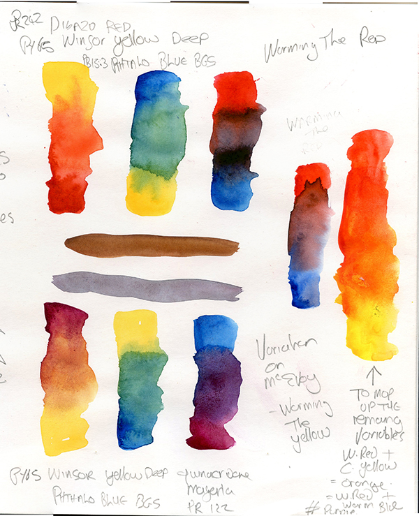
For the Yellow, I moved to Winsor Yellow Deep (PY65) again, and for the red to Winsor Red (PR254). As expected this warmed the orange and muted the green, and ultimately (with the warmer red) took the saturation out of the purple. It is pretty much impossible to mix a violet with a warm red, whatever the colour of the Blue.
I mixed the warm red with the cool yellow- which created the cleanest orange, and then finally warmed the blue to Winsor Blue Red Shade (PB15) – this brings us full circle to the example after Keene Wilson, of the three Winsors.
This will lead on to the discussion of split primaries in a future post.
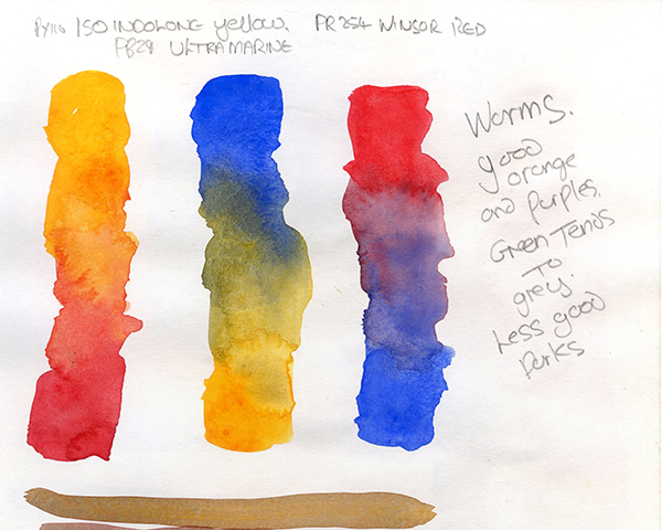
McEvoy14 suggests some alternatives. For a cool yellow, Cadmium Yellow (PY35) could be used15 and I would add Hansa Yellow Light (PY3) and my current passion of Yellow Sophie (PY96). Warms could be Hansa Yellow Deep (PY65), Isoindolone Yellow (PY110) and Nickel Dioxine Yellow (PY153). To be fair there is a vast array of organic yellow pigments to choose from and a number of metal compounds, all of which could have good use.
For warm reds he notes Cadmium Red (PR108), Napthol Reds (PR112, PR170) and Pyrolle Red (PR254) but cautions this will affect the purples. Cool options could be Alizarin Crimson (PR83)16, Quinacridone Magenta (PR202), Quinacridone Scarlett (PR209) or Quinacridone Violets (PV19). I would add Perylene Maroon (PR179) to this list.
For blues (of which there are far fewer) the obvious substitution is Phthalocyanine Blue RS (PB15). Cobalt Blue (PB28 or PB72) is traditional, but weak tinting strength and I would add Ultramarine (PB29). He suggests Prussian Blue (PB27) to be less useful, but suggests Phthalocyanine Turquoise (PB16) or Cobalt Turquoise (PB28, or PG50) to be interesting options. I would also add Indanthrone Blue (PB60) to this list.
By now, it should be clear that while there may be a set of primaries that gives the most saturated secondaries within the widest gamut, this is not always what you need and the joy of these “rules” comes from breaking them for creative effect. I am going to end by noting, and testing, some alternative creative triads, pulled from various sources.
Lisa Spangler17 suggests a set of season themed triads. I chose the winter triad to test, as this was most different to others I have tried in this post so far. This she lists as Gamboge Yellow (PY150), Blackcurrant (PR101), Indanthrone Blue (PB60).
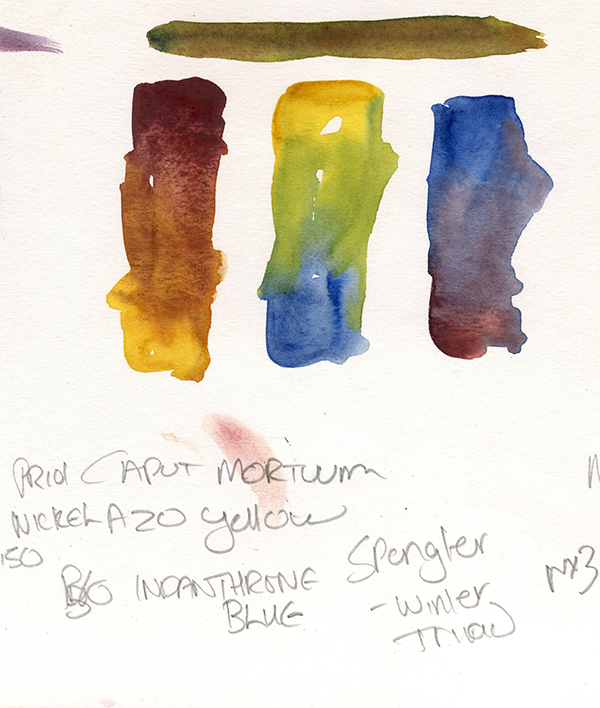
I used Winsor and Newton Caput Mortuum (PR101) as I am unsure what “Blackberry” corresponds to and it seemed the most logical option, Shmincke Transparent Yellow (PY150) and Winsor and Newton Indanthrone Blue (PB60). This is a cool (and muted) red, a middle to warm yellow and a warm blue. Characteristically it is a muted pallete, with an earthy orange, a natural green and a deep, but muted purple. But it is indeed very wintery.
Billy Idyll18 also explores working in19 and subsequently abandons20 triads. However in the course of his various posts he gives some interesting triad ideas, of which I will explore a few here.
Going in totally the other direction to Spangler’s winter triad, this super bright set is listed as Hansa Yellow Light, Opera Rose and Cobalt Turquoise. Specifallly I used my own Dr. Round’s Hansa Lemon (PY3), Mungyo Cold Pink (PR81) – this was chosen as it is a single pigment, unlike my Opera Rose, and Schmincke Cobalt Turquoise (PG50). This is in essence a further extrapolation of the CMY primaries, and my it is bright, but again gives a fairly wide set of colours.
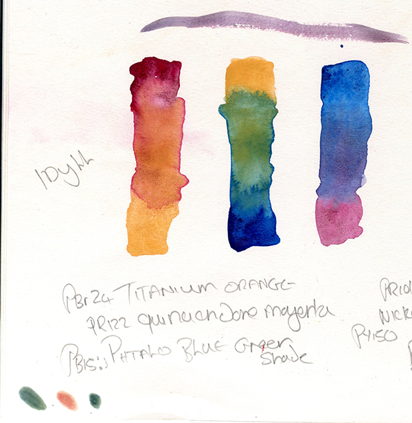
An interesting variation is this pallete using Titanium Orange, Quinacridone Magenta and Phthalocyanine Blue BGS. I used my own Dr Round’s Titanium Butterbean21 (Pbr24), Dr Round’s Quinacridone Magenta (PR122) and Mungyo Cerulean Blue (PB15:3). I tried Titanium Orange as a yellow for mixing greens in some recent experiments, with very limited success, but it seems the secret incredient is the Phthalo Blue BGS (of which I may need to get a different source) as this has worked unexpectedly well for the the green, and unsuprisingly the orange has worked nicely too, with the Titanium orange adding the nice effect from granulating colours and stains when mixed.
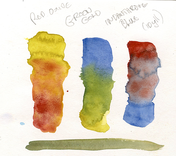
One further one from Billy Idyll, simialr to Spangler’s winter triad is Red Oxide, Green Gold and Indanthrone Blue. I used Talens Van Gogh Azomethine Green (PR129), Dr Round’s Terre Ercolana (PR102) and Winsor and Newton Indanthrone Blue (PB60). This is another quite natural pallete, which albeit with a more limited gamut does give a decent colour for all the secondaries, though the Red Oxide seperates out from the Azomethine Yellow and Indanthrone blue, but in a pleaswnt way.
I’ll leave you with one final test.
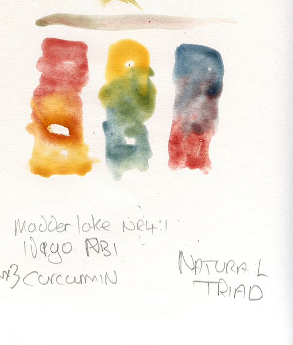
This final Triad, of my own making, is Curcumin (NY3), Madder Lake (NR9)22 and Indigo (NB1) all from the Schmincke Horadum Naturals range. I wanted to test these natural colours, to explore some very old pigments in this way. The results as you can see are surpsingly good.
In a sense, the matter of worring too much about Triads is kind of a pointless issue. While it is clear that there is a set and easy formular to provide secondaries of the highest chroma wiht the greatest gamut, unless you are strictly limiting yourself to three colours for every purpose there are enough options to make inumerable creative choices.
Remembering the basics though – the CMY primaries give the best range, warm reds and blues make better oranges and more natural greens, but more muted purples, cool reds favour violets, and yellow can be changed the most with less impact – can inform these choices.
Ultimately unless for a specific creative purpose, it makes sense to expand this basic pallete – though understanding it gives a good foundation for choosing how.
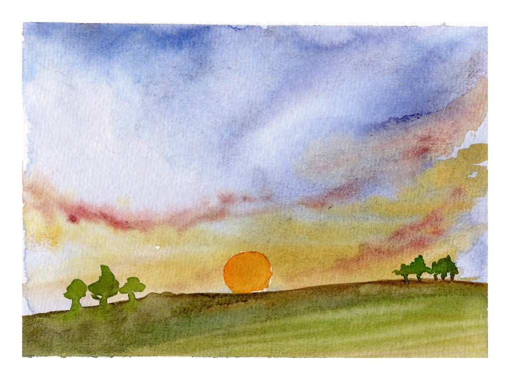
Just to prove the point, below is a quick landscape, from the primary CMY triads.
Next up, we will look at split primary palletes – a thorny subject if ever there was one.
Notes:
- https://www.handprint.com/HP/WCL/color13.html#primary ↩︎
- I will discuss “warm” and “cool” colours, along with some more precise ways of looking at these, in some depth in a later post, for now we just need to define a red as warm when tending to orange and cool when tending to purple, a blue as warm when tending to red and cool when tending to green and a yellow as cool when tending to green and warm when tending to orange. ↩︎
- Written incorrectly on the page. ↩︎
- I’ll discuss some conversation on this in a later post when I consider “Spit Primary Palletes”. ↩︎
- My own preparation. ↩︎
- https://www.keenewilson.com/page/4287/knowing-watercolor-pigments, drawing heavily from the work of Jim Kosovic. ↩︎
- Currently availible to read at https://archive.org/details/transparentwater0000kosv ↩︎
- Though listed as PR83, Wallace Seymour state this a natural pigment stock from 1983. ↩︎
- I’m going to make this point now – the whole “Winsor” thing irritates me – while they may be the oldest and preeminant makers of watercolours, it would be beneficial at times if they just named these core colours after their pigments. ↩︎
- In this model largely, but not entirely, corresponding to granulating. ↩︎
- https://www.handprint.com/HP/WCL/palette4c.html ↩︎
- https://www.handprint.com/HP/WCL/color13.html#primary ↩︎
- Again, excuse the errors in my hand written scrawl. ↩︎
- ibid. ↩︎
- c.f Keene, op. cit. ↩︎
- But be wary of lightfastness ↩︎
- https://arttoolkit.com/supplies/triad-palette/ ↩︎
- Or Logan – https://www.idyllsketching.com/ ↩︎
- https://www.idyllsketching.com/2023/03/23/watercolor-color-wheels-from-harmonious-primary-triads/ ↩︎
- https://www.idyllsketching.com/2025/09/08/ive-abandoned-triads/ ↩︎
- If you must know this is a long convoluted joke about the walls in my Victorian Terrace being made from Titanium and Lump Sugar, as indicated by the problems of drilling consistent accurate holes in the walls, which then became transmuted into Breadcrumbs and Butterbeans which the mice in Bagpuss claimed they could make biscuits from (Consuming a lot of red wine in the back alley in deck chairs a statutory 10ft away from the neighbours in the last throws of coivid was involved in this discussion)… And of course the paint is made from Titanium Pigments and is the colour of a butterbean. Bet you wished you’d never asked. ↩︎
- Written incorrectly on the paper ↩︎