Primatek, Revisited
After the small set of Daniel Smith Primatek Watercolours I received for Christmas a couple of years ago, I have slowly collected a few more from this range.
I am very much still in two minds about these. There is increasing muttering that these are augmented with other pigments which are not declared, which wouldn’t actually bother me in the slightest if they were clear on the labelling, but if there are and this is not listed it pisses me off a little.
They also, arguably, do not provide any real essential colours or effects that other pigments cannot. But, they are interesting, and it is fair to say very individual and I am a sucker for exploration.
So here’s a few more I have copllected over the last couple of years.
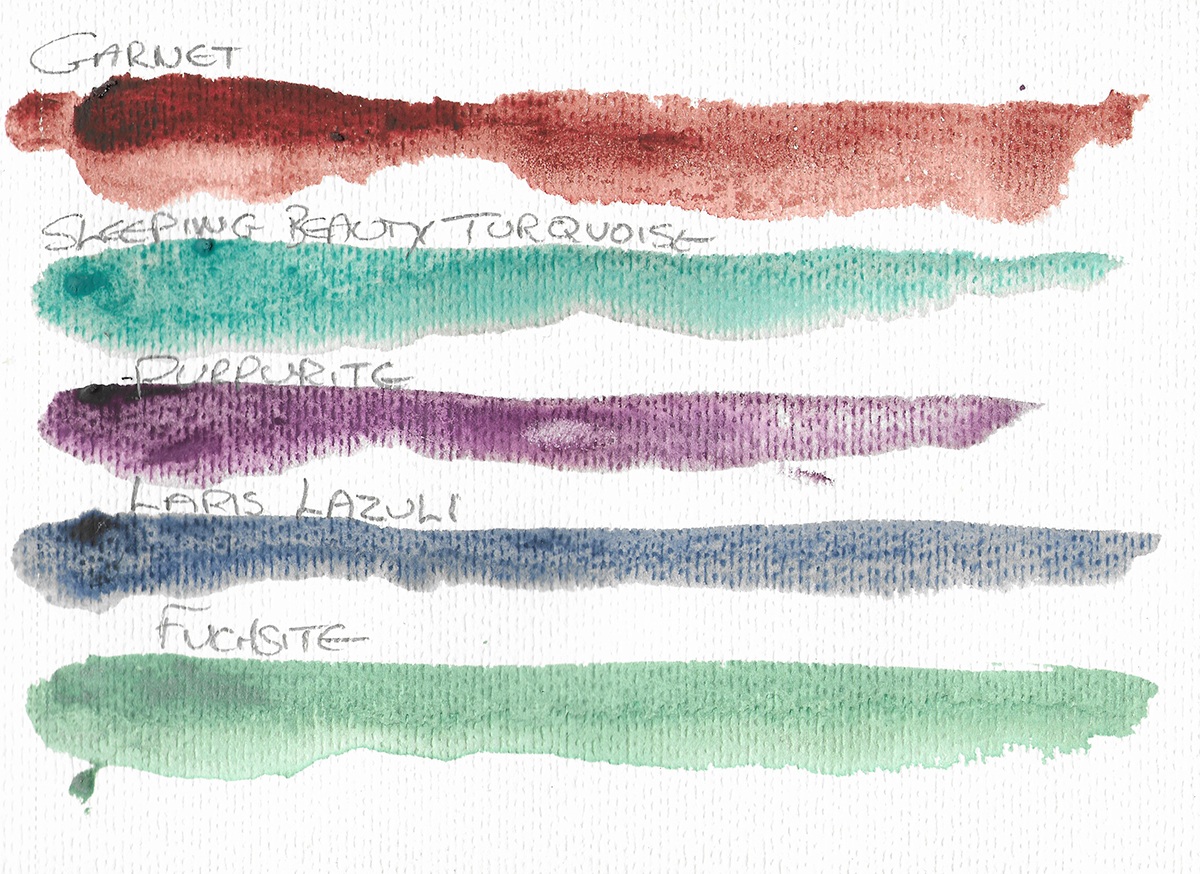
Garnet Genuine
Garnet is Sillicate Mineral with the general formula X3Y2(SiO4)3 – they are often associated with red, but can exist in many colours and have been used as gemstones and abrasives since at least the bronze age. This paint is a gorgeous colour – like various red ochres and siennas, and I will say it has a very nice structure and depth to it.
Sleeping Beauty Turquoise
I am going to try and be honest with myself here. This one was pricey (£29 odd for a 15ml tube). It’s a lovely colour. It has lovely granulation. I am not sure how far it genuinely does more than a (PG50 or PB28) Cobalt Turquoise would and the latter have greater tinting strength and better coverage.
Turquoise is a Phosphate of Copper and Aluminium with the formula CuAl6(PO4)4(OH)8·4H2O. Bruce MacEvoy questions whether this is fully genuine as high quality (high chroma) turquoise is increasingly rare and many gemstone examples are dyed1.
The biggest issue in my mind is that this one can very clearly show the heavy, gloopy binder Daniel Smith use to carry these heavier pigments and it is very prone to settling – perhaps storing the tube upside down for a period and then a lot of gentle massage would be useful before opening – certainly mine shot a lot of binder out before any colour.
Purpurite
With the alllegations that Daniel Smith’s Amesthyst contains Dioxazine Violet as an adjunct, this purple colour seems a little more natural. Purpurite is a manganese based mineral – MnPO4 – Manganese Phosphate – you’ll note the similarity with Manganese Violet (PV16). Again this has a lovely granulation structure and it has a gorgeous smokey violet colour. It’s one of the better ones in my opinion, but Manganese Violet would also do for most use cases.
Lapis Lazuli Genuine
So, this is the one that caused a lot of controversy, especially with MacEvoy’s scathing commentry on the marketing video.
So here’s the rub. Lapis Lazuli is a mineral, the most important constituent for this purpose being Lazurite2, an complex silicate with the formula Na7Ca(Al6Si6O24)(SO4)(S3) ·H2O. Ultramarine (PB29) is an identical synthetic version of this. Good Lapis, can be every bit as deep, dense and vibrant as synthetic ultramarine. Daniel Smith say they use the Good Stuff. The Good Stuff is not really compatible with a price of £25 a tube – Wallace Seymour‘s top quality is about £125 for 5ml!3 The Daniel Smith Lapis is interesting, beautiful (though with the same visibility of the binder in certain cases) but for most uses Ultramarine (or a Cobalt Blue, if you want a loose structure) would probably work fine.
But is is Lapis Lazuli, and that does have a romance of it’s own.
Fuchsite
This one is perhaps the disapointment – not in the quality of the paint, but just in what I tend to use. Fuchsite is a Chromium Rich varity of the mineral Muscovite with the formular K(Al,Cr)3Si3O10(OH)2. Now, while I use some shimmer pigments (made from mica) I don’t really like many examples and think they can look cheap. Some commentary accuses Daniel Smith of using mica to shimmer up some primatek colours. But Fuchsite is, of course, a mica. The colour is intriguing, and interesting, but the effect for me is too shimmery, and in fact it’s intensity (not really picked up by the scanner) makes it look worse. It’s a great paint if you like that sort of thing, and probably one of the better primateks, but probably one of the first paints in a while I have bought and may not use much.
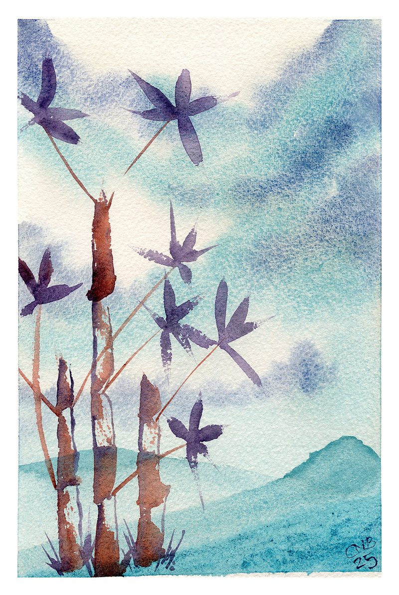
Anyway. The real test is in use. I think the think with these Primatek colours is that they have their place. Mixed in with standard paints, some of them perhaps stick out or don’t fit. They would perhaps struggle to form a coherent pallate for standard work. But for some ideas they are an interesting and valid material.
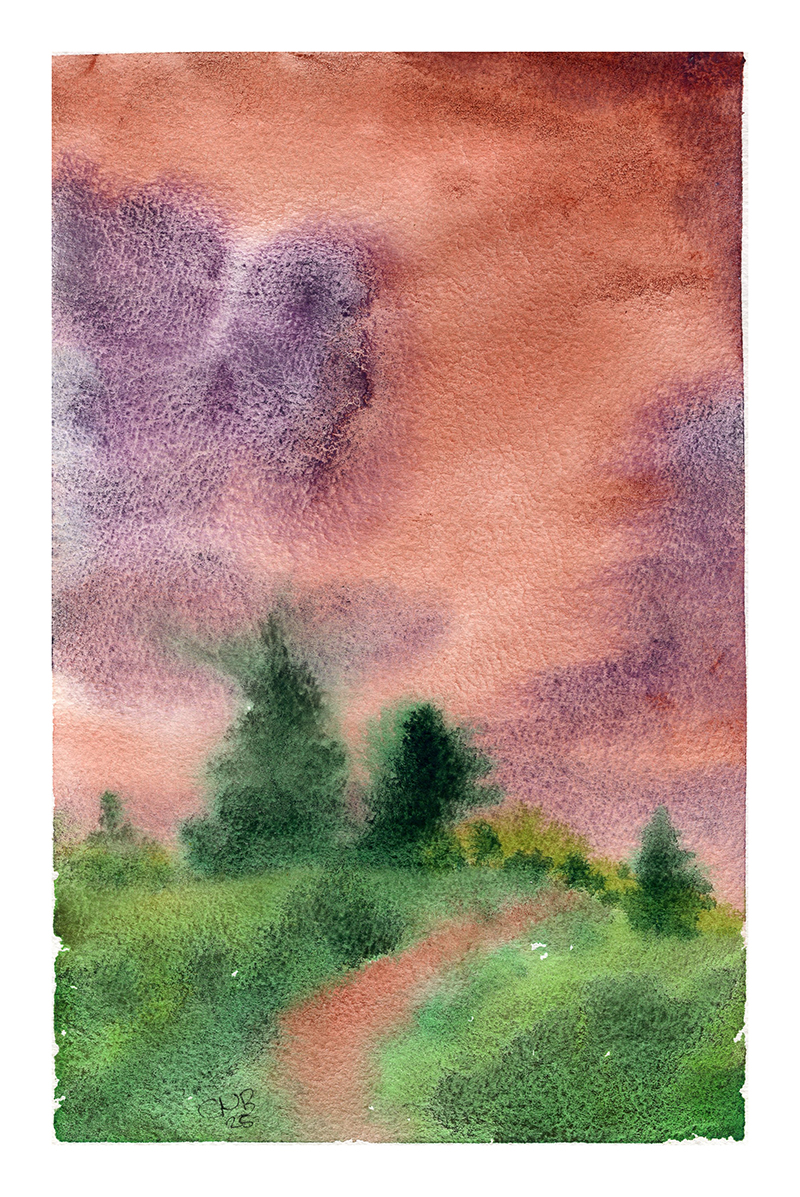
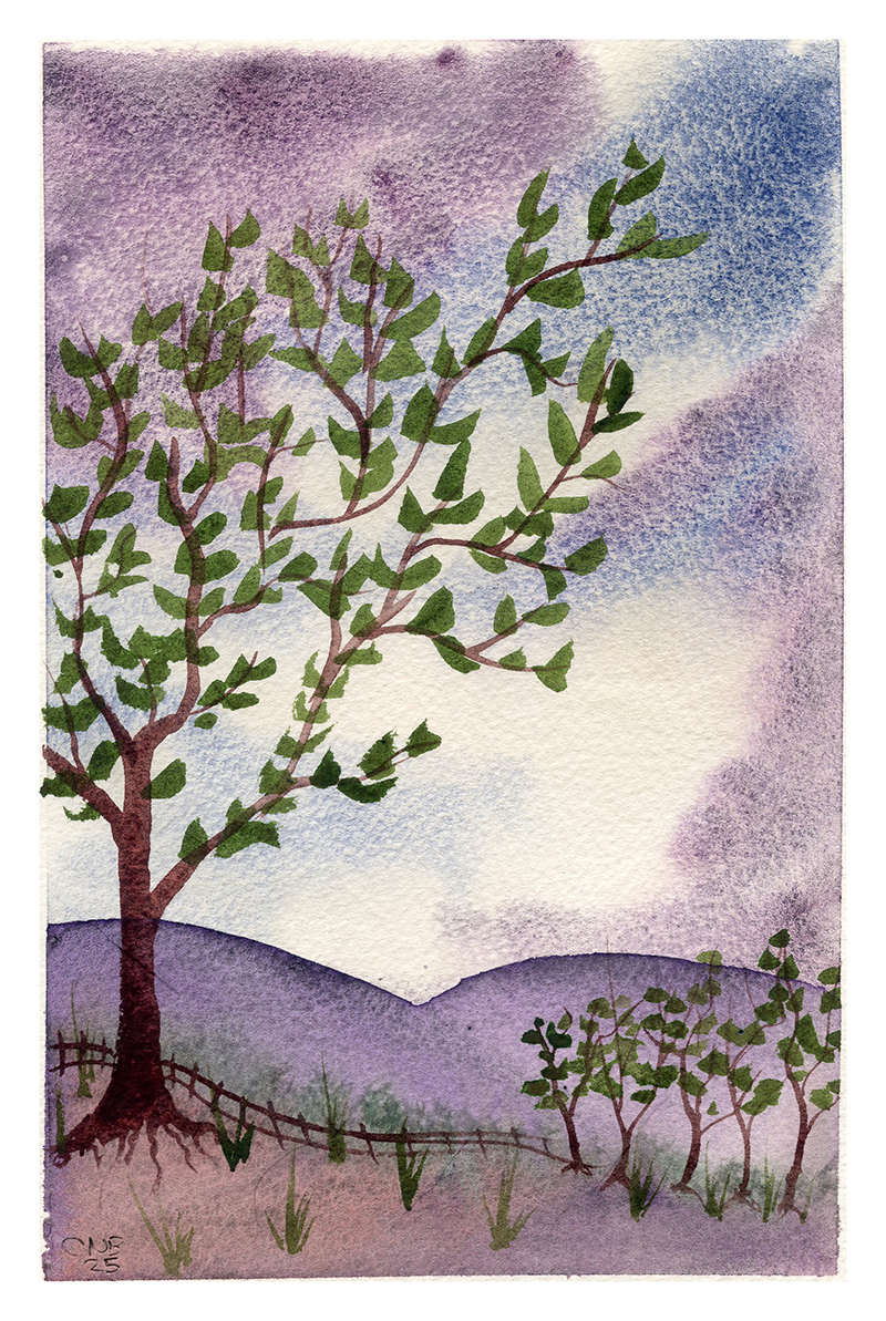
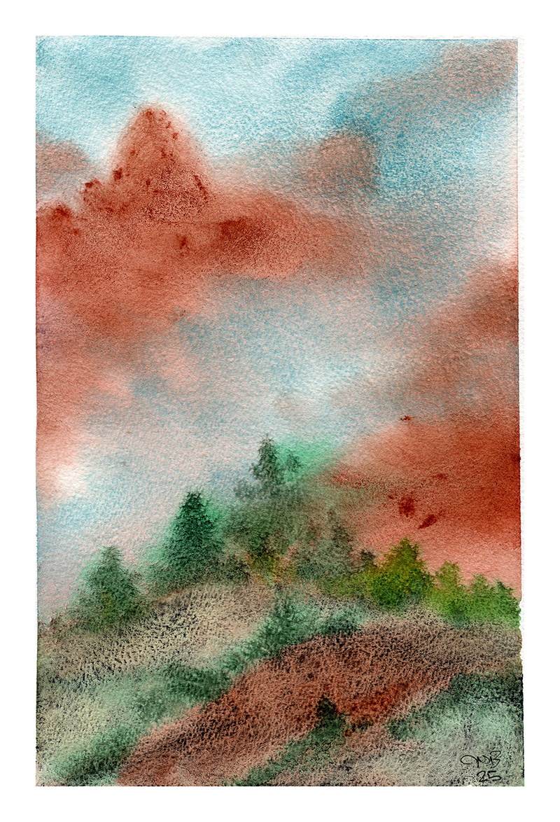
The above four paintings show the four colours discussed here (barring the Fuchsite), with additions of Serpentine and Green Apetite (in the same Primatek range from the Green With Envy set). These were on Arches 300gsm paper, which is of course high quality with reasonably hard sizing, which displays these pigments and their properties well. They certainly have a distinct style and if you learn their ways these paints can definetly create some interesting works.
- https://www.handprint.com/HP/WCL/primatek.html ↩︎
- See https://en.wikipedia.org/wiki/Lapis_lazuli#Composition for the rest ↩︎
- This seems crazy, but while Wallace Seymour are not cheap, they are also not expensive (comparable with any other professional quaility brand), the key thing is I trust them to be clear and honest on their sources, not rip people off and if a 5ml tube is £125, that’s because the contents are expensive ↩︎