Next Level Landscape Tutorials
I’ve been following a few of the free tutorials offered by Geoff Kersey, a landscape artist whose work I have found very appealing in some books I have.
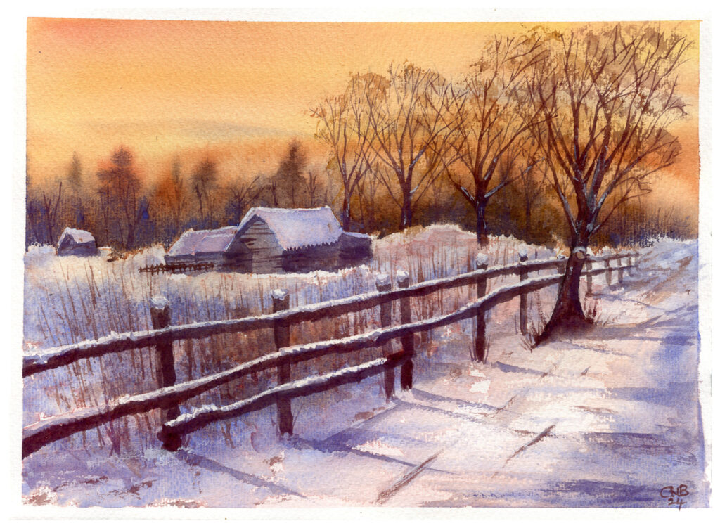
The painting above is very interesting as it almost seems that it should not work. It’s very often put forwards in watercolour that one should harmonise the colours – which this painting does in that it uses quite a limited set of pigments, but it works on the stark contrast between the sunset orange of the sky and the blue shadows on the snow, but pulled together by the faint warmth on the highlights of the snowy ground.
I painted this on Saunders Waterford 425gsm Rough, which is becoming my favourite paper. Overall it was quite a challenge, but I am very pleased with it.
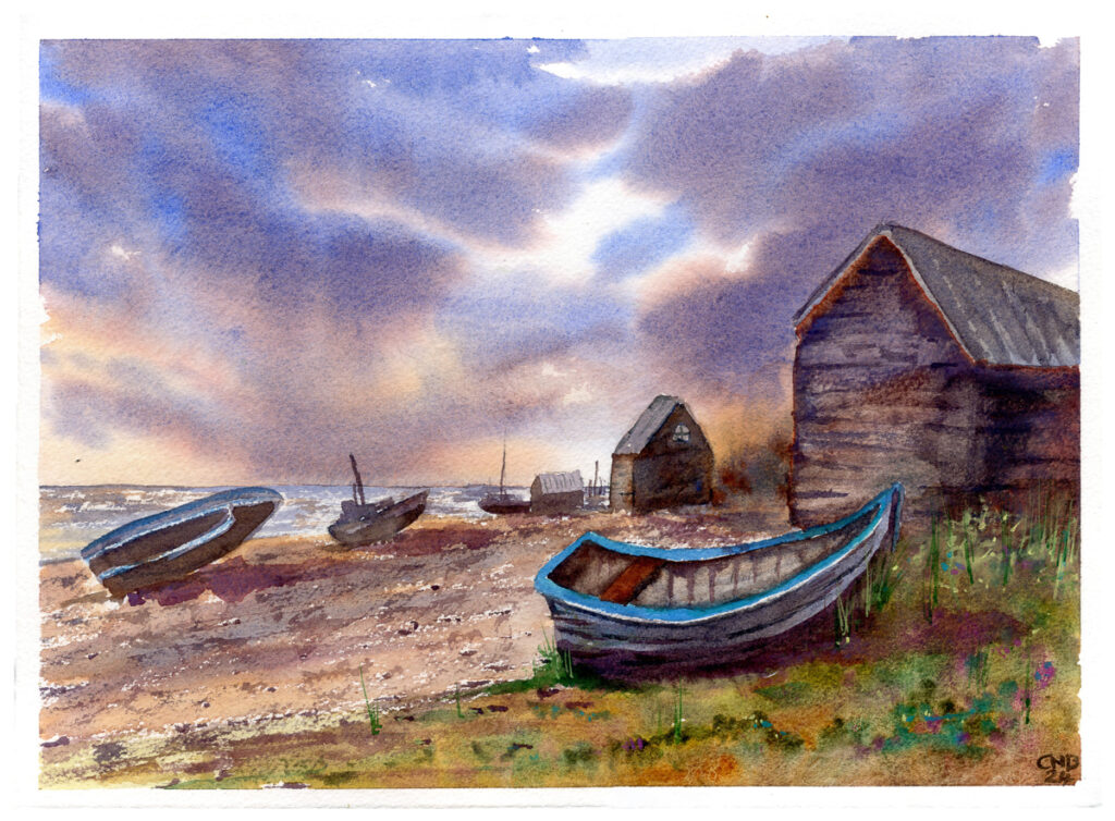
The next one I have looked at is Geoff’s “Boat’s at Hythe” Tutorial. The sky on this one is very important, and skies something I have a tendency to over-work, so this was again an excercise in patience. This is also a very complex picture with quite a lot of elements to pull together. I am very pleased with how the actual excecution of the painting has gone, though I still struggle with perspective on more complex shapes.
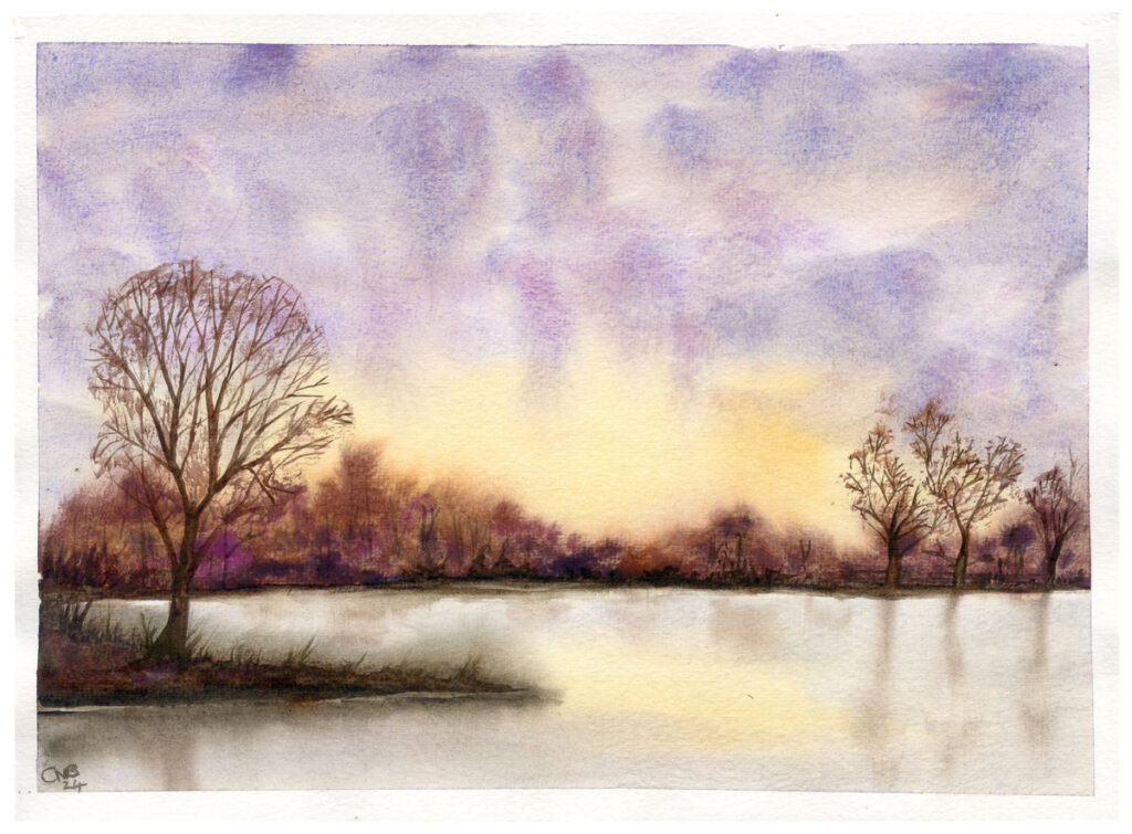
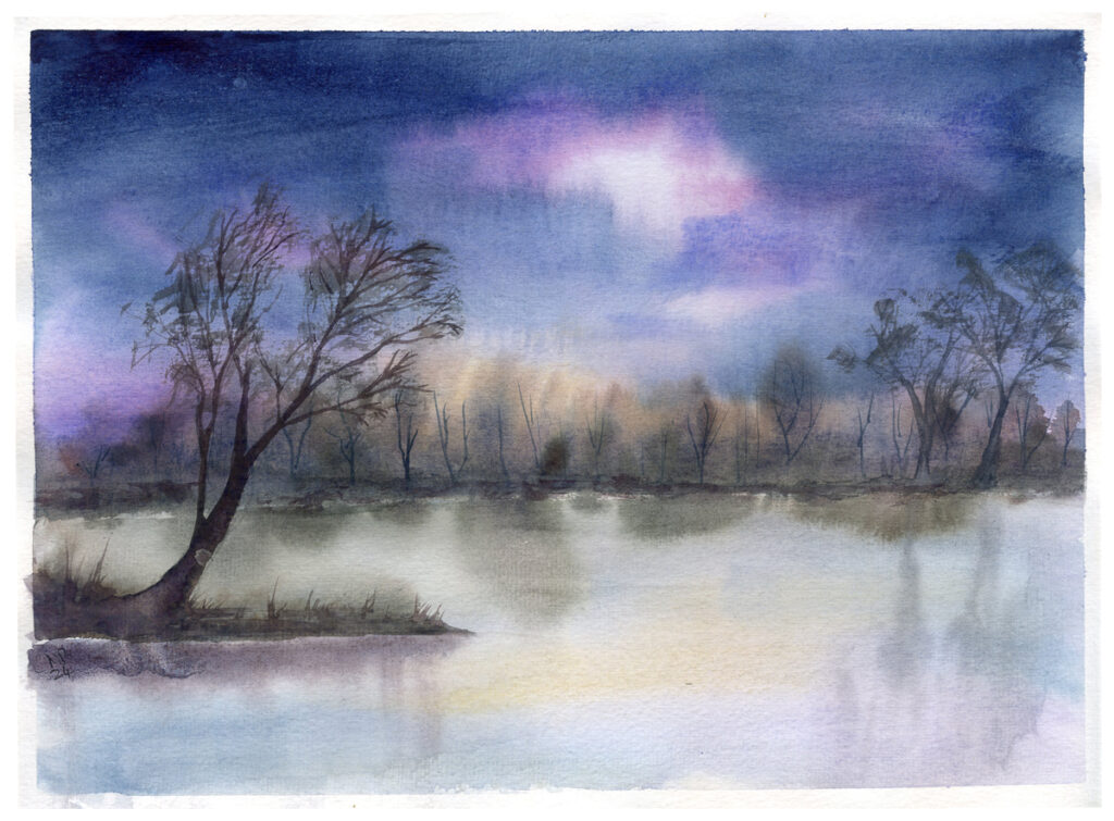
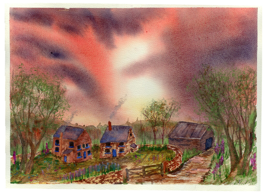
The two above are expositions of an image also by Geoff Kersey in a book I found in Oxfam. This did not come with a tutorial, but I put some of the ideas I have been learning into practice to first work from the original, and then attempt the night time variation.
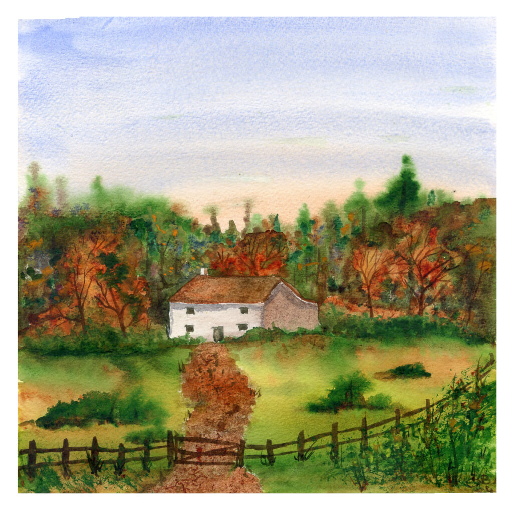
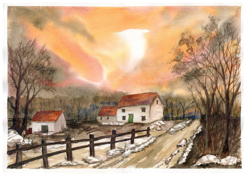
The small farmhouse in the forest is also based very loosely on another painting in the same volume, though I took the idea and developed it substantially. Working from the idea of Kersey’s sunset house, I explored the idea for the second painting above, using many of the same techniques. The Sky on this was put in seperately, while creating a set of my own colours – as when mixing any paint I like to use the remains in the mortar for something, often skies. This of course led to a little difference in the tree line as I was not working wet in wet, but the natural shape of the skies worked well for this composition.
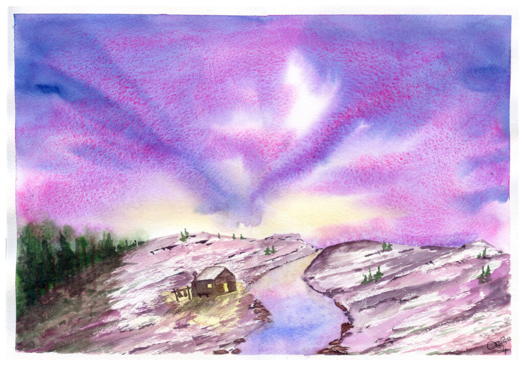
These final two are my own ideas – not up to the standards, yet, of those I worked from tutorials, but these again are built from paper I painted skies on when making paints – the last of hese something I am working on especially, being a blend of granulating pigments with fluorescent dyes to create an interesting effect – especially in this one which is mixed from Culture Hustle’s Pinkest Pink and Ultramarine Blue – with the odd effect that the pink has actually dyed the Ultramarine. I thought the slightly transcendental sky worked with this fantasy trapper’s hut.